
このページについてのご案内
このページでは、本サイトにおける マイケル・ダール のページ閲覧数をご紹介しています。「1回の訪問」とは、1人のユーザーがページを開いたことを指します。各チャートには、それぞれ簡単な解説を添えています。
統計情報は2026年7月1日にリセットされました。そのため、同日より前のデータはご利用いただけません。
マイケル・ダール in figures
Barbara Talbot (1665–1763), Viscountess Longueville is the canvas of マイケル・ダール that readers open most: 300 visits in twelve months, 5% of the views. Then Sir Gilbert Heathcote (1652–1733), One of the Founders of the Bank of England と John Radcliffe (1650–1714) (copy after Godfrey Kneller). In all 6,500 visits: 1,100 on the page of the painter, 5,400 on the canvases. The light is rising: 33% more visits in 9月 2026 than in 8月 2026. 7月 2026 was the peak: 5,400 visits. Devices of the readers: computers (92%), phones (6%) と tablets (2%). A preference shows: 均衡のとれた調和 (色彩の調和) collects 23% of the visits for 8% of the catalog.
マイケル・ダール: the 10 canvases readers open most
This list ranks by real visits on TopImpressionists.com, over twelve months, not by catalog score. First place is the most visited canvas of マイケル・ダール.
-
 1
Barbara Talbot (1665–1763), Viscountess Longueville, 1690
300 visits · 5.4%
1
Barbara Talbot (1665–1763), Viscountess Longueville, 1690
300 visits · 5.4%
-
 2
Sir Gilbert Heathcote (1652–1733), One of the Founders of the Bank of England
300 visits · 5.4%
2
Sir Gilbert Heathcote (1652–1733), One of the Founders of the Bank of England
300 visits · 5.4%
-
 3
John Radcliffe (1650–1714) (copy after Godfrey Kneller)
300 visits · 5.4%
3
John Radcliffe (1650–1714) (copy after Godfrey Kneller)
300 visits · 5.4%
-
 4
Thomas Knight (1701–1781)
300 visits · 5.4%
4
Thomas Knight (1701–1781)
300 visits · 5.4%
-
 5
Portrait of a Woman, 1700
200 visits · 3.6%
5
Portrait of a Woman, 1700
200 visits · 3.6%
-
 6
Sir Robert Walpole (1676–1745), Later 1st Earl of Orford
200 visits · 3.6%
6
Sir Robert Walpole (1676–1745), Later 1st Earl of Orford
200 visits · 3.6%
-
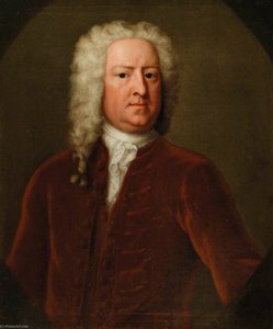 7
Sir Watkin Williams Wynn (1692–1749), Bt, 1720
200 visits · 3.6%
7
Sir Watkin Williams Wynn (1692–1749), Bt, 1720
200 visits · 3.6%
-
 8
Lady Charlotte Herbert (d. after 1751), Later Lady Charlotte Morris (m.1723), then Lady Charlotte Williams, 1720
200 visits · 3.6%
8
Lady Charlotte Herbert (d. after 1751), Later Lady Charlotte Morris (m.1723), then Lady Charlotte Williams, 1720
200 visits · 3.6%
-
 9
Henrietta Maria (1686 1687–1718), Baroness Ashburnham, 1717
200 visits · 3.6%
9
Henrietta Maria (1686 1687–1718), Baroness Ashburnham, 1717
200 visits · 3.6%
-
 10
Portrait of a Gentleman in a Red Turban, 1720
100 visits · 1.8%
10
Portrait of a Gentleman in a Red Turban, 1720
100 visits · 1.8%
How does the readership of マイケル・ダール change from month to month?
各棒グラフは1ヶ月分を表しています。これは、過去12ヶ月間における、各月のこのアーティストのページ閲覧数を示しています。
Show the figures
| Month | Artist page | Artwork pages |
|---|---|---|
| 10月 2025 | 0 | 0 |
| 11月 2025 | 0 | 0 |
| 12月 2025 | 0 | 0 |
| 1月 2026 | 0 | 0 |
| 2月 2026 | 0 | 0 |
| 3月 2026 | 0 | 0 |
| 4月 2026 | 0 | 0 |
| 5月 2026 | 0 | 0 |
| 6月 2026 | 300 | 100 |
| 7月 2026 | 700 | 4,700 |
| 8月 2026 | 0 | 300 |
| 9月 2026 | 100 | 300 |
How are the canvases of マイケル・ダール consulted over the year?
各棒グラフは1ヶ月分を表しています。このアーティストの全作品ページへのアクセス数を、1年間にわたって月ごとに合算したものです。
The monthly figures of both charts are in the first table, above.
What do readers pick among the canvases of マイケル・ダール?
Each star chart compares two things. The dotted shape is the artist's own work: fifty artworks taken at random, sorted by one feature. The solid shape is where the visits actually went during the last twelve months. Where the solid shape reaches further out than the dotted one, that kind of artwork attracts more attention than its share of the artist's work.
雰囲気
情緒的トーン
輝度
彩度
カラーパレット
色彩の鮮やかさ
コントラスト
色彩の調和
Show the figures
| 情緒的トーン | Artworks of the artist | Visits |
|---|---|---|
| 思索的な | 33.3% | 34.6% |
| 穏やか | 26.7% | 23.1% |
| ロマンティックな | 26.7% | 23.1% |
| 郷愁を誘う | 13.3% | 11.5% |
| 圧倒的な存在感 | 0.0% | 3.9% |
| 重厚で厳かな | 0.0% | 3.9% |
| 輝度 | Artworks of the artist | Visits |
|---|---|---|
| 暗め | 74.0% | 82.1% |
| 柔らかな影 | 14.0% | 10.7% |
| 柔らかな輝き | 10.0% | 7.1% |
| 明るいバランス | 2.0% | 0.0% |
| 明るい | 0.0% | 0.0% |
| 彩度 | Artworks of the artist | Visits |
|---|---|---|
| 彩度低め | 38.0% | 46.4% |
| 淡い色彩 | 32.0% | 25.0% |
| 程よく柔らかな色彩 | 22.0% | 21.4% |
| 鮮明な色彩感 | 8.0% | 7.1% |
| 鮮やかな色彩 | 0.0% | 0.0% |
| カラーパレット | Artworks of the artist | Visits |
|---|---|---|
| アースカラー | 81.8% | 90.6% |
| ダークトーン | 9.1% | 7.5% |
| モノクローム | 4.5% | 1.9% |
| ニュートラルカラー | 4.5% | 0.0% |
| 色彩の鮮やかさ | Artworks of the artist | Visits |
|---|---|---|
| モノクローム | 68.0% | 64.3% |
| 調和のとれた | 30.0% | 33.9% |
| 鮮やか | 2.0% | 1.8% |
| コントラスト | Artworks of the artist | Visits |
|---|---|---|
| 静謐な | 30.0% | 28.6% |
| 穏やかな | 24.0% | 30.4% |
| バランスの取れた | 10.0% | 16.1% |
| 鮮やか | 14.0% | 7.1% |
| 解説 | 22.0% | 17.9% |
| 色彩の調和 | Artworks of the artist | Visits |
|---|---|---|
| 不協和な配色 | 12.0% | 8.9% |
| 柔らかな混色によるパレット | 10.0% | 12.5% |
| 均衡のとれた調和 | 8.0% | 23.2% |
| 強い色彩の統一感 | 46.0% | 32.1% |
| 統一された配色 | 24.0% | 23.2% |
How do the favourite canvases of マイケル・ダール compare over the year?
各行は人気の高い作品を、各棒グラフはその作品が1ヶ月間に獲得した訪問数を示しています。棒が高いほど、その月の訪問数が多いことを意味します。
Show the figures
| Artwork | 10月 2025 | 11月 2025 | 12月 2025 | 1月 2026 | 2月 2026 | 3月 2026 | 4月 2026 | 5月 2026 | 6月 2026 | 7月 2026 | 8月 2026 | 9月 2026 |
|---|---|---|---|---|---|---|---|---|---|---|---|---|
| Portrait of a Woman | 0 | 0 | 0 | 0 | 0 | 0 | 0 | 0 | 0 | 100 | 100 | 0 |
| Sir Robert Walpole (1676–17… | 0 | 0 | 0 | 0 | 0 | 0 | 0 | 0 | 0 | 100 | 100 | 0 |
| Thomas Sprat (1635–1713), a… | 0 | 0 | 0 | 0 | 0 | 0 | 0 | 0 | 0 | 0 | 0 | 0 |
| Sir William Carew (1689–174… | 0 | 0 | 0 | 0 | 0 | 0 | 0 | 0 | 0 | 0 | 0 | 0 |
| Elizabeth Noel (d.1705), La… | 0 | 0 | 0 | 0 | 0 | 0 | 0 | 0 | 0 | 100 | 0 | 0 |
| Sir Thomas Cookes (1648–170… | 0 | 0 | 0 | 0 | 0 | 0 | 0 | 0 | 0 | 100 | 0 | 0 |
| Lady Dorothy Savile (1699–1… | 0 | 0 | 0 | 0 | 0 | 0 | 0 | 0 | 0 | 100 | 0 | 0 |
| Sir Watkin Williams Wynn (1… | 0 | 0 | 0 | 0 | 0 | 0 | 0 | 0 | 0 | 200 | 0 | 0 |
| John Radcliffe (1650–1714)… | 0 | 0 | 0 | 0 | 0 | 0 | 0 | 0 | 0 | 300 | 0 | 0 |
| Mary Heywood, Mrs James Hey… | 0 | 0 | 0 | 0 | 0 | 0 | 0 | 0 | 0 | 100 | 0 | 0 |
Phones, tablets or computers: how is マイケル・ダール read?
Each slice is one kind of device: phone, tablet or computer. The bigger the slice, the more visits came from that kind of device during the last twelve months.
Show the figures
| Device | Visits | Share |
|---|---|---|
| computers | 6,000 | 92.3% |
| phones | 400 | 6.2% |
| tablets | 100 | 1.5% |
Which languages do the readers of マイケル・ダール use?
各スライスは一つの言語を表しています。スライスの面積が大きいほど、過去30日間にその言語でウェブサイトを訪れたユーザーが多いことを示しています。上位10件のみが表示されています。
Show the figures
| Language | Visits | Share |
|---|---|---|
| 英語(米国) | 200 | 100.0% |
What do the daily visits to マイケル・ダール look like, and what comes next?
各棒グラフは1日を表しています。最初の棒グラフの範囲は過去3週間の訪問数を示しており、2色目の棒グラフは今後3週間の予測値です。
Show the figures
| Day | Visits |
|---|---|
| 土 19 9月 | 0 |
| 日 20 9月 | 0 |
| 月 21 9月 | 100 |
| 火 22 9月 | 0 |
| 水 23 9月 | 100 |
| 木 24 9月 | 0 |
| 金 25 9月 | 0 |
| 土 26 9月 | 0 |
| 日 27 9月 | 0 |
| 月 28 9月 | 0 |
| 火 29 9月 | 0 |
| 水 30 9月 | 0 |
| 木 1 10月 | 0 |
| 金 2 10月 | 0 |
| 土 3 10月 | 0 |
| 日 4 10月 | 400 |
| 月 5 10月 | 100 |
| 火 6 10月 | 0 |
| 水 7 10月 | 0 |
| 木 8 10月 | 0 |
| 金 9 10月 | 0 |
| 土 10 10月 (予測値) | 0 |
| 日 11 10月 (予測値) | 400 |
| 月 12 10月 (予測値) | 200 |
| 火 13 10月 (予測値) | 0 |
| 水 14 10月 (予測値) | 100 |
| 木 15 10月 (予測値) | 0 |
| 金 16 10月 (予測値) | 0 |
| 土 17 10月 (予測値) | 0 |
| 日 18 10月 (予測値) | 400 |
| 月 19 10月 (予測値) | 200 |
| 火 20 10月 (予測値) | 0 |
| 水 21 10月 (予測値) | 100 |
| 木 22 10月 (予測値) | 0 |
| 金 23 10月 (予測値) | 0 |
| 土 24 10月 (予測値) | 0 |
| 日 25 10月 (予測値) | 500 |
| 月 26 10月 (予測値) | 200 |
| 火 27 10月 (予測値) | 0 |
| 水 28 10月 (予測値) | 100 |
| 木 29 10月 (予測値) | 0 |
| 金 30 10月 (予測値) | 0 |
マイケル・ダール: short answers
What is the most viewed canvas of マイケル・ダール?
- Barbara Talbot (1665–1763), Viscountess Longueville: 300 visits, 5% of the views of マイケル・ダール. The list goes down to rank 10.
How many visits does マイケル・ダール receive?
- 6,500 in twelve months (1,100 on the painter's page, 5,400 on the canvases).
Do readers open マイケル・ダール on a phone or a computer?
- On both: computers (92%), phones (6%) と tablets (2%); computers lead with 92%.
Do readers favour a kind of canvas by マイケル・ダール?
- Yes, 均衡のとれた調和 (色彩の調和): 23% of the visits for 8% of the catalog.