

Vist: · Inklusive ramme:
 Se i rummet

 Del som kort
 Del
 Detaljer
 Guide


 Download
 Lignende værker
 Røntgenundersøgelse
 Diasshow
 Spørgsmål og svar
 Statistikker

- 34.0 x 26.0 cm


Dkr 1796
Håndlavet oliereproduktion
Håndmalet olie på lærred i din valgte størrelse og ramme, udført efter bestilling af vores kunstnere. ( Skift til printsalg Skift til digitalt billede)
Størrelse
·Standardstørrelse
speciallavet
CM
INCH
Vælg mellem vores forudindstillede størrelser, der matcher kunstværkets originale proportioner.
Indlæser størrelser...

bredde
højde
Indtast den bredde og højde, du har brug for, så det passer til din ramme eller din væg. Da dette er håndmalet, kan kunstneren ved en anden form på størrelsen male lidt mere rundt om billedet eller skære lidt væk — det er op til dig. Vi sender dig et digitalt mockup til godkendelse, før maleriet påbegyndes. Billedet, der vises på denne side, viser ikke det endelige resultat — det er kun mockuppet, der gør.
 Læs mere
Afslut
·
Hvid kant Dkr1
Udvasket kant Dkr1
Fortsat motiv Dkr1
P118B Dkr10
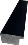
P118H Dkr10
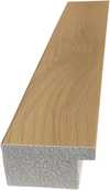
P118W Dkr10
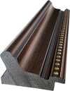
P438Z Dkr10
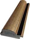
P508JH Dkr12
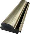
P508YH Dkr12
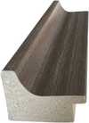
P805H Dkr10
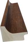
P805Z Dkr10
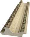
P919BZ Dkr10
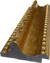
P919G Dkr10
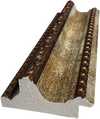
P919XJ Dkr10
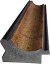
P959ZH Dkr10
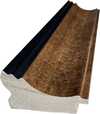
P968JZ Dkr12
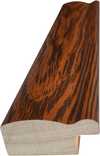
W106C Dkr8
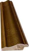
W218G Dkr10
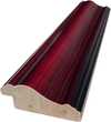
W218JH Dkr8
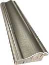
W218Y Dkr10
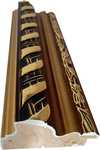
W307PJ Dkr10
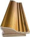
W316G Dkr10
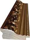
W316PJ Dkr8
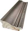
W316Y Dkr10
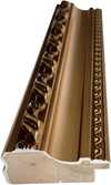
W398PJ Dkr8
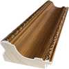
W4111J Dkr10
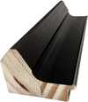
W500HY Dkr15
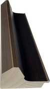
W500JH Dkr15
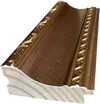
W692G Dkr12
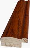
W849H Dkr8
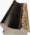
W940BG Dkr15
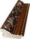
W953PJ Dkr8
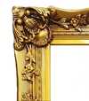
H24-GOLD Dkr30
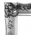
H24-SILVER Dkr30
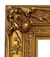
H36-GOLD Dkr45
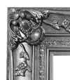
H36-SILVER Dkr45
Sendes i et beskyttende rør, klar til at blive indrammet hos din egen indrammer.
Over 105 cm sendes rammen som et sæt til en professionel indrammer — læs detaljerne.
Tillægsydelser
valgfritHvad indeholder de ekstra tilvalg?
Eksempler på hvad kan ændres: Udskift ansigt med kundens eget foto; Tilføj kæledyr (f.eks. udskift kat med hund); Inkluder skjult besked i baggrunden; Skift baggrundslandskab eller elementer.
Efter bestilling vil TopImpressionists.com-teamet sende en e-mail til kunden for at få instruktioner og levere et udkast til forhåndsvisning
Efter bestilling vil TopImpressionists.com-teamet sende en e-mail til kunden for at få instruktioner og levere et udkast til forhåndsvisning
Verdensomspændende levering () på 3-4 uger i stedet for de standard 5 uger. (24 november). Ingen kompromiser med kvaliteten.
Beskyttende fernis
Navneskilt
Detaljer om indgraveret bronzeskilt
This elegant plaque features the artist's name and the title of the artwork, finely engraved for a timeless presentation.
It is made from bronze with a refined, elegant finish. The text is precisely laser-engraved for a sharp and permanent result. Measuring 9x2 cm, the plaque is compact yet easy to read. It's built to be durable and scratch-resistant, offering a professional, museum-quality look. Mounting is simple thanks to the included adhesive backing.
Detaljer om gennemsigtig akrylplade
The plaque includes essential engraved details such as the artist's name, the title of the artwork, the date it was created, the type of media used-like oil on canvas or watercolor-a brief description of the piece, and a QR code that links to the complete artwork information.
It is crafted from clear acrylic, offering a sleek, modern appearance. The text is UV-engraved in black to ensure strong visual contrast. With a size of 10x15 cm, it ensures optimal readability. It comes equipped with two metal hooks for secure wall mounting. The plaque is designed to be weather-resistant, making it suitable for various environments, and it includes interactive features that work seamlessly with smartphone scanning.
Detaljer om sort akrylplade
This elegant plaque includes engraved information such as the artist's name, the title of the artwork, the date it was created, the type of media used (like oil on canvas or watercolor), a short description of the artwork, and a QR code for quick access to more information.
The plaque itself is made from refined black acrylic with a premium finish. The text is laser-engraved in white for high contrast and readability. Its size is 10x15 cm, designed to be easy to read. It comes with two metal hooks for professional mounting. The design is sleek and fits any interior style. It is also weather-resistant and durable, with built-in digital integration for mobile compatibility.
Glasmulighed er kun tilgængelig i størrelser under 110 cm
 Glasmulighed er kun tilgængelig i størrelser under 110 cm
- Gratis ekspresforsendelse til hele verden
- Lærred af linned i høj kvalitet
- Fuld transportforsikring
- Garanti for refusion af told og importafgifter
- Garanti for præcis farvegengivelse
- 100 dages returret ved fabrikationsfejl
- 100% fuld returret
- Mængderabat ved flere køb


Beskrivelse af samlerobjektet
This somber oil study by Honoré Daumier captures a man lost in thought. Explore this evocative masterpiece today.
Kunstnerbiografi
Fransk realist kendt for bidende politiske litografier og empatiske scener fra det parisiske liv, fra tredjeklasses vognen til Don Quixote.
Om maleriet
Identification of The Reader by Honoré Daumier
The quiet intensity of The Reader meets the viewer through the focused gaze of its subject. Painted by Honoré Daumier, this work captures a moment of profound stillness. The piece emerges from around c. 1857, a time when the artist's hand moved with a particular sense of purpose and weight. It exists as a painting, a physical presence that holds the light and shadow of a private, contemplative world.
Honoré Daumier brings a sense of lived experience to this study. The figure remains lost in the pages of a book, oblivious to the world outside the frame. There is a weight to the atmosphere, a feeling of solitude that settles over the scene. The work carries the mark of its creation, a tangible connection to the era of its origin.
This specific painting, The Reader, remains a significant part of the artist's visual language. It avoids the distractions of a grand setting to focus entirely on the human condition in a state of deep engagement. Through this work, the act of reading becomes a heavy, significant event, frozen in time for those who stop to look.
Composition and Visual Elements
The composition follows a vertical orientation, drawing the eye immediately to the man positioned slightly off-center. He sits in a moment of profound stillness, his gaze directed steadily downwards toward the open book held in his hands. This downward focus creates a tight, intimate space around his head and shoulders. Behind him, a blurred object, perhaps a cushion or a potted plant, rests in the background, providing a sense of depth without pulling attention away from the central figure.
Soft, diffused light falls from an unseen source above and to the left, casting gentle shadows across the man's face. This lighting emphasizes his features and the texture of the pages before him, while the shallow perspective keeps the viewer's focus firmly on the interaction between the reader and his text. The atmosphere feels quiet and heavy with contemplation.
The color palette relies on a somber arrangement of earthy tones. Deep browns, ochres, and muted reds dominate the scene, grounding the subject in a warm but melancholic environment. These colors wrap around the figure, reinforcing the sense of solitude and the weight of the thoughts contained within the book.
Technique and Physical Materials
The oil paint clings to the panel with a palpable, heavy presence. Each stroke carries the weight of the artist's hand, applied with a loose and expressive energy that refuses to settle into stillness. You can see the evidence of layering, where colors are built upon one another to create a sense of depth and substance. These layers blend into one another, creating soft transitions that suggest the subtle shifts of light across a surface.
A visible roughness defines the texture of the work. The brushstrokes remain unpolished and direct, leaving a tactile quality that speaks to the immediacy of the moment. This ruggedness gives the surface a physical life, where the paint does not merely sit upon the panel but seems to emerge from it. The interplay of these thick applications and the careful blending of tones creates a surface that feels both spontaneous and deeply considered.
Spørgsmål og svar
Hvordan forenes kontrast og harmoni i "The Reader"?
I "The Reader" parres en Serene kontrast med en Strong Color Unity harmoni.
Hvor intense er farverne i "The Reader" af Honoré Daumier?
Farveintensiteten i "The Reader" er Monochromatic. Intensitet beskriver, hvor kraftige farverne fremstår.
Kan man downloade "The Reader"?
Du kan downloade billedet af "The Reader" af Honoré Daumier på værkets side med Download: et højopløseligt digitalt billeddownload.
Hurtige fakta og kunstquiz
Om Honoré Daumier

Honoré Daumier
1808 - 1879, Frankrig
Kunstnerbiografi
En Mester af Satire og Realisme: Honoré Daumiers Liv og Verden
Honoré-Victorin Daumier, født i Marseille i 1808, var en kunstner hvis liv og arbejde er dybt forankret i den turbulente franske historie midt på det 19. århundrede. Hans rejse var ikke blot en kunstnerisk udvikling, men også et stærkt engagement i samfundets uretfærdigheder og politiske absurdities – en kamp, han udførte gennem sin skarpe satire og realistiske portrætter. Daumiers tidlige liv, præget af hans fars poetiske ambitioner og den efterfølgende flytning til Paris i 1814, introducerede ham for en by fuld af kunstnerisk energi, men også for de udfordringer og muligheder, der ventede en ung mand uden etableret social status.- En Uventet Karriere: Daumier var oprindeligt tiltænkt en karriere som jurist, men hans interesse blev hurtigt rettet mod kunst. Han begyndte sin træning hos Alexandre Lenoir, en kunstner med stærke forbindelser til den klassiske æra og en forkærlighed for Rubens’ dramatiske lys- og skyggeeffekter. Denne tidlige uddannelse lagde grundlaget for hans unikke stil – en blanding af realistisk observation og udtryksfuld teknik.
- Den Akademiske Vej: Han fortsatte sin træning på den Schweizer Akademi, hvor han studerede klassisk kunst og udførte kopieringer i Louvre, hvilket gav ham et solidt fundament i kunsthistorie og tekniske færdigheder.
Fra Carikatur til Social Kommentar
Daumiers karriere tog fart i kølvandet på 1830-revolutionen, en begivenhed der markerede et vendepunkt for Frankrig og samtidig skabte et ideelt miljø for hans satiriske talent. Han fik hurtigt sit gennembrud som lithograf, først anonymt, men senere som en central figur i *Le Charivari*, et radikalt komisk blad grundlagt af Charles Philipon. Det var her, Daumiers geni virkelig blomstrede. Hans karikaturer var ikke blot sjove illustrationer; de var skarpe kritikker af den borgelighed, retssystemet og politiske magt. Han tøvede ikke i at latterliggøre konge Louis-Philippe, hvilket førte til en seks måneders fængselsstraf i 1832 for en særlig provokerende karikatur. Denne oplevelse, snarere end at slukke hans ild, cementerede hans engagement i at afsløre hykleri og udfordre autoriteter gennem kunsten. Hans lithografier blev til visuelle manifestater, der fangede ånden af modstand og gav en kritisk kommentar til samfundets lidelser. Det er bemærkelsesværdigt, hvor mange værker han producerede i denne periode – tusindvis af litografier, der tjente som både underholdning og politiske erklæringer.- Robert Macaire: En af hans mest kendte serier var "Robert Macaire," en karikaturfigur, der repræsenterede den franske arbejdsklasse og deres livsstil med humoristisk og ofte bitter ironi.
- "Les Gens de Justice": Daumiers satiriske tegninger om retssystemet, kendt som "Les Gens de Justice," var særligt kraftfulde i deres kritik af korruption og uretfærdighed.
Ud over Carikatur: Maleri og Skulptur
Selvom Honoré Daumier er mest berømt for sin lithografi, ville det være en skam at begrænse ham til kun dette medie. Han var også en dedikeret maler og skulptør, selvom anerkendelsen af disse værker kom senere i hans liv. Hans malerier, ofte portrætterende hverdagslivet i Paris – den tredjeklassevogn, vasketøjskvinderne, advokaterne – er præget af en dyb følelse af realisme og medfølelse. De er ikke idealiserede billeder, men snarere uforfængelige skildringer af vanskeligheder og kamp. Han udnyttede mesterligt løse penselstrøg og dramatisk belysning til at formidle følelser og atmosfærer – en forudsigelse af teknikker, der senere blev adopteret af Impressionistiske malere. Hans skulpturer, primært lavet i ler (mange stykker forblev uforarbejdede under hans levetid), afslørede et lignende engagement i at fange den menneskelige form med ærlighed og følelsesmæssig dybde. Disse skulpturer, opdaget efter hans død, demonstrerer en bemærkelig evne til modellering og en evne til at udtrykke psykologisk kompleksitet gennem fysisk gestus.- Uforarbejdede Skulpturer: Mange af Daumiers skulpturer forblev uforarbejdede, hvilket giver et unikt indblik i hans kreative proces og hans umiddelbare udtrykskraft.
Et Varigt Arv: Indflydelse og Historisk Betydning
Honoré Daumiers indflydelse på kunsthistorien er uomtvistelig. Han brolagde mellem Romantikken og Realismen, banede vejen for fremtidige generationer af kunstnere, der søgte at skildre verden som den virkelig var – med alle dens fejl og mangler. Hans urokkelige sociale kommentarer påvirkede kunstnere som Gustave Courbet og Édouard Manet, mens hans innovative brug af lithografi revolutionerede trykkunsten. Hans værker resonerer stadig i dag, der minder os om kunstens magt til at udfordre autoriteter, afsløre uretfærdighed og vidne til den menneskelige tilstand. Musée d'Orsay i Paris huser en betydelig samling af hans malerier og skulpturer, hvilket giver besøgende et glimt ind i den verden, han så levende portrætterede. Hans lithografier er bredt tilgængelige gennem samlinger som dem, der findes på TopImpressionists, hvilket sikrer, at hans satiriske geni fortsætter med at provokere tanke og inspirere dialog. Daumier var ikke blot en kunstner; han var en skildrer af sin tid – en visuel digter, der brugte sit talent til at give stemme til de tavse og holde magten ansvarlig. Hans arv består som et vidnesbyrd om kunstens vedvarende relevans som en kraft for social forandring.Hurtige fakta om Honoré Daumier
- Artistic Movement Or Style: Realisme, Satire
- Artists Or Movements Influenced By This Artist:
- Impressionisme
- Moderne kunst
- Artists Who Influenced This Artist:
- Alexandre Lenoir
- Jacques-Louis David
- Date Of Birth: 26. feb 1808
- Date Of Death: 10. feb 1879
- Full Name: Honoré-Victorin Daumier
- Nationality: Fransk
- Notable Artworks:
- Rue Transnonain
- Les gens de justice
- Ecce Homo
- Place Of Birth: Marseille, Frankrig
Lignende kunstværker


Udforsk kunstværker organiseret efter temaer, stilarter og karakteristika.


Honoré Daumier
The Reader
() ·
Inklusive ramme: · Håndmalet med olie på lærred
Totalbeløb