

Esitetty: · Kehyksineen:
 Esikatselu

 Jaa teos
 Jaa
 Tiedot
 Opas


 Lataa kuva
 Samanlaisia kohteita
 Röntgenkuvaus
 Diaesitys
 Kysymykset ja vastaukset
 Tilastot

- 41.0 x 33.0 cm


€ 63
Giclée- ja taideprintit
Museolaatuisia giclée- tai kankaitaulun tulosteita nopealla tuotannolla ja joustavilla viimeistelyvaihtoehdoilla. ( Osta käsinmaalattu taideteos Siirry digitaaliseen kuvaan)
Materiaali ja tekniikka
 Lue lisää
Lasivaihtoehto on saatavilla vain alle 110 cm kokoisille teoksille
Koko
·Vakiokoko
räätälöity
CM
INCH
Valitse valmiista mitoistamme sellaiset, jotka vastaavat teoksen alkuperäisiä mittasuhteita.
Koot ladataan...

leveys
korkeus
Syötä tarvitsemasi leveys ja korkeus, jotta tuloste sopii kehyksiisi tai seinällesi. Tulostetta voidaan vain leikata, sitä ei voida koskaan suurentaa alkuperäistä kuvaa suuremmaksi, joten eri muotoinen koko aiheuttaa osan kuvasta katoamisen. Lähetämme sinulle digitaalisen mallikuvan hyväksyttäväksi ennen kuin aloitamme tulostuksen. Tällä sivulla näkyvä kuva ei näytä lopullista rajausta — vain mallikuva näyttää sen.
Viimeistely
·
Valkoinen reuna €1
pehmennetty reuna €1
Jatkuva reuna €1
P118B €10
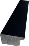
P118H €10
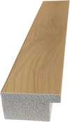
P118W €10
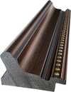
P438Z €10
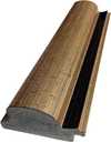
P508JH €12
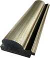
P508YH €12
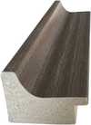
P805H €10
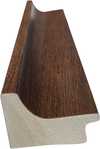
P805Z €10
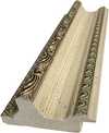
P919BZ €10
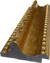
P919G €10
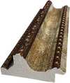
P919XJ €10
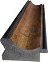
P959ZH €10
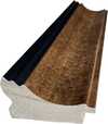
P968JZ €12
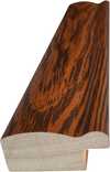
W106C €8
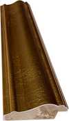
W218G €10
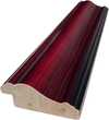
W218JH €8
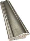
W218Y €10
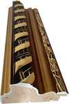
W307PJ €10
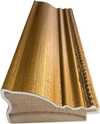
W316G €10
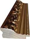
W316PJ €8
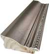
W316Y €10
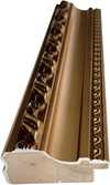
W398PJ €8
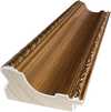
W4111J €10
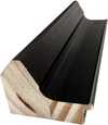
W500HY €15
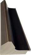
W500JH €15
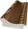
W692G €12
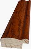
W849H €8
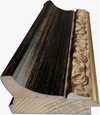
W940BG €15
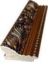
W953PJ €8
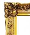
H24-GOLD €30
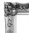
H24-SILVER €30
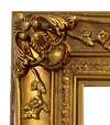
H36-GOLD €45
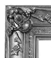
H36-SILVER €45
Toimitetaan suojaputkessa, valmiina kehystettäväksi omassa kehyksessäsi.
Yli 105 cm kokoiset kehykset toimitetaan osasarjana ammattilaiskehystäjälle — lue lisätiedot.
Lisäpalvelut
valinnainenMitä lisämateriaalit sisältävät?
Maailmanlaajuinen toimitus () 2 viikossa tavallisen 4–5 viikon sijaan. (25 marraskuu)
Suojalakkaus
Nimilaatta
Kaiverretun pronssilaatan tiedot
This elegant plaque features the artist's name and the title of the artwork, finely engraved for a timeless presentation.
It is made from bronze with a refined, elegant finish. The text is precisely laser-engraved for a sharp and permanent result. Measuring 9x2 cm, the plaque is compact yet easy to read. It's built to be durable and scratch-resistant, offering a professional, museum-quality look. Mounting is simple thanks to the included adhesive backing.
Läpinäkyvän akryylilaatan tiedot
The plaque includes essential engraved details such as the artist's name, the title of the artwork, the date it was created, the type of media used-like oil on canvas or watercolor-a brief description of the piece, and a QR code that links to the complete artwork information.
It is crafted from clear acrylic, offering a sleek, modern appearance. The text is UV-engraved in black to ensure strong visual contrast. With a size of 10x15 cm, it ensures optimal readability. It comes equipped with two metal hooks for secure wall mounting. The plaque is designed to be weather-resistant, making it suitable for various environments, and it includes interactive features that work seamlessly with smartphone scanning.
Mustan akryylilaatan tiedot
This elegant plaque includes engraved information such as the artist's name, the title of the artwork, the date it was created, the type of media used (like oil on canvas or watercolor), a short description of the artwork, and a QR code for quick access to more information.
The plaque itself is made from refined black acrylic with a premium finish. The text is laser-engraved in white for high contrast and readability. Its size is 10x15 cm, designed to be easy to read. It comes with two metal hooks for professional mounting. The design is sleek and fits any interior style. It is also weather-resistant and durable, with built-in digital integration for mobile compatibility.
Lasivaihtoehto on saatavilla vain alle 110 cm kokoisille teoksille
 Lasivaihtoehto on saatavilla vain alle 110 cm kokoisille teoksille
- Ilmainen pikatoimitus ympäri maailman
- Korkealaatuinen pellavakangas
- Kattava kuljetusvakuutus
- Tulliveron palautustakuu
- Takuu täydellisestä värien vastaavuudesta
- 100 päivän palautusoikeus (vain valmistusvirheet)
- 100% rahat takaisin -takuu
- Määräalennus tarjolla


Keräilykohteen kuvaus
A balanced grid of primary red, blue, and yellow rectangles against black and white, reflecting a search for cosmic order in 1923.
Taiteilijan elämäkerta
De Stijl -liikkeen hollantilainen edelläkävijä, joka käytti päävärejä ja geometrista abstraktiota luodakseen dynaamisia sommitelmia.
Tietoa teoksesta
Identification of Composition by Theo van Doesburg
The canvas known as Composition emerges from the mind of Theo van Doesburg, a work that captures a specific moment in 1923. This piece exists as a precise arrangement of form and color, born from a period of intense creative focus. The artist, Theo van Doesburg, brings a sense of equilibrium to the surface, translating abstract thought into a tangible presence. It is a work that demands attention through its structural clarity and its commitment to the principles of the De Stijl movement.
The history of this object is tied to a specific circle of thinkers and patrons. Antony Kok commissioned the work, setting it on its path through the hands of those who shaped the modern era. From there, the painting finds its way into the hands of Bart de Ligt (1883–1938), who becomes its first owner. This transition marks the beginning of a long lineage of stewardship, as the work moves from the artist's studio into a private collection where its presence remains constant.
Every line and color choice within Composition reflects the artist's pursuit of a universal visual language. As we observe the work, we see the direct result of a vision that seeks to strip away the unnecessary to find a fundamental truth. The painting remains a vital part of the history of abstraction, holding the weight of its 1923 origins in every carefully placed rectangle and primary hue.
Visual Composition and Geometric Elements
The canvas unfolds as a precise grid of rectangles, where vertical and horizontal lines intersect to dictate the movement of the eye. There is a profound sense of equilibrium achieved through this arrangement, as non-representational forms find their place within a structured, rhythmic order. The eye moves across the surface, guided by the intersections of these straight lines, finding balance in the way the shapes occupy the space. It is a study in pure geometry, where the subject matter is stripped of any external reference, leaving only the essence of form and relation.
Color acts as the primary force within this structured environment. The palette relies on the fundamental strength of red, yellow, and blue, which anchor the composition. These primary hues interact with a supporting cast of black, white, and grey, creating a tension between the boldest tones and the more neutral shades. The colors appear solid and flat, avoiding any blending or shading, which emphasizes the stark, clean nature of the geometric arrangement. Each rectangle holds its own weight, contributing to a visual language that seeks a universal harmony through simplicity.
Provenance and History of the Object
The history of this work begins in the creative atmosphere of Paris, where it finds its way from the artist's studio into the hands of Bart de Ligt. This acquisition likely occurs in late 1923, marking the start of a long and steady lineage. De Ligt, a man deeply connected to the avant-garde circles of the time, holds the piece within his personal collection until his passing in 1938.
From that moment, the painting enters a quiet, private chapter. It remains within the same family, passing through the hands of descendants for nearly a century. This continuity preserves the work's integrity, keeping it sheltered within a single domestic line since 1923. The colors and forms remain as they were when they first left the artist's side, held in a state of careful preservation through the decades.
Documented Interpretations and Artistic Debates
The canvas captures a moment of profound transition, acting as a key work within the artist's entire oeuvre. It reveals a growing complexity within his purist style, where the rigid logic of geometry begins to dance with a more nuanced sense of equilibrium. One senses the tension between the absolute and the evolving, as the lines and colors find a new, sophisticated rhythm. This evolution suggests a mind moving beyond simple shapes toward a more intricate visual language.
A deep connection between the realm of architecture and the act of painting pulses through the work. The composition feels less like a mere arrangement of pigment and more like a blueprint for a structured reality. This link is no accident; the artist himself articulated the concept behind its creation in the magazine Architectura on 17th July 1923. The painting exists as a bridge, where the spatial logic of built environments meets the spiritual pursuit of pure abstraction.
Related Works by the Same Artist
The evolution of this geometric language unfolds through several other pieces that trace the artist's shifting focus. One can look back to Composition XX from 1920 to see the early movements of these shapes. Nearby in the timeline, the 1923 work Study for a Composition offers a glimpse into the creative process behind these structured arrangements. These works exist as part of a continuous search for balance and order within the frame.
As the years progress, the compositions grow more complex and dynamic. The 1925 Counter composition XIV introduces a different energy to the grid. Later, the Simultaneous Counter-Composition from 1929–1930 pushes the boundaries of the aesthetic even further. Each piece captures a specific moment in a lifelong pursuit of a new visual language, moving from the rigid to the more fluid and experimental.
Kysymykset ja vastaukset
Kuinka vanha Theo van Doesburg oli luodessaan "Composition" vuonna 1923?
Kun "Composition" luotiin vuonna 1923, Theo van Doesburg (syntynyt 1883) oli 40 vuotias.
Mitä tunnetta Theo van Doesburg:n "Composition" välittää?
Teoksen Theo van Doesburg:n "Composition" tunnelma on Minimalist, ja sen emotionaalinen sävy on Tranquil.
Miten kontrasti ja harmonia yhdistyvät teoksessa "Composition"?
Theo van Doesburg:n "Composition" teoksen väriyhdistelmä yhdistää Statement kontrastin ja Discordant Palette harmonian.
Pikaopas ja taidevisailu
Tietoa artistista Theo van Doesburg

Theo van Doesburg
1883 - 1931, Alankomaat
Taiteilijan elämäkerta
Theo van Doesburg: Arkkitehdin Abstraktio – Elämä Geometrisessä Harmoniassa
Theo van Doesburg, syntynyt Christian Emil Marie Küpper nimellä vuonna 1883 Utrechtissa, Alankomaissa, oli paljon enemmän kuin pelkästään maalaaja; hän oli vallankumouksen tuuletin, joka muutti syvällisesti modernin taiteen perusteita. Hänen matkansa alkoi hämärtyvien Impressionismin ja Post-Impressionismin varjossa, heijastaen aluksi tyylejä, jotka muistuttivat Vincent van Gogia – sekä aihepiireissä että tunteellisessa intensiteetissä. Tämä varhainen vaihe toimi kuitenkin kriittisenä esiaskeleena radikaalille muutokselle, joka määrittäisi hänen ikuisen perintönsä. Ratkaiseva hetki koitti vuonna 1913 hänen kohtaamisensa Wassily Kandinskin *Rückblicke* -tekstin kanssa. Tämä teksti herätti van Doesburgissa syvällisen ymmärryksen: taiteellinen ilmaisu ei perustu ulkomaailman jäljittelyyn, vaan sisäisen, hengellisen todellisuuden kanavointiin puhtaana abstraktiona. Tämä vakaumus synnytti Neoplasticismin – liikkeen, jonka hän perusti ja johon hän uskomattomasti omistautui, tulemalla sen päättäväisin edustaja.Uuden Visuaalisen Kielen Muotoileminen: De Stiilin Periaatteet
De Stijl ei ollut pelkkä taiteellinen tyyli; se oli kattava filosofinen manifesti, joka muutettiin visuaalisesti muotoon. Van Doesburg uskoi, että taide tulisi supistettavaksi sen olennaisimpaan – suorat linjat, suorat kulmat ja päävärit punainen, keltainen ja sininen yhdessä mustan, valkoisen ja harmaan kanssa. Tämä karsittu väripaletti ei syntynyt rajoituksesta, vaan pyrkimyksenä universaalisuuteen – uskoen, että nämä perusmuodot resonoiivat syvemmän kosmisen järjestyksen kanssa. Hän näki *kokonaisvaltaisen* taideteoksen, joka ulottui kankaasta kauemmaksi arkkitehtuuriin, suunnitteluun ja jopa arkipäiväisiin esineisiin. Yhteistyö oli avainasemassa; van Doesburg työskenteli tiiviisti arkkitehtien, kuten J.J.P. Oud’n ja Gerrit Rietveldin kanssa, suunnitellen maalattuja lasi-ikkunoita, huonekaluja ja kokonaisia sisätiloja, jotka heijastivat De Stiilin periaatteita. Hänen yhteistyönsä ulottui myös muiden taiteilijoiden, kuten Piet Mondrianin, ympärille, joiden kanssa hän perusti vaikutusvaltaisen *De Stijl* -lehden, alustaa ideoiden levittämiseen ja samasta arvosta olevien luovien ihmisten houkuttelemiseen. Kuitenkin, vaikka he jakavat saman juuren, syntyi jännitettä van Doesburgin ja Mondrianin välille Neoplasticismin jäykkyyttä koskevissa näkemyksissä. Van Doesburg esitteli "Elementarismia" vuonna 1926, tuoden esiin kulmikkaat linjat ja dynaamisemmat kompositiot – poikkeama, joka lopulta johti liikkeen hajaannukseen paljastaen hänen jatkuvan luovuutensa ja pyrkimyksensä taiteelliseen kehitykseen.Taiteilijan Monipuolinen Visio
Vaikka hän on tunnettu maalaajana, van Doesburgin taiteelliset pyrkimykset olivat huomattavan monipuoliset. Hän oli vilkas kirjoittaja, runoilija ja kriitikko, käyttäen kynäänsä selittääkseen De Stiilin teoreettisia perusteita ja haastaakseen perinteisiä taiteellisia käsityksiä. Varhaisen 1920-luvun kohtaamisensa Dadaismille laajensi hänen taiteellisia horisonttejaan entisestään, johtuen kokeellisista töistä, jotka sisälsivät collageja ja typografiaa. Tämä aika näki myös hänen toimimistaan Weimarissa, jossa hän jakoi ideoitaan uuden sukupolven taiteilijoiden kanssa. Hän ei ollut tyytyväinen pysymään perinteisten taidemuotojen rajoissa; van Doesburg pyrki aktiivisesti yhdistämään taidetta arkipäiväiseen elämään, uskoen sen voimaan muuttaa yhteiskuntaa. Hänen suunnitellut sisätilat ja huonekalut eivät olleet pelkästään esteettisiä harjoituksia, vaan yrityksiä luoda harmonisia tiloja, jotka heijastivat De Stiilin periaatteita. Esimerkki tästä on hänen yhteistyönsä Sophie Taeuber-Arpin kanssa ja Georges Vantongerloon kanssa taiteilijoiden asuinrakennusten suunnittelussa, mikä osoittaa kokonaisvaltaisen lähestymistavan taiteelliseen luomiseen – yrityksen rakentaa maailma *kuvaten* hänen idealinsa.Perintö ja Kestävää Vaikutusta: Modernismin Urbaani Ennennäkemätön
Theo van Doesburgin elämä katkesi traagisesti vuonna 1931, ollessaan vain 47-vuotias, mutta hänen vaikutuksensa moderniin taiteeseen on edelleen syvällinen. De Stijl, vaikka se oli lyhytikäinen liikkeenasettumana, on vaikuttanut suuresti myöhempien taiteilijoiden kehitykseen, mukaan lukien Bauhaus-suunnitteluun, Minimalismiin ja konstruktivismiin. Hänen korostuksensa geometriselle abstraktiolle, puhtaalle värille ja toiminnallisuudelle resonoi edelleen taiteilijoiden ja suunnittelijoiden kanssa tänäkin päivänä. Hänen työnsä on muistutus siitä, että taide ei ole pelkästään esitystä, vaan sisäisen maailman tutkimista. Van Doesburgin visio harmonisesta maailmasta – ilmaistu De Stiilin kielellä – inspiroi edelleen niitä, jotka pyrkivät luomaan kauniimpaa ja merkityksellisempää ympäristöä.Avainteokset & Kestävän Vaikutuksen Avain
- Study for Simultaneous Compositions XXII (1922): Klassinen esimerkki Neoplasticismista, joka esittelee liikkeen tunnusomaiset geometriset muodot ja rajallisen väripaletin.
- Composition with half values (1928): Osoittaa van Doesburgin tutkimusta sävyjen variaatioista De Stiilin estetiikassa.
- Dancers (1917-1918): Edustaa hänen tyylinsä siirtymävaihetta, joka yhdistää hahmoelementtejä nouseviin abstraktioihin.
- Yhteistyö *De Stijl* -lehdessä: Keskeinen alusta ideoiden levittämiseen ja samasta arvosta olevien luovien ihmisten houkuttelemaan.
- Elementarism (1926): Van Doesburgin yritys tuoda dynamiikkaa Neoplasticismiin, esittelemällä kulmikkaita linjoja ja dynaamisempaa kompositiota.
Pikaaakkaukset taiteilijasta Theo van Doesburg
- Artistic Movement Or Style: De Stijl, Neoplasticismi
- Artists Or Movements Influenced By This Artist:
- Bauhaus
- Konstruktivismi
- Artists Who Influenced This Artist:
- Kandinsky
- Van Gogh
- Date Of Birth: 30. elokuuta 1883
- Date Of Death: 7. maaliskuuta 1931
- Full Name: Theo van Doesburg
- Nationality: Alankomainen
- Notable Artworks:
- Kompositiossa...
- Harmaa...
- Dancers
- Place Of Birth: Utrecht, Alankomaat
Tutustu teoksiin, jotka on järjestetty aiheiden, tyylien ja ominaisuuksien mukaan.


Theo van Doesburg
Composition
() ·
Kehyksineen: ·
Yhteensä