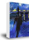
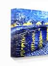
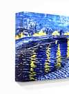
Descrizione dell'opera
Chopin Stamp Design: A Legacy of Minimalism and Illusion
Leon Urbanski (1926 – 1998) stands as a monumental figure in the history of Polish graphic design and typography, shaping the visual landscape of his nation for decades. Born in Tarnów, Poland, Urbanski’s artistic journey began amidst the turbulent backdrop of post-war Europe, fostering an unwavering dedication to craftsmanship and innovation that would define his prolific career. He wasn't merely a designer; he was a storyteller who meticulously crafted images and lettering to convey meaning and emotion—a legacy that continues to inspire contemporary artists.
Early Influences & Artistic Formation
Urbanski’s formative years were marked by exposure to European avant-garde movements, particularly Surrealism and Constructivism. These influences instilled in him a belief in experimentation and a rejection of decorative excess, prioritizing clarity and functionality as guiding principles. Studying at Kraków Academy of Fine Arts honed his skills and cemented his commitment to exploring new visual languages—a dedication that would permeate his entire oeuvre. This intellectual curiosity fueled his desire to push boundaries while maintaining an unwavering respect for established artistic traditions.
The Chopin Stamp Design: A Reflection of Delacroix’s Vision
The “Chopin stamp design,” Urbanski's most celebrated work, embodies the essence of minimalist graphic art and a masterful manipulation of halftone printing. Inspired by Eugène Delacroix’s iconic portrait of Frédéric Chopin—a figure revered for his musical genius and Polish patriotism—Urbanski undertook an ambitious project: to distill Delacroix’s grandeur into a deceptively simple visual representation. This undertaking demanded considerable technical skill, as Urbanski skillfully transformed the painter's monumental canvas into a monochrome print utilizing a halftone effect.
Technique & Illusionistic Depth
The halftone technique itself is crucial to understanding Urbanski’s artistic approach. Rather than relying on color gradients or shading—methods considered outdated by the avant-garde of his time—Urbanski employed dots of varying densities to simulate tonal variations and create an illusion of depth. This process, rooted in principles of pointillism, required painstaking attention to detail and a profound grasp of visual perception. As Urbanski himself eloquently stated, “You have to taste typography… or give up and look for another, easier job,” reflecting his belief that true artistry demanded uncompromising dedication to mastering the fundamentals of design. The preparatory drawing reveals the complexity hidden beneath the surface—a testament to Urbanski’s meticulous methodology.
Symbolism & Emotional Resonance
Beyond its technical prowess, the Chopin stamp design carries significant symbolic weight. The monochrome palette evokes a sense of nostalgia and harkens back to the era of early printing presses, mirroring the stylistic sensibilities of the time. Simultaneously, it underscores the enduring power of simplicity—a deliberate choice that elevates the image beyond mere decoration, imbuing it with an emotional resonance that speaks to themes of memory, contemplation, and artistic integrity. The portrait of Chopin serves as a focal point, representing not only a musical icon but also a symbol of Polish identity and cultural heritage. Urbanski’s masterful execution captures this duality—a quiet grandeur that continues to captivate viewers today.
Conclusion: An Enduring Masterpiece
Leon Urbanski's Chopin stamp design remains an exemplar of graphic art—a testament to his unwavering commitment to innovation, craftsmanship, and artistic vision. Its enduring appeal lies in its ability to convey profound emotion through deceptively understated means, cementing Urbanski’s place as one of Poland’s foremost typographic artists and ensuring that his legacy continues to inspire generations of designers.

 Invia
Invia


 L'opzione vetro è disponibile solo per dimensioni inferiori a 110 cm