


 設置イメージを確認
 送る
送る シェア
シェア
 詳細情報
詳細情報 ガイドを表示

 画像をダウンロード
 似ている作品
 X線調査
X線調査 スライドショー
 統計情報
統計情報Sandridge
 Oil On Canvas
- WallArt
- Australian Impressionism
 1888
1888- 19th Century
 233.0 x 128.0 cm
 オーストラリア国立美術館
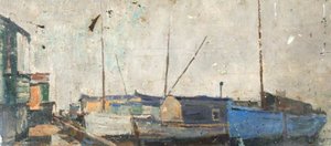
A dramatic harbor scene capturing the chaos of a sinking boat in Arthur Streeton's 1888 masterpiece Sandridge, showcasing Australian Impressionism and inviting you to explore this iconic piece for your collection.
 続きを読む
続きを読む
オーストラリア・インプレッショニズムとハイデルベルク派の重要画家、アーサー・ストリートン(1867-1943)をご紹介。黄金色の風景画やプレネール(戸外)スタイルの探求、オーストラリア美術における彼の決定的な役割をご覧ください。作品集と伝記を公開中。
ジークレー/アートプリント
スピーディーな制作と多彩な仕上げオプションが魅力の、ミュージアムクオリティなジークレー・キャンバスプリント。 ( 手描きの複製画を注文する デジタル画像販売へ切り替え)




P118B ¥10

P118H ¥10

P118W ¥10

P438Z ¥10

P508JH ¥12

P508YH ¥12

P805H ¥10

P805Z ¥10

P919BZ ¥10

P919G ¥10

P919XJ ¥10

P959ZH ¥10

P968JZ ¥12

W106C ¥8

W218G ¥10

W218JH ¥8

W218Y ¥10

W307PJ ¥10

W316G ¥10

W316PJ ¥8

W316Y ¥10

W398PJ ¥8

W4111J ¥10

W500HY ¥15

W500JH ¥15

W692G ¥12

W849H ¥8

W940BG ¥15

W953PJ ¥8




標準サイズ
カスタムサイズ
CM
INCH
作品のオリジナル比率に合わせた、当店の規定サイズからお選びください。
Loading sizes...

横幅
高さ
額縁や壁のスペースに合わせて、ご希望の幅と高さを入力してください。プリントはカットすることは可能ですが、元の画像より大きくすることはできないため、異なる比率のサイズを選択された場合は、画像の一部が欠けることになります。印刷を開始する前に、内容を確認していただくためのデジタルモックアップをお送りいたします。このページに表示されている画像は、実際のカット後の状態を示すものではありません。実際の仕上がりはモックアップにてご確認ください。


 ガラスオプションは、110cm未満のサイズでのみご利用いただけます。

Sandridge
ジークレー/アートプリント
複製画サイズ一覧
-


合計金額
¥ 10911
A Moment Frozen in Time: The Drama of Sandridge
In the vast expanse of Australian Impressionism, few works capture the raw, unscripted tension of maritime life as poignantly as Arthur Streeton’s Sandridge. Painted in 1888, this monumental oil on canvas serves as a window into a bustling, high-stakes moment within a busy harbor. At first glance, the viewer is drawn into a scene of profound movement and uncertainty; the central focus is a vessel caught in a state of distress, appearing to sink or having just succumbed to the elements. This focal point acts as the emotional anchor of the composition, pulling the eye toward the center of a swirling maritime drama where the calm of the water meets the sudden chaos of an emergency.
Streeton, a pioneer of the Heidelberg School, was a master at capturing what his contemporaries called the "Australian Light." In Sandridge, he utilizes this expertise to paint not just a scene, and not just a location, but an atmosphere. The light dances across the hulls of various boats—ranging from large, dominating vessels to smaller, more agile craft—creating a sense of depth and shimmering heat. Through his brushwork, one can almost feel the humidity of the harbor and the frantic energy of the at least twelve figures scattered throughout the scene. Some onlookers stand in stunned proximity to the sinking boat, while others are mere silhouettes against the horizon, their presence adding to the collective weight of the unfolding tragedy.
Technique and the Impressionist Spirit
The technical execution of Sandridge is a testament to Streeton’s ability to blend large-scale composition with delicate, impressionistic touches. The sheer scale of the work, measuring an impressive 233 x 128 cm, allows the viewer to become immersed in the harbor's geography. Streeton employs a palette that reflects the gritty yet luminous reality of a working port. His use of oil on canvas provides a rich texture that gives weight to the wooden hulls and life to the churning water. The way he manages the interplay between light and shadow is crucial; it is through these subtle shifts in tone that the sense of "chaos" is communicated without relying on overt, messy strokes.
For the discerning collector or interior designer, this piece offers a sophisticated balance of narrative intensity and aesthetic harmony. The painting does not merely depict a disaster; it captures the structural beauty of a maritime landscape. The composition guides the eye through a rhythmic arrangement of masts, sails, and figures, making it a powerful statement piece for any grand space. It possesses that rare quality in fine art: the ability to command attention through its historical gravity while simultaneously complementing a modern or classical interior with its masterful use of color and light.
A Legacy of Australian Identity
To understand Sandridge is to understand the birth of a national artistic identity. During the late 19th century, Streeton and his peers were moving away from European traditions to find a way to paint the unique, harsh, yet beautiful Australian landscape. While much of his work focuses on the golden hues of the bush, Sandridge explores the industrial and social heartbeat of the coast. The painting symbolizes the vulnerability of human endeavor when faced with the unpredictable forces of nature, a theme that resonates deeply across generations.
Owning a high-quality reproduction of this masterpiece allows one to bring a piece of Australian history into the contemporary home. It is more than a decoration; it is an invitation to contemplate the fleeting nature of stability and the enduring strength of human observation. Whether placed in a library, a formal dining room, or a curated gallery space, Sandridge serves as a profound conversation starter, embodying the spirit of an era defined by discovery, struggle, and the breathtaking beauty of the Australian light.
よくあるご質問
「Sandridge」の色同士は、どのように調和していますか?
「Sandridge」の色彩の調和は、Balanced Harmonyと表現されます。
「Sandridge」のガイドはどこにありますか?
アーサー・ストリートン作「Sandridge」のガイドページでは、印刷して活用できる2枚構成のファクトシートを提供しています。これには、作品とその詳細情報をまとめたデータテーブル、アーティストの生涯における時代背景を示す年代チャート、同アーティストによる他の作品、測定されたカラーパレット、そしてそのままコピーして使用できる4つの形式の引用文献情報が含まれています。
「Sandridge」にはどのような雰囲気がありますか?
アーサー・ストリートン作「Sandridge」の全体的なムードはDramaticです。このムードは、作品が持つ全体的な雰囲気。
関連作品



アーティストについて
オーストラリアの光の先駆者:アーサー・ストリートンの生涯と芸術
アーサー・アーネスト・ストリートンは、当時の人々から「スバイク」という愛称で親しまれ、オーストラリア美術史において不朽の地位を築いた巨匠です。1867年4月8日、ビクトリア州マウント・デューニードに生まれた彼の生涯は、風景画を通じて自らの声を模索し始めた、ある国家の進化するアイデンティティと密接に結びついていました。オーストラリアへの航海中に巡り合ったイギリス人移民の両親という控えめな出自から、ストリートンの芸術的旅路は、1882年から1887年にかけてメルボルンのナショナル・ギャラリー・スクールでの学びから始まりました。この時期が、後のオーストラリア・インプレッショニズム(印象主義)とハイデルベルク派を定義することになるキャリアの礎となったのです。しかし、その初期の研鑽は単なる技術の習得に留まりませんでした。それは、ヨーロッパでは決して目にすることのできない、オーストラリアのブッシュ(原生林)特有の光と大気の質を捉える方法を見出すための探求でもありました。この独自の光への挑戦こそが、ストリートンの生涯を通じて彼を魅了し続けたのです。また、彼は正規の訓練に加え、リトグラファーとしての修行も積んでおり、その経験が構図や色調の理解に疑いようのない深みを与えました。ハイデルベルク派とイーグルモント・キャンプ
ストリートンの芸術的な成熟は、真にオーストラリアらしい様式を確立しようと決意した芸術家集団、ハイデルレンベルク派の隆盛と重なります。トム・ロバーツやフレデリック・マッカビンとの友情は極めて重要でした。彼らは共に屋外での「プレネール(外光派)」の遠足へと繰り出し、自然から直接風景を写し取ることを追求したのです。フランス印象主義に触発されつつも、それを明確にオーストラリアという文脈へと適応させたこの屋外制作への献身は、彼らの作品の代名詞となりました。1888年のイーグルモント・キャンプの設立は、大きな転換点となりました。メルボルン郊外の農家を仲間と共有しながら、ストリートントンは強烈な創造性の時代へと突入します。ここで彼は、黄金の夏、イーグルモント(1889年)や流れは今も静かに、そして永遠に流れ続ける(1890年)といった、最も象徴的な作品を次々と生み出しました。これらの絵画は単なる風景の描写ではありませんでした。それは、黄金色の野原の上で揺らめく陽炎や、夏の午後の静寂といった「感覚」の呼び起こしだったのです。このキャンプは実験と相互激励の場となり、ハイデルベルク派がオーストラリア美術界において無視できない勢力としての地位を固めることとなりました。彼らの大胆なアプローチは、1889年の物議を醸した「9×5印象展」において頂点に達し、従来の芸術的規範に挑戦する、小さなシガーボックスの蓋に描かれた迅速な筆致の作品群を世に示しました。名声への渇望と帰郷
さらなる名声と広い世界での評価を求め、ストリートントンは1897年、船「ポリネシエン号」に乗ってロンドンへと向かいました。1900年にはロイヤル・アカデミーでの展示を実現させるなど、一定の成功を収めたものの、オーストラリアで享受していたような熱狂的な称賛を再現することは困難でした。当時のヨーロッパの芸術界は混迷を極め競争も激しく、彼の極めてオーストラリア的なヴィジョンは、確立された既成の嗜好と必ずしも共鳴しなかったのです。それでも彼は描き続け、対象を広げていきました。例えばヴェネツィア、パラッツォ・ラビア(1ウム08年)のようなヴェネツィアの情景は、主題の転換を示しながらも、彼特有の光と色彩への鋭敏な感性を保持していました。第一次世界大戦の勃発により、ストリートントンは王立陸軍衛生部隊の衛生兵として貢献を試み、後に1918年には公式の戦争画家となりました。戦時中の作品は、西部戦線の荒廃を記録しながらも、しばしば風景そのものに焦点を当てており、自然界に対する彼の不変の魅惑を反映していました。彼は1923年に、芸術への貢献が認められ騎士爵を授与されるほどの名声を得て、オーストラリアへと帰還しました。遺産と永続的な影響
アーサー・ストリートンの遺産は、個々の絵画の枠を遥かに超えて広がっています。彼は、大陸の美しさと広大さを讃える、唯一無二のオーストラリア的芸術アイデンティティを確立する上で決定的な役割を果たしました。彼の作品は、オーストラリア人が自ら自身と自国の大地をどのように捉えるかを定義づける一助となったのです。主要作品とテーマ
- 黄金の夏、イーグルモント (1889): おそらく彼の最も有名な作品であり、オーストラリアの夏の熱気と光を体現しています。
- 流れは今も静かに、そして永遠に流れ続ける (1890): ヤラ川を叙情的に描き出し、大気遠近法の卓越した技量を示しています。
- 火の手が上がる (1891): オーストラリアのブッシュファイア(森林火災)の風景を力強く表現し、その美しさと恐ろしさの両面を捉えています。
- ヴェネツィア、パラッツォ・ラビア (1908): 自身の印象主義的な様式をヨーロッパの主題へと適応させる能力を示しています。
- エジプトの飲み物売り (1897): 彼の旅と異文化への探求を反映した、鮮やかな情景です。

アーサー・ストリートン
1867 - 1943 , オーストラリア
アーティスト情報
- Artistic Movement Or Style: 印象派、ハイデルベルク派
- Artists Or Movements Influenced By This Artist: オーストラリア印象派
- Artists Who Influenced This Artist:
- ルイ・ブヴェロ
- J.M.W. ターナー
- Date Of Birth: 1867年4月8日
- Date Of Death: 1943年9月1日
- Full Name: アーサー・アーネスト・ストリートン
- Nationality: オーストラリア人
- Notable Artworks:
- ゴールデン・サマー、イーグルモント
- 静かに流れる小川
- ヴェネツィア、パラッツォ・ラビア
- エジプトの飲み物売り
- シリウス・コーヴ
- Place Of Birth: オーストラリア、マウント・デュニード
関連記事

Capturing the Light: A Journey Through the Soul of American Impressionism and the Hudson River School
Explore the luminous beauty of American Impressionism and the Hudson River School. Discover a curated journey through light, landscape, and history, celebrating the enduring legacy of masters through exquisite, hand-painted oil reproductions for the discerning art lover.
