


 設置イメージを確認
 送る
送る シェア
シェア
 詳細情報
詳細情報 ガイドを表示

 画像をダウンロード
 似ている作品
 X線調査
X線調査 スライドショー
 統計情報
統計情報The pink tablecloth

Delve into Henri Matisse's "The Pink Tablecloth" (c.1924-1925), a vibrant Fauvist masterpiece showcasing bold color palettes and simplified forms. Explore its legacy at Glasgow Life Museums.
 続きを読む
続きを読む
美しい色彩とシンプルな線で知られる印象派の画家、エドゥアール・マネやゴッホの影響を受け、大胆な表現主義を追求したフランスの画家。特に初期の作品は、豊かな色彩と自由な筆致が特徴的です。彼の代表作は「ギルド」などがあり、現代美術に大きな影響を与えました。
ジークレー/アートプリント
スピーディーな制作と多彩な仕上げオプションが魅力の、ミュージアムクオリティなジークレー・キャンバスプリント。 ( 手描きの複製画を注文する デジタル画像販売へ切り替え)




P118B ¥10

P118H ¥10

P118W ¥10

P438Z ¥10

P508JH ¥12

P508YH ¥12

P805H ¥10

P805Z ¥10

P919BZ ¥10

P919G ¥10

P919XJ ¥10

P959ZH ¥10

P968JZ ¥12

W106C ¥8

W218G ¥10

W218JH ¥8

W218Y ¥10

W307PJ ¥10

W316G ¥10

W316PJ ¥8

W316Y ¥10

W398PJ ¥8

W4111J ¥10

W500HY ¥15

W500JH ¥15

W692G ¥12

W849H ¥8

W940BG ¥15

W953PJ ¥8




標準サイズ
カスタムサイズ
CM
INCH
作品のオリジナル比率に合わせた、当店の規定サイズからお選びください。
Loading sizes...

横幅
高さ
特定のフレームやスペースに合わせて、ご自身でサイズを指定することも可能です。選択されたサイズが元の画像の比率と一致しない場合、作品をトリミングするか、鏡面反射または単色での塗りつぶしによって画像を拡張いたします。制作を開始する前に、ご確認用のデジタルモックアップをお送りいたします。
画面上のプレビューには、実際のトリミングや拡張は反映されませんのでご注意ください。最終的な構図を正確に確認できるのは、モックアップのみとなります。
カスタムサイズも承っておりますが、元の比率を維持するためには、あらかじめ用意されたリストからサイズを選択することをお勧めいたします。


 ガラスオプションは、110cm未満のサイズでのみご利用いただけます。

The pink tablecloth
ジークレー/アートプリント
複製画サイズ一覧
-


合計金額
¥ 10594
The Pink Tablecloth: A Study in Matisse’s Bold Color Palette
Henri Matisse's "The Pink Tablecloth," painted around 1924-1925, stands as a quintessential example of Fauvist art—a movement that championed unrestrained color and simplified forms as reactions against Impressionism. This unassuming still life transcends mere depiction; it’s an exploration of emotion conveyed through pigment, reflecting Matisse's profound belief in painting as a vehicle for expressing inner feelings rather than objective reality. The artwork resides within the collection of Glasgow Life Museums, acquired from William McInnes in 1944, and its accession number is 2402. Measuring approximately 60.3 x 81 cm (approximately 23 ¾ x 32 inches), it’s a relatively small canvas that belies the monumental impact of Matisse's artistic vision.- Style: Fauvist – Characterized by its deliberate disregard for naturalistic color, “The Pink Tablecloth” prioritizes vibrant hues—primarily shades of pink—to create an atmosphere of warmth and tranquility. This bold chromatic choice distinguishes it from the muted tones favored by Impressionists who sought to capture fleeting moments of light and shadow.
- Technique: Matisse employed a loose brushstroke technique, applying paint thickly onto the canvas with visible marks that contribute to the textural richness of the composition. The artist’s deliberate layering of color creates depth and luminosity, emphasizing the materiality of the surface itself.
よくあるご質問
マティス作「The pink tablecloth」の輝度はどのくらいですか?
マティス作「The pink tablecloth」 の輝度は Soft Shadow です。輝度とは、色がどれほど光を反射しているかを表す指標です。
「The pink tablecloth」のプレビューはどこで確認できますか?
マティス作「The pink tablecloth」の複製画をプレビューするには、作品のプレビューページを開いてください。
拡張現実(AR)を使って、自分の部屋にマティス作「The pink tablecloth」を配置して見ることはできますか?
「The pink tablecloth」は、拡張現実(AR)でのプレビューが可能です。対応デバイスで作品のARプレビューページを表示すると、ご自身の空間に作品を配置してご確認いただけます。
その色彩から、マティス作「The pink tablecloth」 はどの部屋に飾るのがおすすめですか?
Earthyの色彩を纏ったマティス作「The pink tablecloth」は、Dining Roomに飾るのがおすすめです。その色使いこそが、この提案の理由のひとつです。
マティス作「The pink tablecloth」のデジタルデータを入手するには、どうすればよいですか?
マティス作「The pink tablecloth」のデジタルファイルを入手するには、このページにて高解像度デジタル画像のダウンロードをご注文ください。
マティス作「The pink tablecloth」にはどのような主題が描かれていますか?
マティス作「The pink tablecloth」に描かれているもの:still life, fruit composition, color palette, table setting, decorative art, post impressionism, floral arrangement
「The pink tablecloth」は、マティスの最も人気のある作品の一つでしょうか?
マティス作「The pink tablecloth」 の人気度は Iconic です。この分類は、その作品がどの程度広く知られているかを表しています。
「The pink tablecloth」全体の明るさはどの程度ですか?
全体として、「The pink tablecloth」の明るさはbalancedと記録されています。知覚的な明るさとは、作品がどの程度明るく、あるいは暗く感じられるかを表すものです。
アーティストについて
色彩の魔術師、アンリ・マティス:近代美術への革命
アンリ・マティスは、19世紀末から20世紀にかけて活躍したフランスの画家であり、色彩と線描の卓越した表現力によって、近代美術に多大な影響を与えた芸術家です。1869年12月31日、北フランスのル・カトウ=カンブレーシスの小さな町で生まれました。当初は法律を志望し、パリで法学を学びましたが、1889年の虫垂炎の発病が彼の人生を劇的に変えました。療養中に母親から贈られた絵具セットを手にしたことをきっかけに、芸術への情熱が芽生え、法廷の弁護士になるはずだった彼は、色彩とキャンバスの世界へと足を踏み入れたのです。幼少期をボーアン=アン=ヴェルマンдуаで過ごし、穀物商の両親のもとで育ちましたが、ボヘミアンな芸術家の生活とは一見相容れない存在でした。しかし、その種は既に蒔かれており、療養生活によって育まれ、生涯にわたる芸術への献身へと花開いたのです。アカデミー・ジュリアンやÉcole Nationale des Beaux-Artsでウィリアム=アドルフ・ブルゲーローやギュスターヴ・モローといった巨匠の下で学び、古典的な技法を習得しましたが、初期の作品にはその影響が見られ、独自の個性が確立されるまでには時間がかかりました。fauve(野獣)の誕生:色彩への解放
1896年のベル=イル訪問が転換点となりました。オーストラリア人画家ジョン・ラッセルとの出会いは、彼に印象派の世界と、より重要なことに、フィンセント・ファン・ゴッホの感情を揺さぶるようなキャンバスを紹介しました。この経験は、マティスのそれまでの抑制された色彩感覚を打ち砕き、より大胆で主観的なアプローチへと駆り立てました。地味な色合いから離れ、感情に共鳴する鮮やかな色彩を受け入れ、1905年頃には fauve(野獣)と呼ばれる芸術運動が誕生しました。この名称は当初、批評家によって彼らの作品の鮮烈な色彩に対して用いられた嘲笑的な表現でしたが、やがてマティスを中心とするグループを指す言葉として定着しました。アンドレ・ドランやモーリス・ド・ヴラマンクといった画家たちと共に、マティスは色彩を独立した表現要素として捉え、従来の写実性を無視して感情を直接的に伝えることを追求しました。The Gourds(1905年)に見られるように、赤、緑、黄色の鮮やかな色彩が大胆に用いられ、伝統的な遠近法や模倣を無視した自由な表現が特徴です。装飾性と調和:新たな美の探求
fauve運動の熱狂期を経て、マティスのスタイルは洗練され、装飾性を重視する方向へと変化しました。色彩への愛着を持ちながらも、より平坦化された形態と複雑なパターンを強調し、調和のとれた構成を生み出しました。1917年に南フランスのニースに移住したことで、彼の作品には穏やかさと古典的なバランスが加味されるようになりました。彼は絵画だけでなく、陶芸やテキスタイルなど、様々なメディアを通して芸術的表現の領域を広げました。単に風景を描写するのではなく、鑑賞者を美しさで包み込むような世界を構築しようとしたのです。晩年:制限からの革新—切り絵による創造
晩年は、健康状態の悪化により従来の画法が困難になったため、彼は新たな芸術的表現として切り絵(découpages)に挑戦しました。1947年頃から始まったこの技法は、車椅子生活を送る中で生まれた実用的な解決策でしたが、やがて色彩と形態に関する新しい思考へと発展しました。鮮やかな色彩の大きな紙を切り抜き、有機的な形や人物などをキャンバス上に配置することで、ダイナミックでありながらも一見すると単純な構成を生み出しました。これらのdécoupagesは、単なる代替手段ではなく、色彩、形態、構成に対する新たなアプローチを示すものでした。彼は肉体的な制約にも屈することなく、芸術家としての進化を続けました。切り絵の技法は、彼が絵具では困難だった純粋な形態と色彩を実現することを可能にし、過去のテーマやモチーフを新鮮で革新的な方法で再解釈する手段となりました。近代美術への遺産:色彩の力
1954年11月3日、ニースで死去したアンリ・マティスは、世界中の美術館に彼の作品が収蔵され、今なお多くの芸術家や愛好家に影響を与え続けています。彼は伝統的な表現方法に挑戦し、色彩の表現力を称揚することで、近代美術の流れを大きく変えました。パブロ・ピカソと並び称される最も重要な20世紀の芸術家の一人として、マティスはモダニズムを根本的に形作り、喜び、美しさ、そして色彩の持つ変革的な可能性を祝福する芸術哲学を提唱しました。彼は世界を描写したのではなく、鑑賞者に感情的な体験を促し、光と鮮やかな色彩に満たされた世界への共有を招いたのです。マティスの遺産は、彼の作品を超え、様々な分野のアーティストたちに影響を与え続けており、真の芸術の巨匠としての地位を確固たるものとしています。
マティス
1869 - 1954 , フランス
アーティスト情報
- フルネーム: アンリ・マティス
- 主な作品:
- 風の歌
- 豪華な静寂
- 踊り
- 出生地: ル・カトウ=カンブレーシス、フランス
- 国籍: フランス人
- 影響を与えたアーティストや運動:
- モダニズム
- 表現主義
- 影響を受けたアーティスト:
- フィンセント・ファン・ゴッホ
- シャルダン
- 没年月日: 1954年11月3日
- 生年月日: 1869年12月31日
- 芸術運動またはスタイル: フォーヴィスム
関連記事

Fauvism Unveiled: The Wild Revolution of Color and Emotion in Modern Art
Explore the vibrant revolution of Fauvism. Discover how masters like Henri Matisse liberated color from reality to express pure emotion. An expert guide into the 'Wild Beasts' of modern art history for collectors and enthusiasts.

Fauvism's Boldest Visions: 10 Masterpieces That Revolutionized Modern Art | TopImpressionists
Explore 10 Fauvist masterpieces by Matisse, Derain & Vlaminck that ignited Modern Art! Discover bold colors, expressionist landscapes & the history of this revolutionary movement. Find museum-quality prints at TopImpressionists.com.

アンリ・マティスの傑作25選:色彩と情熱の軌跡|TopImpressionists
アンリ・マティスの傑作25選🎨 色彩と情熱が織りなす世界を旅する。フォーヴィスム代表の巨匠、マティスの絵画の魅力と歴史を紐解きます。TopImpressionistsで高品質なアートプリントや複製画を見つけ、インテリアに芸術的な輝きを✨ Explore the full collection online
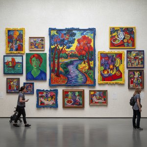
至福の色彩が彩る:フォーヴィズムを定義づけた10大名作
鮮烈な色彩が時代を席巻!フォーヴィズムを代表する10大名作を徹底解剖。マティスら巨匠の技と情熱に触れ、アートの新たな世界を発見。TopImpressionists.comで至高の美術館級レプリカと洗練されたインテリアアイデアを見つけよう。

Blush & Brilliance: 10 Iconic Paintings Dominated by Light Pink Tones |
Explore 10 iconic paintings bathed in captivating light pink tones! From Monet's Impressionism to Renoir’s romance, discover the stories behind these blush-hued masterpieces. Find museum-quality art reproductions & decor inspiration at .
テーマ、スタイル、特徴別に分類された作品を探索しましょう。


