


 ნახვა ინტერьерში
 გაგზავნა
 გაზიარება
 დეტალები
 გზამკვლევი

 ჩამოტვირთვა
 მსგავსები
 რენტგენოგრაფიული კვლევა
 სლაიდშოუ
 სტატისტიკა
The pink tablecloth

Delve into Henri Matisse's "The Pink Tablecloth" (c.1924-1925), a vibrant Fauvist masterpiece showcasing bold color palettes and simplified forms. Explore its legacy at Glasgow Life Museums.
 სრული ტექსტის ნახვა
"მენდიმატ მატის დაფნის უნიკალური სტილი და ფანტაზიური ხంగుები მიმდინარე სხეპურში და ტრადიციულ ხელოვნებაში შეცინა და შეაფერხა ფანტაზიას და შეცინა ფანტაზიას და შეაფერხა ფანტაზიას და შეაფერხა ფანტაზიას და შეაფერხა ფანტაზიას და შეაფერხა ფანტაზიას და შეაფერხა ფანტაზიას და შეაფერხა ფანტაზიას და შეაფერხა ფანტაზიას და შეაფერხა ფანტაზიას და შეაფერხა ფანტაზიას და შეაფერხა ფანტაზიას და შეაფერხა ფანტაზიას და შ
გიკლე / ხელოვნების პრინტი
მუზეუმის დონის ჟიკლე ან ტილოზე ბეჭდვა სწრაფი წარმოებისა და დასრულების მოქნილი ვარიანტებით. ( შეიძინეთ ხელით შესრულებული ნახატი გადასვლა ციფრულ გამოსახულებაზე)




P118B ₾10

P118H ₾10

P118W ₾10

P438Z ₾10

P508JH ₾12

P508YH ₾12

P805H ₾10

P805Z ₾10

P919BZ ₾10

P919G ₾10

P919XJ ₾10

P959ZH ₾10

P968JZ ₾12

W106C ₾8

W218G ₾10

W218JH ₾8

W218Y ₾10

W307PJ ₾10

W316G ₾10

W316PJ ₾8

W316Y ₾10

W398PJ ₾8

W4111J ₾10

W500HY ₾15

W500JH ₾15

W692G ₾12

W849H ₾8

W940BG ₾15

W953PJ ₾8




სტანდარტული ზომა
ინდივიდუალური ზომა
CM
INCH
აირჩიეთ ჩვენს მიერ წინასწარ განსაზღვრული ზომებიდან, რომლებიც ნაწარმოების ორიგინალურ პროპორციებს შეესაბამება.
Loading sizes...

სიგანე
სიმაღლე
თქვენ შეგიძლიათ მიუთითოთ საკუთარი ზომები კონკრეტული ჩარჩოსთვის ან სივრცისთვის მოსარგებლებლად. თუ თქვენ მიერ არჩეული ზომა არ შეესაბამება ორიგინალი გამოსახულების პროპორციებს, ჩვენ ან დავჭრით ნამუშევარს, ან გავაფართოვებთ გამოსახულებას სარკული ან ერთფეროვანი კიდეებით. წარმოების დაწყებამდე თქვენს დასამტკიცებლად გამოგეგზავნებათ ციფრული მაკეტი.
გთხოვთ, გაითვალისწინოთ, რომ ეკრანზე ნაჩვენები წინასწარი ნახვა არ ასახავს რეალურ ჭრას ან გაფართოებას. მხოლოდ მაკეტზე იქნება ზუსტად წარმოდგენილი საბოლოო კომპოზიცია.
მიუხედავად იმისა, რომ ინდივიდუალური ზომები ხელმისაწვდომია, ორიგინალური პროპორციების შესანარჩუნებლად გირჩევთ, აირჩიოთ ზომა წინასწარ განსაზღვრული სიისგან.
მიწოდება მთელ მსოფლიოში () 2 კვირაში, სტანდარტული 4/5 კვირის ნაცვლად. (12 ოქტომბერი)

უფასო ექსპრეს მიწოდება მთელ მსოფლიოში

მაღალი ხარისხის ტილო

ტრანსპორტირების სრული დაზღვევა

საბაჟო გადასახადების დაბრუნების გარანტია

ფერების სრული შესაბამისობის გარანტია

დაბრუნების 100-დღიანი პერიოდი (მხოლოდ წარმოების დეფექტის შემთხვევაში)

100% თანხის სრული დაბრუნების გარანტია

ფასდაკლება დიდი რაოდენობით შეკვეთისას
 მინის ჩარჩოს არჩევანი ხელმისაწვდომია მხოლოდ 110 სმ-მდე ზომისთვის

The pink tablecloth
გიკლე / ხელოვნების პრინტი
რეპროდუქციის ზომა
-


ჯამური ღირებულება
₾ 180
The Pink Tablecloth: A Study in Matisse’s Bold Color Palette
Henri Matisse's "The Pink Tablecloth," painted around 1924-1925, stands as a quintessential example of Fauvist art—a movement that championed unrestrained color and simplified forms as reactions against Impressionism. This unassuming still life transcends mere depiction; it’s an exploration of emotion conveyed through pigment, reflecting Matisse's profound belief in painting as a vehicle for expressing inner feelings rather than objective reality. The artwork resides within the collection of Glasgow Life Museums, acquired from William McInnes in 1944, and its accession number is 2402. Measuring approximately 60.3 x 81 cm (approximately 23 ¾ x 32 inches), it’s a relatively small canvas that belies the monumental impact of Matisse's artistic vision.- Style: Fauvist – Characterized by its deliberate disregard for naturalistic color, “The Pink Tablecloth” prioritizes vibrant hues—primarily shades of pink—to create an atmosphere of warmth and tranquility. This bold chromatic choice distinguishes it from the muted tones favored by Impressionists who sought to capture fleeting moments of light and shadow.
- Technique: Matisse employed a loose brushstroke technique, applying paint thickly onto the canvas with visible marks that contribute to the textural richness of the composition. The artist’s deliberate layering of color creates depth and luminosity, emphasizing the materiality of the surface itself.
კითხვები და პასუხები
რა არის ანრი მათისი-ის „The pink tablecloth“-ის სიკაშკაშე?
ანრი მათისი-ის „The pink tablecloth“-ის სინათლის სიმკვეთრე Soft Shadow-ია. სიმკვეთრე აღწერს, თუ რამდენ სინათლეს ასახავს ფერები.
სად შემიძლია "The pink tablecloth"-ის წინასწარი ნახვა?
ანრი მათისი-ის „The pink tablecloth“-ის რეპროდუქციის წინასწარი ნახვისთვის, გახსენით ნამუშევრის წინასწარი ნახვა გვერდი.
შესაძლებელია თუ არა დამატებული რეალობის (AR) გამოყენება იმისათვის, რომ ანრი მათისი-ის „The pink tablecloth“ ჩემს ოთახში ვნახო?
„The pink tablecloth“-ს აქვს augmented reality (AR) წინასწარი ნახვის ფუნქცია: ნამუშევრის AR წინასწარი ნახვა გვერდი მას თქვენს საკუთარ სივრცეში, თავსებად მოწყობილობაზე აჩვენებს.
სათანადო ფერების გათვალისწინებით, რომელ ოთახშია რეკომენდებული ანრი მათისი-ის „The pink tablecloth“-ის განთავსება?
Earthy პალიტრის წყალობით, ანრი მათისი-ის „The pink tablecloth“ რეკომენდებულია Dining Room-ისთვის. სწორედ ფერები განაპირობებს ამ რეკომენდაციას.
როგორ შემიძლია ანრი მათისი-ის „The pink tablecloth“-ის ციფრული ფაილის მიღება?
ანრი მათისი-ის „The pink tablecloth“-ის ციფრული ფაილის მისაღებად, შეუკვეთეთ მაღალი გარჩევადობის ციფრული გამოსახულების ჩამოტვირთვა გვერდზე ეს გვერდი.
რა თემები არის გამოსახული ნამუშევარში ანრი მათისი-ის „The pink tablecloth“?
ანრი მათისი-ის „The pink tablecloth“-ზე გამოსახულია: still life, fruit composition, color palette, table setting, decorative art, post impressionism, floral arrangement.
არის თუ არა "The pink tablecloth" ანრი მათისი-ის ერთ-ერთი ყველაზე პოპულარული ნამუშევარი?
ანრი მათისი-ის „The pink tablecloth“-ის პოპულარობის დონე არის Iconic. ეს კლასიფიკაცია ასახავს, თუ რამდენად ფართოდ არის აღიარებული ეს ნამუშევარი.
ზოგადად, რამდენად ნათელია "The pink tablecloth"?
ზოგადად, „The pink tablecloth“-ის სინათლის დონე შეფასებულია როგორც balanced. აღქმადი სიკაშკაშე აღწერს, თუ რამდენად ღია ან ბნელი ჩანს ნამუშევარი.


მხატვრის ბიოგრაფია
ზღვის ფერებით ნათლილი: ჰენრი მათისეს სამყარო
ჰენრი ემილ ბენუა მათისი, დაიბადა 1869 წლის 31 დეკემბერს, საფრანგეთის ჩრდილოეთში მდებარე პატარა ქალაქ ლე კატო-კამბრესისში. მისი ბავშვობა გაიცვალა ბოჰენ-ენ-ვერმანდუასში, სადაც მისი მშობლები მარცვლოვანი პროდუქტის ვაჭრები იყვნენ. თუმცა, ჰენრი მათისი თავდაპირველად იურიდიულს აკეთებდა და არ ჰქონდა განზრახული, გახდეს მხატვარი, მაგრამ ცხოვრების ბრწყინვალე ტალღებმა მას სხვა გზაზე მიიყვანა. 1889 წელს, მუცლის შარდის შეშუპების გამო გამოწვეული ავადმყოფობის შემდეგ, მას უწესრიგო დრო ჰქონდა ხელთ და სწორედ მაშინ აღმოაჩინა ფერებით სავსე სამყარო. დედამისმა შესთავაზა საღებავები და მათისემ აღმოაჩენა, რომ ეს არ იყო მხოლოდ გასართობი – ეს იყო გამოცხადება, რომელიც მას სამუდაგოდ მიაბიჯებდა ხელოვნების სამეფოში. პარიზში იურიდიული განათლების მისაღებამდე, მათისი სწავლობდა სენტ-კვენტინის საშუალო పాఠლაში, ხოლო მოგვიანებით – ჟულიანის აკადემიაში და ბელაუ-არტების ეროვნულ škole-ში, სადაც უილიამ-ადოლფ ბუგრო და გუსტავ მორე იყვნენ მისი მასწავლებლები. ადრეული ნაშრომები ასახავდა კლასიკურ ტრადიციებს, მაგრამ მათისს ჯერ არ ჰქონდა საკუთარი, გამომისიებელი ხმა.ფაუვიზმის გაბნევა და ბედადობა
1896 წელს, ავსტრალიელი მხატვრის ჯონ რასელთან ერთად ბელ-ილისკენ მოგზაურობამ ჰენრი მათისეს ცხოვრებაში გადამწყვეტი როლი ითამაშა. რასელმა მას გააცნო იმპრესიონიზმის სამყარო და, რაც უფრო მნიშვნელოვანი იყო, ვინსენტ ვან გოგის ემოციური სიმძლავეებით სავსე ტილოები. ვან გოგის ფერების გამომხატველი გამოყენებამ გაანგარიშა მათისესამდე ამ დროისთვის შეკრული პალიტრა და უბიძგა უფრო смелым, სუბიექტურ მიდგომაზე გადასვლა. მან დაიწყო ყოველდღიური ფერების εγκαტეება და ტონალური გამების გამოყენება, რაც 1905 წელს ფაუვიზმის გაჩენამდე მიგვიყვანა – მოძრაობა, რომელშიც მათისი ლიდერის 역할을 ასრულებდა. "ველური звеრი" - ასეთი სახელი ეწოდა ამ სტილს კრიტიკოსებმა, მას შემდეგ რაც მათი ნამუშევრები შოკისმომგვრელია ფერების ინტენსიურობითა და ბუნათაგან განსხვავებული წარმოსადგენლობით. მათისი, ანდრე დერეინის და მორიც დე ვლამინკის გვერდით, ხაზგასმით აღნიშნავდა ფერის მნიშვნელობას გამოხატვის ინსტრუმენტად, ფორმების უმარტივებას კი – მისი გავლენის გასაძლიერებლელ საშუალებად. "ზარაფხანის ნათარგმნი" (1905) ტილო ამ სტილის შესანიშნავ მაგალითად გვევლება - წითელი, 녹색 და ყვითელი ფერის აფეთქება, რომელიც ტრადიციულ პერსპექტივასა და რეალისტურ აღქმას უარყოფს.გადაწყვეტა და დეკორატიული ჰარმონია
ფაუვიზმის პირველადი იმპულსის შემდეგ, მათისეს სტილი უფრო ნուրაზი დახვეწილ ფორმას მიიღებს. ფერს არ უარის ევლობოდა, მაგრამ მისი ნამუშევრები უფრო დეკორატიული ხასიათით გამოირჩევდა, რაც ფორმების გაფანტებასა და რთულ 패턴ს აძლიერებდა. ის თემებს შეეცადა, რომლებიც დასვენებას, ოჯახურ ცხოვრებასა და ადამიანის ფიგურას ასახავდნენ ნაზად განწყობილ სივრცეებში, კომპოზიციებს ქმნიდა, რომელიც ჰარმონიულს და ემოციურად რეზონანსს იწვევდა. საფრანგეთის სამხრეთში, ნიცაში გადასახლება კიდევ უფრო გააძლიერა ეს ცვლილება, მისი ნამუშევრები სინაზესა და კლასიკურ ბალანსს უმატებდა. მასული ტილოების გარდა, მათისი სხვადასხვა მედიუმშიც ექსპერიმენტებს ატარებდა, მათ შორის კერამიკაში და ტექსტილში, რაც მის ხელოვნებას კიდევ უფრო 확장ობდა. ის არ უბრალოდ სცენას აღწერდა; ის სამყაროს ქმნიდა, რომელიც კონკრეტულ ემოციურ რეაქციას იწვევდა.სწოლო წლები: შეზღუდვების გზით ინოვაცია
გადასახედი ჯანმრთელობის გამო მათისეს ტრადიციული ფერწერა შეუძლებელი გახდა, რის შედეგადაც მან ხელოვნების ახალი, გამორჩეული ეტაპი გაიარა – ქაღალდისგან ნაკერი კოლაჟები (*découpages*). დაახლოებით 1947 წლიდან, ეს ნამუშევრები აუცილებლობის შედეგი იყო. ინვალიდთა მოძრაობის შეზღუდვების გამო, მას ფიზიკურად შეუძლებოდა ფერწერა, მაგრამ ქაღალს მაინც უმკლავებდა. პრაქტიკული გადაწყვეტა ხელოვნების ახალ ტექნიკად გარდაიქმნა. ის დიდ ფურცლებს ნათელ ფერებში აღებდა, შემდეგ კი მათ ფორმებად კრეფდა – ორგანულ ფორმებს, ფოთლებს, ფიგურებს და განთავსებდა ტილოებზე, კომპოზიციებს ქმნიდა, რომლებიც დინამიკასა და მოჩვენებითი სიმარტივით გამოირჩევოდა. ეს *découpages* არ იყო მხოლოდ ფერწერის შემცვლელი; ეს იყო ფერის, ფორმის და კომპოზიციის შესახებ აზროვნების ახალი გზა. მან განაგრძო მისი მთელი ცხოვრების განმავლობაში ფერებით დაკავებული ექსპერიმენტები, რაც ხელოვნების უმაღლეს დონეზე ადაპტაციისა და განვითარების უნარს აჩვენებდა.უაღრესი მნიშვნელობა: მათისეს გავლენა თანამედროვე ხელოვნებაზე
ჰენრი მათისი 1954 წლის ნოემბერში ნიცაში გარდაიცვალა, მას შემდეგ რაც მისმა ნამუშევართა კოლექციონერებმა მთელ მსოფლიოში აღიარეს მისი მნიშვნელობა. მისი გავლენა ხელოვნების სამყაროზე უნაკლეგია; მან გაანგარიშა წარმოსადგენლობის ტრადიციული კონცეფციები, ხაზგასმით აღნიშნა ფერის გამოხატვითი ძალა და მომავალი თაობების მხატვრებისთვის გზა გაუხსნა. პაბლო פיקאסოსთან ერთად, როგორც თანამედროვე ხელოვნების ერთ-ერთი ყველაზე მნიშვნელოვანი ფიგურა, მათისმა არსებითად განსაზღვრა მოდერნიზმი. მისი მემკვიდრეობა მის ნამუშევრებზეც მეტს მოიცავს – ის არის სილამძესთან, ჰარმონიასთან და ფერის გარდამორთქმულ პოტენციალთან დაკავშირებული ფილოსოფია. ის
ანრი მათისი
1869 - 1954 , საფრანგო
მოკლე ფაქტები
- Artistic Movement Or Style: ფავიზმი, მოდაერნიზმი
- Artists Or Movements Influenced By This Artist:
- პაბლო პიკასო
- მოდერნიზმი
- Artists Who Influenced This Artist:
- ვინსენტ ვან გოგი
- შარლანდენი
- Date Of Birth: 1869 წლის 31 დეკემბერი
- Date Of Death: 1954 წლის 3 ნოემბერი
- Full Name: ენრი მატისი
- Nationality: ფრანგი
- Notable Artworks:
- The Gourds
- Laurette in a White Turban
- Place Of Birth: ლეკატო-კამბრეზი, საფრანგეთი
მსგავსი სტატიები

Fauvism Unveiled: The Wild Revolution of Color and Emotion in Modern Art
Explore the vibrant revolution of Fauvism. Discover how masters like Henri Matisse liberated color from reality to express pure emotion. An expert guide into the 'Wild Beasts' of modern art history for collectors and enthusiasts.

Fauvism's Boldest Visions: 10 Masterpieces That Revolutionized Modern Art | TopImpressionists
Explore 10 Fauvist masterpieces by Matisse, Derain & Vlaminck that ignited Modern Art! Discover bold colors, expressionist landscapes & the history of this revolutionary movement. Find museum-quality prints at TopImpressionists.com.

ანრი მატისის 25 შედევრი: ფერების სიმფონია თქვენს სახლში | TopImpressionists.com
გაიცანით ანრი მატისის 25 შედევრი! ფოვიზმის ბრწყინვალება, ფერადი პორტრეტები და უნიკალური სტილი. ხელოვნების ისტორია TopImpressionists.com-ზე - მაღალი ხარისხის რეპროდუქციები თქვენი სახლისთვის. აღმოაჩინეთ მთელი კოლექცია ონლაინ!
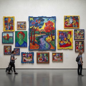
ფავიზმის 10 შედევრი: ხელოვნების ისტორიას განმსაზღვავი ნამუშევრები
აღმოფრთოვანდით ფავიზმის 10 გამორჩეული შედევრით! Henri Matisse, André Derain და სხვა მხატვრების ნამუშევრები. შეიგრძენ ექსპრესიულ ფერებსა და უნიკალურ სტილს. იხილეთ საუკეთესო ტილოები TopImpressionists.com-ზე!

Blush & Brilliance: 10 Iconic Paintings Dominated by Light Pink Tones |
Explore 10 iconic paintings bathed in captivating light pink tones! From Monet's Impressionism to Renoir’s romance, discover the stories behind these blush-hued masterpieces. Find museum-quality art reproductions & decor inspiration at .
აღმოაჩინეთ ხელოვნების ნაწარმოებები თემების, სტილისა და მახასიათებლების მიხედვით დაჯგუფებული.


