빠른 제작과 다양한 마감 옵션을 제공하는 박물관 품질의 지클레이 또는 캔버스 프린트. (![]() 수제 페인팅으로 전환하기
수제 페인팅으로 전환하기![]() 이미지로 전환)
이미지로 전환)
작품의 원본 비율을 유지하는 미리 설정된 크기 중에서 선택하세요.
특정 프레임이나 공간에 맞춰 직접 치수를 입력하실 수 있습니다. 선택하신 사이즈가 원본 이미지의 비율과 일치하지 않을 경우, 작품을 크롭(자르기)하거나 이미지를 대칭 또는 단색 채우기로 확장하여 제작합니다. 제작 시작 전, 최종 확인을 위해 디지털 목업이 전송됩니다.
화면상의 미리보기는 실제 크롭이나 확장 상태를 반영하지 않으므로, 최종 구도는 오직 목업을 통해서만 정확하게 확인하실 수 있습니다.
맞춤 사이즈 제작도 가능하지만, 원본 비율을 유지하기 위해서는 사전 정의된 목록에서 치수를 선택하시는 것을 권장합니다.

180 Colors
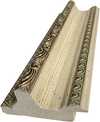
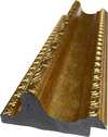
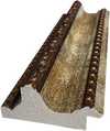
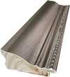
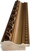
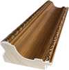
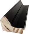
복제본 크기
Gerhard Richter's "180 Colors" is not merely a painting; it’s an immersive experience, a systematic exploration of color that challenges our perceptions and invites contemplation. Created in 1971, this large-scale work presents a grid composed of 180 precisely delineated squares, each filled with a unique hue. The initial impact is one of vibrant complexity, a dazzling array of shades that seem to hum with energy. Yet, beneath the apparent chaos lies a rigorous order, a testament to Richter’s conceptual approach and his fascination with systems as a means of both creation and control.
Richter wasn't interested in expressive brushwork or spontaneous gestures when he conceived “180 Colors.” Instead, he employed a methodical process. He systematically mixed colors, starting from primary hues and creating twelve basic shades, then generating fifteen tones of each – light to dark. This deliberate methodology is crucial to understanding the work; it’s not about *feeling* color, but about analyzing its very structure. The resulting grid isn't intended to evoke a specific emotion or represent a tangible subject. Rather, it presents color as an independent entity, divorced from representation and open to infinite interpretation. The smooth application of enamel paint within each square further emphasizes this detachment, eliminating any trace of the artist’s hand and reinforcing the sense of mechanical precision.
To understand “180 Colors,” one must consider its place within the broader context of 20th-century art. Richter emerged during a period of profound artistic experimentation, influenced by movements like Minimalism, Pop Art, and Conceptualism. He questioned traditional notions of authorship and originality, often employing techniques that minimized his personal touch. His work reflects a post-war German sensibility – a desire to move beyond the emotional weight of history and embrace a more objective, analytical approach. Richter’s exploration of color charts, like “180 Colors,” can be seen as a response to the dominance of Abstract Expressionism, rejecting its emphasis on subjective expression in favor of a more systematic and intellectual investigation.
The painting's impact extends beyond its formal qualities. Interestingly, viewers often report perceiving an optical illusion – faint gray dots seemingly hovering at the corners of each colored square. This phenomenon highlights the inherent subjectivity of perception and how our brains actively construct meaning from visual information. “180 Colors” isn’t simply a display of hues; it's a study in how we *see* color, how it interacts with our eyes and minds. The work subtly reminds us that reality is not fixed but rather a constantly negotiated experience. It invites us to question the nature of representation itself, and to consider the power of systems – both artistic and otherwise – to shape our understanding of the world.

1932 - , 독일

Explore the captivating world of Color Field painting! Discover its origins, key artists like Rothko & Newman, philosophical depth, and lasting influence on modern art. Expert insights for collectors.

Explore the vibrant world of Gene Davis and the Washington Color School. Discover his iconic stripe paintings, innovative techniques, and lasting impact on American abstract art. A deep dive for collectors & enthusiasts.

Explore the groundbreaking abstract expressionism of Morris Louis, a pioneer of Color Field painting. Discover his innovative techniques, influential series & lasting legacy in post-war American art. Learn more at TopImpressionists.

Explore the profound world of Color Field painting with TopImpressionists. Discover key artists like Rothko & Newman, its philosophical roots, and lasting impact on modern art. Expert insights for collectors.

Explore the life & work of Jacob Kainen, a pivotal figure in American Abstract Expressionism and Color Field painting. Discover his journey from Social Realism to vibrant abstraction and lasting influence on 20th-century art.


최신 미술 뉴스, 특별 혜택 및 인테리어 아이디어를 가장 먼저 만나보세요.
프로젝트에 대해 알려주시면 저희 미술 전문가들이 맞춤형 아트 제안 3가지를 전달해 드립니다.
당신만을 위한 맞춤형 옵션 3가지를 무료로 추천해 드립니다!

 공유하기
공유하기


 유리 옵션은 110cm 미만 크기에서만 선택 가능합니다.


