


 실제 크기로 보기
 보내기
보내기 공유하기
공유하기
 상세 보기
상세 보기 가이드 보기

 이미지 다운로드
 유사 작품 더 보기
 X-레이
X-레이 슬라이드 쇼 보기
 통계 정보
통계 정보The pink tablecloth

Delve into Henri Matisse's "The Pink Tablecloth" (c.1924-1925), a vibrant Fauvist masterpiece showcasing bold color palettes and simplified forms. Explore its legacy at Glasgow Life Museums.
 상세 보기
상세 보기
마테리스 화가는 강렬한 색채와 자유로운 표현 기법으로 현대 미술에 혁명을 일으켰습니다. 대표작은 아름다운 정원과 인물들을 그린 그림들로 유명하며, 특히 후기 작품인 콜라주 기법은 그의 예술적 영감을 보여줍니다.
핸드메이드 유화 복제화
작가가 직접 캔버스에 손으로 그린 유화 작품으로, 원하는 크기와 액자로 맞춤 제작해 드립니다. ( 프린트 판매로 전환 디지털 이미지 판매 채널로 전환)




P118B ₩10

P118H ₩10

P118W ₩10

P438Z ₩10

P508JH ₩12

P508YH ₩12

P805H ₩10

P805Z ₩10

P919BZ ₩10

P919G ₩10

P919XJ ₩10

P959ZH ₩10

P968JZ ₩12

W106C ₩8

W218G ₩10

W218JH ₩8

W218Y ₩10

W307PJ ₩10

W316G ₩10

W316PJ ₩8

W316Y ₩10

W398PJ ₩8

W4111J ₩10

W500HY ₩15

W500JH ₩15

W692G ₩12

W849H ₩8

W940BG ₩15

W953PJ ₩8




표준 규격
맞춤 제작
CM
INCH
작품의 원본 비율을 그대로 유지하는 프리셋 사이즈 중에서 선택해 보세요.
Loading sizes...

가로 너비
높이
특정 프레임이나 공간에 맞춰 원하는 크기를 직접 입력하실 수 있습니다. 선택하신 크기가 원본 이미지의 비율과 일치하지 않을 경우, 작품을 자르거나 추가적인 수작업 요소를 더해 그림을 확장하여 제작합니다. 제작 시작 전, 최종 확인을 위해 디지털 목업을 보내드립니다.
화면상의 미리 보기는 실제 크롭(자르기)이나 확장된 상태를 완벽히 반영하지 않을 수 있습니다. 최종 구도는 오직 목업을 통해서만 정확하게 확인하실 수 있습니다.
맞춤 크기 제작도 가능하지만, 원본의 비율을 그대로 유지하기 위해서는 미리 정의된 목록에서 크기를 선택하시는 것을 권장합니다.
변경 가능한 예시: 얼굴을 고객님의 사진으로 교체, 반려동물 추가(예: 고양이를 강아지로 변경), 배경에 숨겨진 메시지 삽입, 배경 풍경 또는 요소 변경 등
주문 완료 후 TopImpressionists.com 팀에서 상세 안내를 위해 고객님께 이메일을 보내드리며, 미리보기 시안을 함께 제공해 드립니다.
주문 완료 후 TopImpressionists.com 팀에서 상세 안내를 위해 고객님께 이메일을 보내드리며, 미리보기 시안을 함께 제공해 드립니다.


 유리 옵션은 110cm 미만 크기에서만 선택 가능합니다.

The pink tablecloth
재현 매체
복제본 규격
-


총 결제 금액
₩ 360998
The Pink Tablecloth: A Study in Matisse’s Bold Color Palette
Henri Matisse's "The Pink Tablecloth," painted around 1924-1925, stands as a quintessential example of Fauvist art—a movement that championed unrestrained color and simplified forms as reactions against Impressionism. This unassuming still life transcends mere depiction; it’s an exploration of emotion conveyed through pigment, reflecting Matisse's profound belief in painting as a vehicle for expressing inner feelings rather than objective reality. The artwork resides within the collection of Glasgow Life Museums, acquired from William McInnes in 1944, and its accession number is 2402. Measuring approximately 60.3 x 81 cm (approximately 23 ¾ x 32 inches), it’s a relatively small canvas that belies the monumental impact of Matisse's artistic vision.- Style: Fauvist – Characterized by its deliberate disregard for naturalistic color, “The Pink Tablecloth” prioritizes vibrant hues—primarily shades of pink—to create an atmosphere of warmth and tranquility. This bold chromatic choice distinguishes it from the muted tones favored by Impressionists who sought to capture fleeting moments of light and shadow.
- Technique: Matisse employed a loose brushstroke technique, applying paint thickly onto the canvas with visible marks that contribute to the textural richness of the composition. The artist’s deliberate layering of color creates depth and luminosity, emphasizing the materiality of the surface itself.
질의응답
앙리 마티스의 "The pink tablecloth"의 휘도는 어느 정도인가요?
앙리 마티스의 "The pink tablecloth"의 휘도는 Soft Shadow입니다. 휘도는 색상이 빛을 얼마나 반사하는지를 나타냅니다.
"The pink tablecloth"의 미리보기를 어디에서 볼 수 있나요?
앙리 마티스의 "The pink tablecloth"의 복제본을 미리 보려면 작품의 미리보기 페이지를 열어주세요.
증강 현실(AR)을 사용하여 제 방에 앙리 마티스의 "The pink tablecloth"를 배치해 볼 수 있나요?
"The pink tablecloth"은(는) 증강 현실 미리보기를 제공합니다. 작품의 AR 미리보기 페이지를 통해 호환 가능한 기기에서 여러분의 공간에 배치된 작품을 확인해 보세요.
앙리 마티스의 "The pink tablecloth"의 색감을 고려했을 때, 어떤 공간에 배치하는 것이 가장 좋을까요?
Earthy 색조를 담은 앙리 마티스의 "The pink tablecloth"는 Dining Room에 배치하시길 추천드립니다. 이 작품의 색감이 이러한 제안의 이유이기도 합니다.
앙리 마티스의 "The pink tablecloth"의 디지털 파일을 어떻게 구할 수 있나요?
앙리 마티스의 "The pink tablecloth"의 디지털 파일을 소장하시려면, 현재 페이지에서 고해상도 디지털 이미지 다운로드을(를) 주문해 주세요.
앙리 마티스의 "The pink tablecloth"에는 어떤 소재가 등장하나요?
앙리 마티스의 "The pink tablecloth"에 묘사된 주제: still life, fruit composition, color palette, table setting, decorative art, post impressionism, floral arrangement.
"The pink tablecloth"이(가) 앙리 마티스의 가장 인기 있는 작품 중 하나인가요?
앙리 마티스의 "The pink tablecloth"의 인기도는 Iconic 수준입니다. 이 분류는 해당 작품이 얼마나 널리 알려져 있는지를 반영합니다.
"The pink tablecloth"의 전체적인 밝기는 어느 정도인가요?
전반적으로 "The pink tablecloth"의 밝기는 balanced로 기록되었습니다. 인지된 밝기는 작품이 얼마나 밝거나 어둡게 보이는지를 나타냅니다.
작가 소개
색채의 거장, 앙리 마티스: 삶과 예술
앙리 에밀 베노와 마티스는 1869년 프랑스 북부 작은 마을 레 카토-캄브레시에서 태어났습니다. 법학을 공부하려던 그는 우연히 병으로 입원하며 그림에 눈뜨게 되었고, 어머니에게 받은 물감 세트가 그의 삶의 전환점이 되었습니다. 보앵-앙-베르망두아에서 성장하며 상인의 아들로 평범한 삶을 살았지만, 예술가의 길을 걷기로 결심한 순간부터 그는 색채와 형태로 표현되는 새로운 세계를 향해 나아갔습니다. 파리 학원과 에콜 데 보자르에서 전통적인 기법을 익혔지만, 그의 작품은 곧 자신만의 독특한 목소리를 찾아나갈 준비가 되어 있었습니다.야수파의 탄생과 대담한 실험
1896년 존 러셀과의 Belle Île 방문이 마티스의 예술 세계에 결정적인 영향을 미쳤습니다. 러셀을 통해 인상주의를 접하고, 더욱 중요한 것은 빈센트 반 고흐의 강렬한 색채와 감정을 담은 작품들을 보며 충격을 받았습니다. 이는 그의 팔레트를 변화시키고, 엄격한 재현 대신 감정과 어우러지는 색채를 탐구하도록 이끌었습니다. 이러한 탐색의 결과로 1905년 야수파가 등장했습니다. ‘야수’라는 이름은 비평가들이 그들의 강렬하고 비전통적인 작품에 붙인 조롱이었지만, 마티스와 앙드레 데랭, 모리스 드 블라멩크 등은 색채를 독립적인 표현 수단으로 활용하며 미술계에 새로운 바람을 일으켰습니다. 호박들(1905)과 같은 작품에서 볼 수 있듯이, 그는 전통적인 원근법을 무시하고 순수한 색면을 사용하여 강렬한 시각적 효과를 만들어냈습니다. 야수파는 짧은 기간 동안 존재했지만, 현대 미술의 흐름을 바꾸는 데 중요한 역할을 했습니다.장식과 조화: 예술의 진화
야수파 운동 이후 마티스는 더욱 세련된 스타일로 나아갔습니다. 색채에 대한 사랑을 포기하지 않으면서도, 그의 작품은 장식적인 아름다움을 강조하고 형태를 단순화하는 경향을 보였습니다. 프랑스 리비에라의 니스에서 정착하면서 지중해의 햇살과 여유로운 분위기가 그의 예술에 반영되었고, 평온함과 고전적인 균형미가 느껴지는 작품들을 탄생시켰습니다. 그는 회화뿐만 아니라 도자기, 직물 등 다양한 매체를 통해 자신의 예술적 비전을 확장했습니다. 단순한 장면 묘사를 넘어, 특정한 감정을 불러일으키는 환경을 구축하고자 했습니다.제한 속의 혁신: 종이 콜라주
건강 악화로 인해 전통적인 회화 기법을 사용하기 어려워지자, 마티스는 종이 콜라주라는 새로운 예술 영역을 개척했습니다. 1947년부터 시작된 이 작업은 필연에 의해 촉발되었지만, 곧 그의 예술적 탐구의 중요한 단계가 되었습니다. 그는 넓은 종이를 다채로운 색상으로 칠한 후, 가위로 잘라낸 형태들을 캔버스 위에 배열하여 역동적이면서도 간결한 작품을 창조했습니다. 이러한 콜라주들은 단순히 회화의 대체재가 아니라, 색과 형태에 대한 새로운 사고방식을 제시하며 그의 예술적 유산을 더욱 풍성하게 만들었습니다. 종이 콜라주는 그에게 순수한 형태와 색채를 얻는 데 유리했을 뿐만 아니라, 이전 작품들의 주제와 모티프를 새롭고 혁신적인 방식으로 재해석할 수 있는 기회를 제공했습니다.현대 미술에 미친 영향: 마티스의 유산
1954년 니스에서 세상을 떠난 앙리 마티스는 현대 미술사에 지대한 영향을 미쳤습니다. 그는 전통적인 표현 방식을 거부하고 색채의 힘을 옹호하며, 후대 예술가들에게 영감을 주었습니다. 파블로 피카소와 함께 20세기 미술을 정의한 주요 인물 중 한 명으로 평가받으며, 그의 작품은 전 세계 박물관과 개인 소장품에서 감상할 수 있습니다. 마티스는 단순한 그림쟁이가 아니라, 색채, 조화, 그리고 무한한 가능성으로 가득 찬 세상을 창조하고자 했던 예술가였습니다. 그는 우리가 세상을 보는 방식을 바꾸었고, 그의 유산은 오늘날까지도 현대 미술에 깊은 영향을 미치고 있습니다.
앙리 마티스
1869 - 1954 , 프랑스
작가 정보 요약
- 국적: 프랑스
- 대표 작품:
- 호박들
- 흰 터번을 쓴 로레트
- 사망일: 1954년 11월 3일
- 영향을 받은 예술가:
- 모던 미술
- 표현주의
- 영향을 준 예술가:
- 반 고흐
- 샤르댕
- 러스
- 예술 사조: 포비즘 (Fauvism)
- 전체 이름: 앙리 에밀 베노와 마티스
- 출생일: 1869년 12월 31일
- 출생지: 르 카토-캄브레시, 프랑스
관련 기사

Fauvism Unveiled: The Wild Revolution of Color and Emotion in Modern Art
Explore the vibrant revolution of Fauvism. Discover how masters like Henri Matisse liberated color from reality to express pure emotion. An expert guide into the 'Wild Beasts' of modern art history for collectors and enthusiasts.

Fauvism's Boldest Visions: 10 Masterpieces That Revolutionized Modern Art | TopImpressionists
Explore 10 Fauvist masterpieces by Matisse, Derain & Vlaminck that ignited Modern Art! Discover bold colors, expressionist landscapes & the history of this revolutionary movement. Find museum-quality prints at TopImpressionists.com.

앙리 마티스의 걸작 25선: 색채와 감각의 혁신을 만나다 | TopImpressionists
앙리 마티스의 시대를 초월하는 걸작 25선을 만나보세요. 색채주의, 야수파를 대표하는 그의 삶과 예술 세계를 탐험하고, TopImpressionists에서 명화 복제본으로 거실 인테리어에 감동을 더하세요. 지금 바로 컬렉션을 확인하세요!
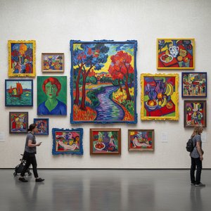
fauve 미술을 정의한 10대 걸작: 강렬한 색채와 혁신적인 표현의 세계
fauve 미술의 심장을 뛰게 하는 10대 걸작! 모리스 드니, 마티스 등 거장의 강렬한 색채와 혁신적인 표현을 만나보세요. 예술 작품 감상부터 인테리어 디자인 영감까지, TopImpressionists.com에서 명품 아트 프린트를 찾아보세요.

Blush & Brilliance: 10 Iconic Paintings Dominated by Light Pink Tones |
Explore 10 iconic paintings bathed in captivating light pink tones! From Monet's Impressionism to Renoir’s romance, discover the stories behind these blush-hued masterpieces. Find museum-quality art reproductions & decor inspiration at .
테마, 스타일, 특징별로 큐레이션된 작품들을 만나보세요.


