
표시된 작품: · 액자 포함:
 미리보기

 공유하기
 공유하기
 상세 정보
 학습용 요약본


 다운로드
 유사 작품 더 보기
 X-레이
 슬라이드 쇼 보기
 질의응답

 통계 정보
Stranded (라이오넬 파이닝거)


27 x 37 cm 사이즈부터 ₩63342부터 시작하는 캔버스 및 파인 아트 프린트
- 3~5주 내 전 세계 무료 배송
- 롤 형태의 프린트 배송 기간: 3~5주
- 100일 이내 반품 및 환불 보장
- ArtShopReviews.com의 고객 241명이 평가한 4.9/5점
₩ 94339
지클레 / 아트 프린트
빠른 제작과 다양한 마감 옵션을 제공하는 박물관 수준의 지클레이 및 캔버스 프린트. ( 인상주의 유화 디지털 이미지 구매
)
매체 및 재료
 더 알아보기
가성비 옵션: 면 캔버스 대신 240 g/m² 폴리에스터 캔버스에 동일한 이미지를 인쇄하며, 일반 우편을 통해 튜브에 말린 상태로 3~5주 이내에 배송됩니다. 한쪽 면이 80 cm 이하인 사이즈에 한해 제공되는 롤 형태(스트레처 및 프레임 미포함) 제품으로, 급행 제작은 불가능합니다. 면 캔버스 인쇄보다 약 30% 저렴합니다.
이 사이즈에서는 선택할 수 없습니다: 최소 한 쪽 면의 길이가 80 cm 이하여야 합니다.
롤 형태 전용: 이 프린트를 선택하시려면 튜브에 말린 형태의 캔버스를 선택해 주세요.
한 변의 길이가 100 cm 이하인 사이즈에 한해 주문 가능합니다. 이보다 큰 사이즈는 매트 코튼 캔버스에 인쇄됩니다.
이 사이즈에는 매트 아카이브 캔버스 옵션을 사용할 수 없습니다. 최소 한 쪽 면의 길이가 100 cm 이하여야 합니다. 대신 매트 코튼 캔버스로 인쇄됩니다.
유리 옵션은 110cm 미만 크기에서만 선택 가능합니다.
사이즈
·작품의 원본 비율을 그대로 유지하는 프리셋 사이즈 중에서 선택해 보세요.
사이즈 불러오는 중...

가로 너비
세로 길이
액자나 벽면 크기에 맞춰 필요한 가로와 세로 길이를 입력해 주세요. 프린트는 원본 이미지보다 크게 제작할 수 없으며 오직 자르는 것만 가능하므로, 비율이 다른 사이즈를 선택할 경우 이미지의 일부가 잘려 나갈 수 있습니다. 인쇄 작업에 들어가기 전, 최종 확인을 위해 디지털 목업을 보내드립니다. 이 페이지에 표시된 이미지는 실제 잘리는 영역을 나타내지 않으며, 오직 목업을 통해서만 정확한 확인이 가능합니다.
표준 규격
맞춤형
CM
인치
완료
·
화이트 테두리 ₩1
블러사이드 ₩1
옆면 확장형 ₩1
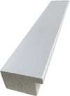
P118B ₩10
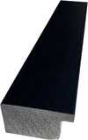
P118H ₩10
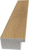
P118W ₩10
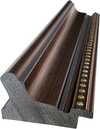
P438Z ₩10
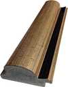
P508JH ₩12
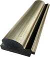
P508YH ₩12
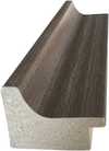
P805H ₩10
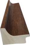
P805Z ₩10
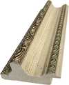
P919BZ ₩10
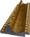
P919G ₩10
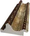
P919XJ ₩10
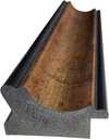
P959ZH ₩10
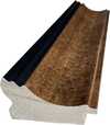
P968JZ ₩12
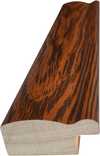
W106C ₩8
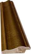
W218G ₩10
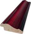
W218JH ₩8
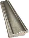
W218Y ₩10
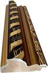
W307PJ ₩10
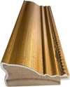
W316G ₩10
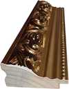
W316PJ ₩8
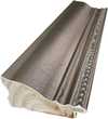
W316Y ₩10
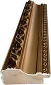
W398PJ ₩8
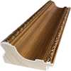
W4111J ₩10
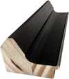
W500HY ₩15
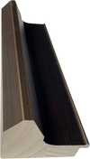
W500JH ₩15
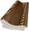
W692G ₩12
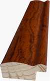
W849H ₩8
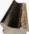
W940BG ₩15
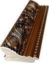
W953PJ ₩8
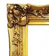
H24-GOLD ₩30
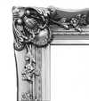
H24-SILVER ₩30
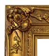
H36-GOLD ₩45
H36-SILVER ₩45
보호용 튜브에 담겨 안전하게 배송되며, 고객님께서 직접 액자에 끼워 사용하실 수 있습니다.
105cm를 초과하는 프레임은 전문 액자 제작사를 위한 키트 형태로 배송됩니다 — 자세한 내용을 확인하세요.
추가 서비스
선택 사항추가 구성품에는 무엇이 포함되어 있나요?
전 세계 배송()은 일반적인 4~5주의 소요 기간 대신 2주 이내에 완료됩니다. (5 12월)
Economy poly-canvas print은 일반 우편으로 배송되므로, 긴급 제작 및 특급 택배 서비스를 이용하실 수 없습니다.
보호용 바니시
작품 설명문
동판 각인 상세 정보
이 우아한 명판에는 작가의 성함과 작품명이 정교하게 각인되어 있어, 변치 않는 가치를 선사합니다.
세련되고 우아한 마감 처리가 돋보이는 브론즈 소재로 제작되었습니다. 텍스트는 정교한 레이저 각인 공법을 통해 선명하고 영구적으로 새겨집니다. 9x2cm 크기의 명판은 콤팩트하면서도 가독성이 뛰어납니다. 내구성이 높고 스크래치에 강해 박물관 전시물과 같은 전문적인 품격을 선사합니다. 동봉된 접착 패치를 사용하여 간편하게 부착할 수 있습니다.
투명 아크릴 명판 상세 정보
명판에는 작가명, 작품 제목, 제작 연도, 사용된 재료(캔버스에 유채 또는 수채화 등), 작품에 대한 간략한 설명, 그리고 작품의 상세 정보로 연결되는 QR 코드를 포함한 필수 각인 정보가 포함됩니다.
투명 아크릴로 제작되어 세련되고 현대적인 느낌을 줍니다. 텍스트는 검은색 UV 각인 방식으로 처리되어 시각적 대비가 뚜렷합니다. 10x15 cm 크기로 제작되어 가독성이 뛰어납니다. 벽면에 안정적으로 설치할 수 있도록 두 개의 금속 고리가 포함되어 있습니다. 내후성이 뛰어난 설계로 다양한 환경에서 사용하기 적합하며, 스마트폰 스캔을 통해 연동되는 인터랙티브 기능도 포함되어 있습니다.
블랙 아크릴 명판 상세 정보
이 우아한 명판에는 작가명, 작품명, 제작 연도, 사용된 재료(캔버스에 유채 또는 수채화 등), 작품에 대한 짧은 설명, 그리고 상세 정보를 빠르게 확인할 수 있는 QR 코드가 각인됩니다.
명판은 고급스러운 마감 처리가 된 정교한 블랙 아크릴로 제작되었습니다. 텍스트는 높은 대비와 가독성을 위해 화이트 색상으로 레이저 각인됩니다. 크기는 10x15cm로 제작되어 읽기 편리하며, 전문적인 설치를 위한 금속 고리 두 개가 함께 제공됩니다. 세련된 디자인은 어떤 인테리어 스타일과도 잘 어우러집니다. 또한 내구성이 뛰어나고 날씨 변화에 강하며, 모바일 호환성을 위한 디지털 통합 기능이 내장되어 있습니다.
유리 옵션은 110cm 미만 크기에서만 선택 가능합니다.
 유리 옵션은 110cm 미만 크기에서만 선택 가능합니다.
- 3~5주 내 전 세계 무료 배송
- 프리미엄 린넨 캔버스
- 배송 전 과정 보험 적용
- 관세 및 수입세 환급 보장 서비스
- 원본과 동일한 색상 구현 보장
- 100일 이내 반품 및 환불 보장
- 100% 환불 보장
- 다량 구매 할인 혜택


Stranded: 라이오넬 파이닝거와 Expressionism의 순간
Fragmented sailing ships dissolve into angular geometric planes and muted gray washes in this expressive watercolor study of isolation.
라이오넬 파이닝거: 작가 소개
프리즘처럼 분절된 형태, 투명한 색채, 그리고 바다에서 영감을 받은 건축적 테마로 잘 알려진 독일계 미국인 표현주의 화가입니다.
작품 정보
The Depiction of Stranded by Lyonel Feininger
In Stranded, Lyonel Feininger presents a scene of sailing ships at sea, though the familiar maritime subject is transformed through a highly abstracted lens. Rather than a literal representation of vessels navigating the waves, the work offers a fragmented view of these ships. The forms are broken into angular planes and overlapping shapes that disrupt a traditional sense of perspective. This approach creates a feeling of disorientation, as if the viewer is witnessing a moment of profound isolation or abandonment.
The subject matter is stripped of its conventional clarity. Instead of solid hulls and billowing sails, we encounter a series of intersecting lines and geometric shapes. This fragmentation suggests a sense of being lost or adrift, a sentiment reinforced by the title. The ships appear as echoes of their former selves, caught in a space where the boundaries between the sea and the sky are blurred by muted tones and shifting forms.
Composition and Visual Elements of the Work
The composition of this piece is highly unconventional, eschewing the stability we typically expect from a maritime scene. Instead of a grounded perspective, the space seems to tilt and shift, creating a sense of disorientation. Diagonal lines dominate the work, cutting through the frame to disrupt any sense of traditional equilibrium. These sharp, angular lines intersect at odd angles, working alongside overlapping forms to fragment the subject matter into a series of disconnected planes.
Geometric shapes, specifically triangles and rectangles, dictate the structure of the composition. These forms represent the hulls, masts, and sails of the ships, yet they are rendered with a fractured logic that denies a clear horizon line. The absence of a steady horizon contributes to the feeling of being adrift. The arrangement of these elements feels both arbitrary and deliberate, contributing to an overall atmosphere of unease and isolation.
Technique and Materials Used in the Artwork
In this work, the artist employs watercolor as the primary medium, utilizing the fluid nature of the pigment to establish the atmosphere. Through the careful layering of color washes, a sense of tonal variation is achieved, allowing the grays and creams to shift subtly across the surface. This method creates a soft, impressionistic background that suggests the presence of water or sky without relying on heavy, opaque applications.
The structural integrity of the composition relies on more deliberate, linear marks. These lines, likely rendered with a pen or pencil, provide a sharp contrast to the softer watercolor washes. They define the angular planes of the ships and the intersecting geometric shapes that characterize the scene. This interplay between the translucent, bleeding edges of the paint and the precise, controlled lines creates a tension within the work's surface.
The choice of materials—watercolor paints applied to paper—is evident in the subtle graininess visible through the washes. This texture adds a tactile quality to the piece, grounding the abstraction in the physical reality of the medium. The artist's hand is visible in the way the pigment settles into the fibers of the paper, particularly where the colors are most diluted.
Artistic Style and Visual Characteristics
The work is deeply rooted in Expressionism, prioritizing a subjective emotional state over a literal representation of the sea. You can see this through the way the forms are broken apart, revealing a clear Cubist influence. Rather than presenting a cohesive vessel, the artist uses a fragmentation of forms to disrupt the viewer's sense of space. This approach creates a tension between the recognizable subject of sailing ships and the abstract, geometric reality of the composition.
The color palette is restrained and somber, relying on a quiet arrangement of grays, browns, and creams. These muted tones are punctuated only by small, deliberate accents of orange that catch the eye amidst the more subdued washes. The lighting is diffused and even, lacking a singular, dramatic source. This evenness flattens the image, working in tandem with the watercolor technique to produce a relatively smooth texture across the surface of the paper.
Related Works by Lyonel Feininger
To understand the nuances of this piece, one might look toward other maritime explorations by the artist. His interest in the sea often manifested through various media and stylistic shifts. For instance, Boats offers a different perspective through the lens of cubism, rendered in oil on canvas. This work provides a point of comparison for how Feininger approached the fragmentation of nautical forms. Similarly, The Motor Boat exists within his body of work, reflecting his ongoing engagement with these aquatic subjects.
The artist's versatility is further evident in his use of different mediums to capture light and atmosphere. While Stranded utilizes watercolor, his work Werder I also employs this medium to explore tonal variations. There is a certain continuity in how he handles the fluidity of the sea across these different applications. Even the more subtle movements of the water are addressed in Gentle swell, which remains a significant related work in the catalog.
질의응답
Stranded의 이 복제본은 수작업으로 그려진 것인가요, 아니면 인쇄된 것인가요?
인쇄 방식: Stranded은(는) 면 캔버스 또는 에프슨(Epson) 아카이브 캔버스지에 지클레이(giclée) 방식으로 인쇄됩니다.
Stranded의 사이즈는 어떤 것을 선택해야 하나요?
사이즈는 27.2 x 36.8 cm (₩63342)부터 180.8 x 244.2 cm (₩481127)까지 있으며, 이 페이지의 표에 주요 단계별 가격이 안내되어 있습니다.
배송은 얼마나 걸리나요?
튜브에 말린 형태의 프린트는 일반 우편을 통해 무료로 배송되며 3~5주 이내에 도착합니다. 캔버스 스트레칭 또는 액자 작업이 된 프린트는 4~5주가 소요되며, 본 페이지에서 빠른 배송 옵션을 선택하실 수 있습니다. 제품은 조건 없이 100일 이내에 반품하여 전액 환불받으실 수 있습니다.
라이오넬 파이닝거 작가는 Stranded 작품에 어떤 재료를 사용했나요?
Watercolor
주요 정보 및 아트 퀴즈
라이오넬 파이닝거 소개

라이오넬 파이닝거
1871 - 1956, 미국
라이오넬 파이닝거에 관한 주요 정보
- Artistic Movement Or Style: 표현주의, 입체주의
- Artists Or Movements Influenced By This Artist:
- 바우하우스 운동
- 루트비히 히르슈펠트 막
- Date Of Birth: 1871년 7월 17일
- Date Of Death: 1956년 1월 13일
- Full Name: 리오넬 찰스 에이드리언 파이닝거
- Nationality: 독일계 미국인
- Notable Artworks:
- 베르데르 I (수채화)
- 가버도르프 II (종이)
- 보트 (캔버스에 유채)
- Place Of Birth: 미국 뉴욕시

라이오넬 파이닝거
Stranded
() ·
액자 포함: ·
총액