빠른 제작과 다양한 마감 옵션을 제공하는 박물관 품질의 지클레이 또는 캔버스 프린트. (![]() 수제 페인팅으로 전환하기
수제 페인팅으로 전환하기![]() 이미지로 전환)
이미지로 전환)
작품의 원본 비율을 유지하는 미리 설정된 크기 중에서 선택하세요.
특정 프레임이나 공간에 맞춰 직접 치수를 입력하실 수 있습니다. 선택하신 사이즈가 원본 이미지의 비율과 일치하지 않을 경우, 작품을 크롭(자르기)하거나 이미지를 대칭 또는 단색 채우기로 확장하여 제작합니다. 제작 시작 전, 최종 확인을 위해 디지털 목업이 전송됩니다.
화면상의 미리보기는 실제 크롭이나 확장 상태를 반영하지 않으므로, 최종 구도는 오직 목업을 통해서만 정확하게 확인하실 수 있습니다.
맞춤 사이즈 제작도 가능하지만, 원본 비율을 유지하기 위해서는 사전 정의된 목록에서 치수를 선택하시는 것을 권장합니다.

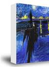
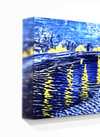
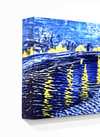
No.24
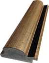
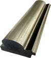
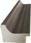
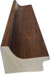
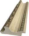
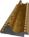
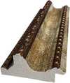
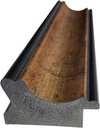
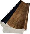
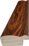
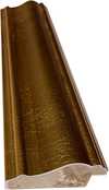
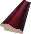
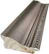
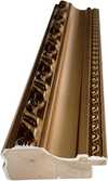
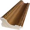
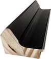
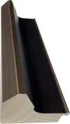
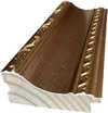
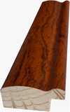
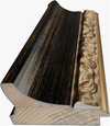
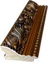
복제본 크기
TopImpressionists.com presents an exquisite hand-painted reproduction of Mark Rothko's “No. 24,” a seminal work from 1949 that embodies the artist’s revolutionary approach to abstract expressionism. This piece, dominated by intense reds and greens, immediately draws the viewer into a realm of profound emotional resonance – a hallmark of Rothko’s mature style. The canvas itself is not merely a surface for paint; it's a textured landscape, built up in layers of thick impasto, creating a palpable physicality that invites tactile engagement. Subtle hints of orange peek through, adding to the complexity and dynamism within the seemingly simple color field composition.
Born in 1903 in Daugavpils, Latvia – then part of the Russian Empire – Mark Rothko's early life was profoundly shaped by displacement and a sensitivity to human suffering. His family’s experiences within the volatile political landscape of Eastern Europe instilled a deep awareness of mortality and existential questions, themes that would become central to his artistic vision. This biographical context is crucial to understanding “No. 24.” Rothko wasn't simply applying color; he was channeling deeply felt emotions, attempting to evoke a visceral response in the viewer. The layering technique, achieved through repeated applications of paint, builds up these emotional layers, creating an almost meditative effect.
Rothko’s use of color wasn't arbitrary. He meticulously studied color theory, particularly the work of Josef Albers, to understand how colors interact and influence each other. The juxtaposition of red and green in “No. 24” is particularly significant. These colors are often associated with primal emotions – red representing passion, anger, or danger, while green symbolizes nature, growth, and sometimes, decay. Rothko aimed to create a spiritual experience for the viewer, suggesting a connection between the individual’s inner world and the vastness of the universe. The thick application of paint, almost sculptural in its presence, further enhances this sense of depth and weight.
"No. 24" represents a pivotal moment in Rothko's career, solidifying his reputation as one of the foremost figures in abstract expressionism. This reproduction captures not just the visual elements of the original but also its emotional core – the profound sense of melancholy, contemplation, and perhaps even spiritual yearning that defines Rothko’s work. A hand-painted reproduction offers a unique opportunity to experience this artwork's power firsthand, bringing Rothko’s intensely personal vision into your space. This piece is more than just decoration; it’s an investment in art history and a gateway to exploring the depths of human emotion.

1903 - 1970 , 라트비아

Explore the profound emotional depth of Mark Rothko's abstract expressionism. Discover the history, techniques & lasting impact of this pivotal Color Field painter. Expert insights for collectors and art enthusiasts.

Explore the captivating world of Beatrice Parsons, a pioneering British abstract expressionist. Discover her journey from garden watercolors to evocative color field paintings and learn about her place within art history.

Explore the life & work of Jacob Kainen, a pivotal figure in American Abstract Expressionism and Color Field painting. Discover his journey from Social Realism to vibrant abstraction and lasting influence on 20th-century art.

앙리 마티스의 시대를 초월하는 걸작 25선을 만나보세요. 색채주의, 야수파를 대표하는 그의 삶과 예술 세계를 탐험하고, TopImpressionists에서 명화 복제본으로 거실 인테리어에 감동을 더하세요. 지금 바로 컬렉션을 확인하세요!

Explore 10 legendary 'Acrylic On Canvas' masterpieces by artists like Rothko, Warhol & Frankenthaler. Discover the stories behind these iconic paintings and their impact on modern art. Find museum-quality reproductions at – elevate your home with timeless beauty.

최신 미술 뉴스, 특별 혜택 및 인테리어 아이디어를 가장 먼저 만나보세요.
프로젝트에 대해 알려주시면 저희 미술 전문가들이 맞춤형 아트 제안 3가지를 전달해 드립니다.
당신만을 위한 맞춤형 옵션 3가지를 무료로 추천해 드립니다!

 공유하기
공유하기


 유리 옵션은 110cm 미만 크기에서만 선택 가능합니다.


