실제 크기로 보기
 보내기
보내기 공유하기
공유하기
 상세 보기
상세 보기 가이드 보기

 이미지 다운로드
 유사 작품 더 보기
 X-레이
X-레이 슬라이드 쇼 보기
 통계 정보
통계 정보Composition 9

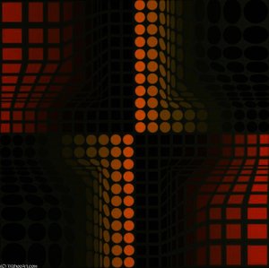
Experience Victor Vasarely’s ‘Composition 9’, a mesmerizing Op Art masterpiece of circles and earthy tones from the 1950s. Explore this iconic geometric abstraction and discover its captivating visual impact.
 상세 보기
상세 보기
옵 아트의 선구자 빅터 바사렐리(1906-1997)를 만나보세요! 기하학적 추상과 착시 현상을 활용한 그의 작품은 현대 미술과 디자인에 큰 영향을 미쳤습니다. 'Zebra'와 같은 대표작 감상하세요.
이 페이지에 표시된 작품은 저작권법의 보호를 받으며, 이에 따라 동일한 복제품을 제작하거나 판매하는 것은 법으로 금지되어 있습니다. 이러한 권리 보호는 다음과 같은 국제 협약에 따라 시행됩니다. 베른 협약 또한 다음에서 명시하는 법률을 포함한 국내법에 의해 보호됩니다. 미국 저작권법 제17조.
이 방식은 저작권 보호를 받는 예술 작품을 복제하거나 그대로 재현하는 것이 아니기에 저작권 규정을 완벽히 준수합니다. 대신, 이는 창의적인 재해석의 과정을 거칩니다. 즉, 원작에서 영감을 받되 원작과 동일하지 않은 새로운 회화 작품을 의미합니다.
지클레 / 아트 프린트
빠른 제작과 다양한 마감 옵션을 선택할 수 있는 박물관 수준의 지클레이 및 캔버스 프린트. ( 수작업 채색 복제본 주문하기 디지털 이미지 판매 채널로 전환)




P118B ₩10

P118H ₩10

P118W ₩10

P438Z ₩10

P508JH ₩12

P508YH ₩12

P805H ₩10

P805Z ₩10

P919BZ ₩10

P919G ₩10

P919XJ ₩10

P959ZH ₩10

P968JZ ₩12

W106C ₩8

W218G ₩10

W218JH ₩8

W218Y ₩10

W307PJ ₩10

W316G ₩10

W316PJ ₩8

W316Y ₩10

W398PJ ₩8

W4111J ₩10

W500HY ₩15

W500JH ₩15

W692G ₩12

W849H ₩8

W940BG ₩15

W953PJ ₩8




표준 규격
맞춤 제작
CM
INCH
작품의 원본 비율을 그대로 유지하는 프리셋 사이즈 중에서 선택해 보세요.
Loading sizes...

가로 너비
높이
특정 프레임이나 공간에 맞춰 직접 치수를 입력하실 수 있습니다. 선택하신 사이즈가 원본 이미지의 비율과 일치하지 않을 경우, 작품을 크롭(자르기)하거나 이미지를 대칭 또는 단색 채우기로 확장하여 제작합니다. 제작 시작 전, 최종 확인을 위해 디지털 목업이 전송됩니다.
화면상의 미리보기는 실제 크롭이나 확장 상태를 반영하지 않으므로, 최종 구도는 오직 목업을 통해서만 정확하게 확인하실 수 있습니다.
맞춤 사이즈 제작도 가능하지만, 원본 비율을 유지하기 위해서는 사전 정의된 목록에서 치수를 선택하시는 것을 권장합니다.


 유리 옵션은 110cm 미만 크기에서만 선택 가능합니다.

Composition 9
지클레 / 아트 프린트
복제본 규격
-


총 결제 금액
₩ 92669
Composition ö – A Symphony of Circles and Melancholy
Victor Vasarely’s “Composition ö” isn't merely a painting; it’s an invitation into a realm where geometry dances with emotion, capturing the essence of Op Art’s fascination with illusion and perception. Created in 1959, this vibrant artwork embodies Vasarely’s signature style—a masterful blend of bold colors against a textured yellow background punctuated by meticulously placed circles of varying sizes. The image itself is a close-up, allowing viewers to appreciate the intricate patterns and subtle shifts in hue that contribute to its captivating visual experience.- Style: Op Art – Vasarely’s work belongs firmly within the influential Op Art movement, which sought to stimulate sensory perception through optical illusions. Artists like Bridget Riley and Piero Dorazio pioneered this style, prioritizing visual stimulation over representational accuracy.
- Technique: Screenprinting – Vasarely employed screenprinting, a technique known for its ability to achieve precise color gradients and textural effects. This meticulous process ensured that every circle adhered perfectly to the canvas, reinforcing the artwork’s geometric precision.
- Color Palette: Earthy Tones – The painting utilizes a palette dominated by earthy hues—primarily ochre and amber—creating a sense of warmth and grounding amidst the dynamic circular forms. These colors subtly convey a feeling of melancholy, reflecting Vasarely's own contemplative approach to artmaking.
- Historical Context: Postwar Modernism – “Composition ö” emerged during the postwar period in Europe, coinciding with a surge of experimentation in visual arts and design. It represents a reaction against traditional artistic conventions, embracing abstraction as a means of exploring fundamental principles of perception.
Exploring Geometric Abstraction: Vasarely’s Vision
Vasarely's philosophy centered on the belief that art should transcend mere imitation of nature and delve into the underlying structure of reality—specifically, geometry. He argued that shapes possessed inherent qualities that could evoke emotions and stimulate thought independently of their visual appearance. “Composition ö” exemplifies this conviction, demonstrating how geometric forms can generate a profound psychological response. The artist’s intention was to create an experience akin to listening to music, where the eye perceives rhythm and movement—a deliberate departure from conventional painting techniques.A Reproduction Worthy of Celebration
Hand-painted reproductions of “Composition ö” offer collectors and interior designers alike a chance to bring Vasarely’s groundbreaking vision into their homes. The artwork's striking visual impact, combined with its masterful execution, ensures that it remains relevant and inspiring for generations to come. Its textured surface captures the essence of Op Art's exploration of illusion and depth, transforming any space into an immersive experience of color and form. Consider framing this exceptional piece—a testament to Vasarely’s enduring legacy in modern art history.질의응답
빅터 바사렐리의 "Composition 9"의 프린트 제품은 어디에서 구매할 수 있나요?
빅터 바사렐리의 "Composition 9"의 프린트는 현재 페이지에서 바로 주문하실 수 있습니다: 코튼 캔버스 또는 아카이브용 캔버스지에 인쇄된 파인 아트 프린트.
빅터 바사렐리의 "Composition 9"의 수작업 복제화를 어디에서 구매할 수 있나요?
"Composition 9" 작품은 리넨 캔버스 위에 손으로 직접 그린 유화 복제화로 만나보실 수 있습니다. 다양한 사이즈 중 선택하여 현재 페이지에서 주문하실 수 있습니다.
빅터 바사렐리의 "Composition 9"의 주된 색조는 무엇인가요?
빅터 바사렐리의 "Composition 9"의 주된 색조는 Ochre to Sepia입니다. 이 색조는 팔레트의 바탕이 되는 톤을 형성합니다.
"Composition 9"은(는) 어느 작가의 작품인가요?
"Composition 9"은(는) 빅터 바사렐리의 작품입니다. 이 페이지의 정보는 빅터 바사렐리의 원작에 대해 설명합니다.
빅터 바사렐리의 "Composition 9"은 어디에서 다운로드할 수 있나요?
빅터 바사렐리의 "Composition 9"은(는) 디지털 이미지로 고해상도 디지털 이미지 다운로드할 수 있으며, 작품의 다운로드 페이지에서 다운로드 가능합니다.
"Composition 9"은(는) 누가 제작했으며 어떤 화풍인가요?
"Composition 9"은(는) Op Art 양식으로 빅터 바사렐리가 제작하였습니다. 작가와 미술 사조는 해당 작품의 전통을 나타냅니다.
빅터 바사렐리의 "Composition 9"에서 주를 이루는 색상은 무엇인가요?
빅터 바사렐리의 "Composition 9"은(는) Earthy 색조의 팔레트를 사용하며, Clay (#846c3e)이(가) 주된 색상을 이룹니다.
작가 소개
기하학적 환상의 거장, 빅터 바사렐리
빅터 바사렐리(Victor Vasarely, 1906-1997)는 헝가리계 프랑스 화가로, 옵 아트(Op Art)의 선구자이자 키네틱 아트(Kinetic Art) 분야에서도 혁혁한 업적을 남긴 인물입니다. 그의 삶은 의료 공부를 시작으로 미술에 전념하게 되는 파격적인 전환점을 맞이하며, 시각적 인식과 형태의 근본 원리를 탐구하는 끊임없는 여정으로 이어졌습니다. 1906년 페치(Pécs)에서 태어난 바사렐리는 초기에는 부다페스트 대학교에서 의학을 공부했지만, 예술에 대한 강렬한 열정에 이끌려 1927년 포돌리니-볼크만 아카데미에 입학하며 화가의 길을 선택했습니다. 이후 산도르 보트닉(Sándor Bortnyik)의 워크숍인 ‘뮐레이(Műhely)’에서 활동하며 바우하우스 운동의 영향을 받아 기능적 디자인과 기하학적 추상의 토대를 다졌습니다. 이러한 경험은 그의 작품 세계에 깊숙이 자리 잡아, 전통적인 예술 규범을 해체하고 논리와 정밀성을 기반으로 한 새로운 시각 언어를 구축하는 데 결정적인 역할을 했습니다.추상에서 옵 아트로: 시각적 착시의 탄생
1930년대 초반, 바사렐리는 점차 재현 미술에서 벗어나 기하학적 추상에 몰두하기 시작했습니다. 1929년에 제작된 “블루 스터디(Blue Study)”와 “그린 스터디(Green Study)”는 이러한 전환을 명확히 보여주는 작품입니다. 그는 피에트 몬드리안(Piet Mondrian)과 카지미르 말레비치(Kazimir Malevich) 등 거장들의 영향을 받았지만, 그저 모방하는 데 그치지 않고 선배들의 정적인 구성을 초월하여 시청자의 인식을 적극적으로 참여시키는 역동성을 추구했습니다. 1930년 파리로 이주한 후 그래픽 디자이너이자 광고 아티스트로 활동하며 실력을 연마하는 동시에 자신만의 독창적인 예술적 비전을 발전시켰습니다. 바로 이 시기에 그는 옵 아트의 특징이 될 기술들을 실험하기 시작했는데, 이는 형태와 색상을 조작하여 움직임이나 깊이의 착각을 불러일으키는 것이었습니다.계통화된 환상: 옵 아트 운동의 정의
1960년대에 이르러 빅터 바사렐리는 급부상하는 옵 아트 운동의 선두 주자로서 확고한 위치를 차지했습니다. 많은 예술가들이 직관과 즉흥적인 표현에 의존했던 반면, 바사렐리는 작품을 체계적인 방법론으로 접근했습니다. 그는 격자와 수학적 원리를 활용하여 시청자의 눈을 속여 강력한 시각적 착시 효과를 만들어내는 패턴을 생성했습니다. 이는 단순한 기교가 아니라, 인간의 인지 과정 자체에 대한 과학적 탐구였습니다. 그는 예술이 갤러리와 박물관이라는 제한된 공간을 벗어나 대중에게 더 쉽게 접근할 수 있기를 바랐으며, 시청자가 자신의 시각 경험에 적극적으로 참여하도록 유도하여 의미를 창조하는 데 기여하고자 했습니다. 이러한 의도는 옵 아트를 다른 미술 사조와 차별화했으며, 바사렐리를 이 운동의 최전선에 위치시켰습니다. 그는 그림을 그리는 것을 넘어, 경험을 구축하고 있었습니다.캔버스를 넘어서: 키네틱 탐구와 지속적인 유산
바사렐리의 예술적 탐구는 정적인 환상에 머무르지 않았습니다. 그는 실제 움직임을 통합하거나 시각적으로 움직이는 듯한 효과를 만들어내는 키네틱 아트 분야로 영역을 넓혔습니다. 1976년, 파리 센테르 포므피두(Centre Pompidou)에 설치된 대규모 키네마틱 오브제 “조르주 포므피두(Georges Pompidou)”는 이러한 야망을 보여주는 대표적인 작품입니다. 그는 또한 로젠탈(Rosenthal) 도자기와의 협업을 통해 상징적인 “수오미(Suomi)” 식기 시리즈를 탄생시키며 예술과 실용성을 융합하는 데 성공했습니다. 이는 미적 가치와 기능성을 결합하여 일상생활 속에서 예술의 잠재력을 극대화하려는 그의 신념을 반영합니다. 프랑스-소련 공동 우주선 살류트 7호에 자신의 세리그래프 작품을 탑재한 사건은 그의 예술이 전 세계적으로 인정받고 있으며, 인류의 탐구 노력과 연결되어 있음을 상징적으로 보여주었습니다. 빅터 바사렐리의 유산은 회화 영역을 넘어 그래픽 디자인, 패션, 실내 장식, 심지어 초기 컴퓨터 그래픽에까지 영향을 미치며 수많은 세대에 영감을 주었습니다.역사적 의의
바사렐리는 예술사에 다층적인 기여를 했습니다. 그는 전통적인 회화 기법을 벗어나 시청자의 인식을 적극적으로 참여시키는 작품을 창조했습니다. 그의 체계적인 접근 방식은 예술적 창의성에 대한 기존의 관념에 도전하며 컴퓨터 생성 아트와 디지털 디자인의 길을 열었습니다. 재현 가능성과 상업적 응용을 포용함으로써 그는 미세 예술과 대중 문화를 융합하여 양쪽 모두에 지속적인 영향을 미쳤습니다. 그는 단순히 보기 좋은 물건을 만드는 것이 아니라, 우리가 세상을 어떻게 인식하는지에 대한 근본적인 진실을 드러내는 시각 실험을 수행했습니다. 그의 작품은 오늘날에도 여전히 울림을 주며, 추상, 기하학의 아름다움, 그리고 인간 창의력의 무한한 가능성을 상기시켜 줍니다. 그는 우리의 예술에 대한 이해를 근본적으로 바꾸어 놓은 진정한 선구자였습니다.
빅터 바사렐리
1906 - 1997 , 크로아티아
작가 정보 요약
- 국적: 헝가리-프랑스 국적
- 영향을 받은 예술 사조:
- 그래픽 디자인
- 실내 디자인
- 영향을 준 예술가:
- 피에트 몬드리안
- 카지미르 말레비치
- 예술 사조: 옵 아트, 키네틱 아트
- 전체 이름: 빅터 바사렐리
- 주요 작품:
- 블루 스터디
- 그린 스터디
- Zebra
- Suomi 테이블웨어
- 출생일: 1906년 4월 9일
관련 기사

The Beauty of Order: A Journey Through the Timeless Elegance of Geometric Abstraction
Discover the profound elegance of geometric abstraction. Explore a curated journey through minimalist mastery, from De Stijl to modern textures, and learn how structured beauty brings timeless order and sophisticated serenity to your art collection.

The Beauty of Less: A Sophisticated Guide to the Soul of Minimalist Art and Geometric Harmony
Discover the profound elegance of minimalist art. Explore how geometric abstraction and the beauty of reduction create serene, sophisticated spaces through our expert guide to finding soul and harmony in every line and shape.