

Vist: · Med ramme:
 Forhåndsvisning

 Send
 Del
 Vis detaljer
 Utskriftsvennlig guide


 Last ned bilde
 Liknende objekter
 Røntgenundersøkelse
 Lysbildefremvisning
 Spørsmål og svar
 Statistikk

- 41.0 x 33.0 cm


Nkr 653
Giclée / Kunsttrykk
Giclée- eller lerretsprint av museumskvalitet med rask produksjon og fleksible valgmuligheter for etterbehandling. ( Kjøp håndmalt maleri Bytt til digitalt bilde)
 Les mer om dette
Størrelse
·Standardformat
skreddersydd
CM
INCH
Velg mellom våre forhåndsdefinerte størrelser som bevarer kunstverkets opprinnelige proporsjoner.
Laster inn størrelser...

bredde
høyde
Skriv inn ønsket bredde og høyde for å tilpasse trykket til din ramme eller vegg. Et trykk kan kun beskjæres, aldri skaleres opp utover motivets opprinnelige størrelse, noe som betyr at et format med andre proporsjoner vil føre til tap av deler av bildet. Vi sender deg en digital mockup for godkjenning før vi starter trykkeprosessen. Bildet som vises på denne siden viser ikke den faktiske beskjæringen — det er kun mockuppen som viser dette.
Fullfør
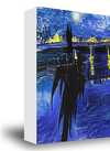
·
Hvit kant Nkr1
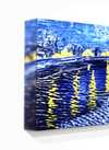
Uskarp kantfinish Nkr1
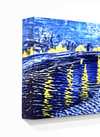
Fortsatt motiv Nkr1
P118B Nkr10
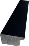
P118H Nkr10
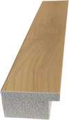
P118W Nkr10
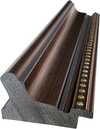
P438Z Nkr10
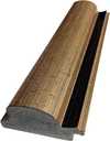
P508JH Nkr12
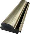
P508YH Nkr12
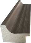
P805H Nkr10
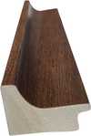
P805Z Nkr10
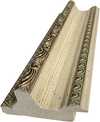
P919BZ Nkr10
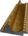
P919G Nkr10
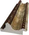
P919XJ Nkr10
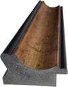
P959ZH Nkr10
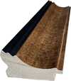
P968JZ Nkr12
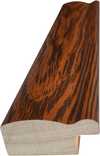
W106C Nkr8
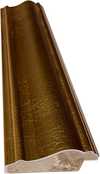
W218G Nkr10
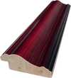
W218JH Nkr8
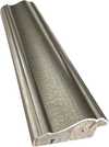
W218Y Nkr10
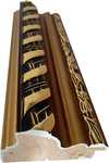
W307PJ Nkr10
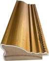
W316G Nkr10
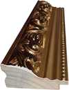
W316PJ Nkr8
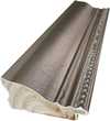
W316Y Nkr10
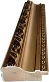
W398PJ Nkr8
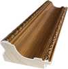
W4111J Nkr10
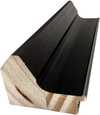
W500HY Nkr15
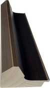
W500JH Nkr15
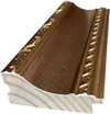
W692G Nkr12
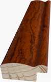
W849H Nkr8
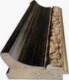
W940BG Nkr15
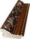
W953PJ Nkr8
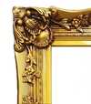
H24-GOLD Nkr30
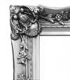
H24-SILVER Nkr30
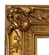
H36-GOLD Nkr45
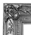
H36-SILVER Nkr45
Sendes i et beskyttende rør, klar til å rammes inn av din egen innrammer.
Over 105 cm sendes rammen som et sett til en profesjonell rammemaker — les detaljene.
Tilleggstjenester
valgfrittHva inkluderer ekstratjenestene?
Verdensomspennende levering () på 2 uker i stedet for standard 4/5 uker. (25 November)
Beskyttende ferniss
Navneskilt
Detaljer om gravert bronseplate
This elegant plaque features the artist's name and the title of the artwork, finely engraved for a timeless presentation.
It is made from bronze with a refined, elegant finish. The text is precisely laser-engraved for a sharp and permanent result. Measuring 9x2 cm, the plaque is compact yet easy to read. It's built to be durable and scratch-resistant, offering a professional, museum-quality look. Mounting is simple thanks to the included adhesive backing.
Detaljer om gjennomsiktig akrylplate
The plaque includes essential engraved details such as the artist's name, the title of the artwork, the date it was created, the type of media used-like oil on canvas or watercolor-a brief description of the piece, and a QR code that links to the complete artwork information.
It is crafted from clear acrylic, offering a sleek, modern appearance. The text is UV-engraved in black to ensure strong visual contrast. With a size of 10x15 cm, it ensures optimal readability. It comes equipped with two metal hooks for secure wall mounting. The plaque is designed to be weather-resistant, making it suitable for various environments, and it includes interactive features that work seamlessly with smartphone scanning.
Detaljer om plakett i svart akryl
This elegant plaque includes engraved information such as the artist's name, the title of the artwork, the date it was created, the type of media used (like oil on canvas or watercolor), a short description of the artwork, and a QR code for quick access to more information.
The plaque itself is made from refined black acrylic with a premium finish. The text is laser-engraved in white for high contrast and readability. Its size is 10x15 cm, designed to be easy to read. It comes with two metal hooks for professional mounting. The design is sleek and fits any interior style. It is also weather-resistant and durable, with built-in digital integration for mobile compatibility.
Glassalternativet er kun tilgjengelig i størrelser under 110 cm
 Glassalternativet er kun tilgjengelig i størrelser under 110 cm
- Gratis ekspressfrakt over hele verden
- Lerretsduk av lin av høy kvalitet
- Full transportforsikring
- Garanti for refusjon av toll og importavgifter
- Garantert fargegjengivelse
- 100 dagers returrett ved fabrikasjonsfeil
- 100% pengene tilbake-garanti
- Rabatt ved flere kjøp


Beskrivelse av objektet
A balanced grid of primary red, blue, and yellow rectangles against black and white, reflecting a search for cosmic order in 1923.
Om kunstneren
Nederlandsk De Stijl-pioner som bruker primærfarger og geometrisk abstraksjon for å skape dynamiske komposisjoner med rette linjer og vinkler.
Om kunstverket
Identification of Composition by Theo van Doesburg
The canvas known as Composition emerges from the mind of Theo van Doesburg, a work that captures a specific moment in 1923. This piece exists as a precise arrangement of form and color, born from a period of intense creative focus. The artist, Theo van Doesburg, brings a sense of equilibrium to the surface, translating abstract thought into a tangible presence. It is a work that demands attention through its structural clarity and its commitment to the principles of the De Stijl movement.
The history of this object is tied to a specific circle of thinkers and patrons. Antony Kok commissioned the work, setting it on its path through the hands of those who shaped the modern era. From there, the painting finds its way into the hands of Bart de Ligt (1883–1938), who becomes its first owner. This transition marks the beginning of a long lineage of stewardship, as the work moves from the artist's studio into a private collection where its presence remains constant.
Every line and color choice within Composition reflects the artist's pursuit of a universal visual language. As we observe the work, we see the direct result of a vision that seeks to strip away the unnecessary to find a fundamental truth. The painting remains a vital part of the history of abstraction, holding the weight of its 1923 origins in every carefully placed rectangle and primary hue.
Visual Composition and Geometric Elements
The canvas unfolds as a precise grid of rectangles, where vertical and horizontal lines intersect to dictate the movement of the eye. There is a profound sense of equilibrium achieved through this arrangement, as non-representational forms find their place within a structured, rhythmic order. The eye moves across the surface, guided by the intersections of these straight lines, finding balance in the way the shapes occupy the space. It is a study in pure geometry, where the subject matter is stripped of any external reference, leaving only the essence of form and relation.
Color acts as the primary force within this structured environment. The palette relies on the fundamental strength of red, yellow, and blue, which anchor the composition. These primary hues interact with a supporting cast of black, white, and grey, creating a tension between the boldest tones and the more neutral shades. The colors appear solid and flat, avoiding any blending or shading, which emphasizes the stark, clean nature of the geometric arrangement. Each rectangle holds its own weight, contributing to a visual language that seeks a universal harmony through simplicity.
Provenance and History of the Object
The history of this work begins in the creative atmosphere of Paris, where it finds its way from the artist's studio into the hands of Bart de Ligt. This acquisition likely occurs in late 1923, marking the start of a long and steady lineage. De Ligt, a man deeply connected to the avant-garde circles of the time, holds the piece within his personal collection until his passing in 1938.
From that moment, the painting enters a quiet, private chapter. It remains within the same family, passing through the hands of descendants for nearly a century. This continuity preserves the work's integrity, keeping it sheltered within a single domestic line since 1923. The colors and forms remain as they were when they first left the artist's side, held in a state of careful preservation through the decades.
Documented Interpretations and Artistic Debates
The canvas captures a moment of profound transition, acting as a key work within the artist's entire oeuvre. It reveals a growing complexity within his purist style, where the rigid logic of geometry begins to dance with a more nuanced sense of equilibrium. One senses the tension between the absolute and the evolving, as the lines and colors find a new, sophisticated rhythm. This evolution suggests a mind moving beyond simple shapes toward a more intricate visual language.
A deep connection between the realm of architecture and the act of painting pulses through the work. The composition feels less like a mere arrangement of pigment and more like a blueprint for a structured reality. This link is no accident; the artist himself articulated the concept behind its creation in the magazine Architectura on 17th July 1923. The painting exists as a bridge, where the spatial logic of built environments meets the spiritual pursuit of pure abstraction.
Related Works by the Same Artist
The evolution of this geometric language unfolds through several other pieces that trace the artist's shifting focus. One can look back to Composition XX from 1920 to see the early movements of these shapes. Nearby in the timeline, the 1923 work Study for a Composition offers a glimpse into the creative process behind these structured arrangements. These works exist as part of a continuous search for balance and order within the frame.
As the years progress, the compositions grow more complex and dynamic. The 1925 Counter composition XIV introduces a different energy to the grid. Later, the Simultaneous Counter-Composition from 1929–1930 pushes the boundaries of the aesthetic even further. Each piece captures a specific moment in a lifelong pursuit of a new visual language, moving from the rigid to the more fluid and experimental.
Spørsmål og svar
Hvordan relaterer motivet i "Composition" seg til Theo van Doesburg sine vanlige temaer?
Theo van Doesburg sine tilbakevendende temaer inkluderer wassily kandinsky, de stijl movement, neoplasticism, geometric abstraction, total work of art; "Composition" fokuserer på red, blue, yellow, black, white, rectangles, lines.
Hvilken lysstyrke har "Composition" av Theo van Doesburg?
Fargene i "Composition" har en Bright Balance luminans.
Hvilken følelse formidler "Composition" av Theo van Doesburg?
Stemningen i "Composition" av Theo van Doesburg kan beskrives som Minimalist, og den emosjonelle tonen er Tranquil.
Kort om verket og kunstquiz
Om Theo van Doesburg

Theo van Doesburg
1883 - 1931, Nederland
Om kunstneren
Theo van Doesburg: Arkitekten av Abstraksjon
Theo van Doesburg, født Christian Emil Marie Küpper den 30. august 1883 i Utrecht, var mer enn bare en maler; han var en revolusjonerende kraft som omformet selve grunnlaget for moderne kunst. Hans reise begynte midt i de vedvarende ekkoene av impresjonismen og postimpresjonismen, og speilet opprinnelig stiler minnende om Vincent van Goghs – både i motivvalg og emosjonell intensitet. Likevel tjente denne tidlige fasen som en kritisk forberedelse, et nødvendig springbrett mot den radikale transformasjonen som skulle definere hans varige arv. Et avgjørende øyeblikk kom i 1913 med møtet med Wassily Kandinskys *Rückblicke*. Denne teksten utløste en dyp erkjennelse i van Doesburg: kunstig ekthet lå ikke i å gjenskape den ytre verden, men i å kanalisere en indre, åndelig virkelighet gjennom ren abstraksjon. Dette var overbevisningen som fødte Neoplasticisme – bevegelsen han grunnla og med lidenskap forsvart, og ble dens mest uttalte forkjemper.Forming a New Visual Language: The Principles of De Stijl
De Stijl var ikke bare en kunstnerisk stil; det var et omfattende filosofisk manifest oversatt til visuell form. Van Doesburg trodde på å redusere kunsten ned til dens mest essensielle elementer – rette linjer, rettvinklede vinkler og de primære fargene rød, gul og blå, sammen med svart, hvitt og grått. Denne austere paletten ble ikke født av begrensning, men fra et ønske om universellhet – en tro på at disse grunnleggende formene resonerte med en underliggende kosmisk orden. Han forestilte seg et *totalt* kunstverk, som utvidet seg utover lerretet for å omfatte arkitektur, design og til og med hverdagsgjenstander. Samarbeid var nøkkelen; van Doesburg arbeidet tett med arkitekter som J.J.P. Oud og Gerrit Rietveld, og designet glassmalerier, møbler og hele interiører som gjenspeilte prinsippene i De Stijl. Hans samarbeid utvidet seg til andre kunstnere som Piet Mondrian, med hvem han grunnla det innflytelsesrike tidsskriftet *De Stijl*, en plattform for å spre deres ideer og skape dialog blant kunstnere og intellektuelle. Likevel oppsto det spenninger mellom van Doesburg og Mondrian om strengheten i Neoplasticismen. Van Doesburg introduserte “Elementarism” i 1926, og forsøkte å injisere dynamikk inn i Neoplasticismen ved å introdusere diagonale linjer og en mer flytende tilnærming til komposisjon.Beyond Painting: A Multifaceted Artistic Vision
Mens han ble feiret som maler, var van Doesburgs kunstneriske strekker bemerkelsesverdig mangfoldige. Han var en produktiv skribent, poet og kritiker, og brukte sin penn til å uttrykke de teoretiske underpinnene til De Stijl og utfordre konvensjonelle oppfatninger av kunst. Hans engasjement i Dadaismen tidlig på 1920-tallet utvidet ytterligere hans kunstneriske horisonter, noe som førte til eksperimentelle verk som inkluderte collage og typografi. Denne perioden så også ham undervise ved Bauhaus, hvor han delte sine ideer med en ny generasjon kunstnere og designere. Han var ikke fornøyd med å forbli innenfor grensene for tradisjonelle kunstformer; van Doesburg søkte aktivt etter å integrere kunst i hverdagen, og trodde at den hadde kraften til å transformere samfunnet. Hans design for interiører og møbler var ikke bare estetiske øvelser, men forsøk på å skape harmoniske boliger som gjenspeilte prinsippene i De Stijl. Et typisk eksempel er hans samarbeid med Sophie Taeuber-Arp og Georges Vantongerloo ved å designe kunstnerboliger, noe som viste en helhetlig tilnærming til kunstnerisk skapelse – et forsøk på å bygge en verden *i* bildet av hans idealer.Influences and Development
Van Doesburgs kunstneriske utvikling var preget av en konstant søken etter nye uttrykksformer og ideer. Han ble dypt påvirket av Kubismen, som han studerte nøye i Paris, og eksperimenterte med å kombinere kubistiske elementer med sine egne abstrakte konsepter. Hans møte med Kandinsky i 1913 var avgjørende for hans overgang til abstraksjon, og inspirerte ham til å se kunst som en måte å uttrykke det spirituelle på. Han ble også en aktiv deltaker i den intellektuelle debatten om kunsten og samfunnet, og skrev artikler og essays om sine ideer. Hans engasjement i Dadaismen førte til at han utforsket nye former for kunstnerisk uttrykk, inkludert collage og typografi, og bidro til å forme den abstrakte bevegelsen på 1920-tallet.Legacy and Enduring Influence
Theo van Doesburgs liv ble tragisk avbrutt i 1931, men hans innflytelse på moderne kunst er fortsatt dypgående. De Stijl, selv om det var relativt kortvarig som en samlet bevegelse, utøvde enorm innflytelse på etterfølgende kunstutviklinger, inkludert Bauhaus-design, Minimalisme og Konstruktivisme. Hans vektlegging av geometrisk abstraksjon, ren farge og funksjonalitet resonnerer fortsatt med kunstnere og designere i dag. Hans verk tjener som en påminnelse om at kunst ikke bare handler om representasjon, men om å utforske grunnleggende former og ideer. Van Doesburgs visjon om en forent, harmonisk verden – uttrykt gjennom språket til De Stijl – inspirerer fortsatt de som søker å skape et mer vakkert og meningsfylt miljø.Key Works & Lasting Impact
- Study for Simultaneous Compositions XXII (1922): Et typisk eksempel på Neoplasticisme, som viser bevegelsens signatur geometriske former og begrensede fargepalett.
- Composition with half values (1928): Demonstrerer van Doesburgs utforskning av tonevariasjoner innenfor De Stijl-estetikken.
- Dancers (1917-1918): Representerer en overgangsfase i hans arbeid, som blander figurative elementer med fremvoksende abstrakte tendenser.
- Collaboration on *De Stijl* journal: En kritisk plattform for å spre bevegelsens ideer og skape dialog blant kunstnere og intellektuelle.
- Elementarism (1926): Van Doesburgs forsøk på å injisere dynamikk inn i Neoplasticismen ved å introdusere diagonale linjer og en mer flytende tilnærming til komposisjon.
Kort om Theo van Doesburg
- Artistic Movement Or Style: De Stijl, Neoplasticisme
- Artists Or Movements Influenced By This Artist:
- Bauhaus
- Minimalisme
- Artists Who Influenced This Artist:
- Wassily Kandinsky
- Vincent van Gogh
- Date Of Birth: 30. august 1883
- Date Of Death: 7. mars 1931
- Full Name: Theo van Doesburg
- Nationality: Nederlandsk
- Notable Artworks:
- Studie for Simultane...
- Komposisjon med halvverdier
- Dansere
- Place Of Birth: Utrecht, Nederland
Utforsk kunstverk organisert etter temaer, stiler og kjennetegn.


Theo van Doesburg
Composition
() ·
Med ramme: ·
Totalt