

Prikazano: · Sa okvirom:
 Pregledaj u prostoru

 Pošalji
 Podeli
 Detalji o delu
 Vodič


 Preuzmi
 Slični predmeti
 Rendgenski snimak
 Automatska prezentacija
 Pitanja i odgovori
 Statistika

- 41.0 x 33.0 cm


дин 7378
Giclee štampa / Umetnički otisak
Giclée štampa ili print na platnu muzejskog kvaliteta uz brzu izradu i raznovrsne opcije završne obrade. ( Kupite ručno oslikano delo Pređi na digitalnu sliku)
 Pročitajte više
Veličina
·Standardne dimenzije
po meri
CM
INCH
Izaberite jednu od naših unapred definisanih veličina koje odgovaraju originalnim proporcijama umetničkog dela.
Učitavanje dimenzija...

širina
visina
Unesite željenu širinu i visinu kako bi se štampa uklopila u vaš ram ili zid. Štampu je moguće samo iseći, ali nikada povećati iznad dimenzija originalne slike, stoga format sa drugačijim proporcijama uzrokuje gubitak dela slike. Pre početka štampe, poslaćemo vam digitalni prikaz radi potvrde. Slika prikazana na ovoj stranici ne predstavlja stvarni isrez — to pokazuje samo digitalni prikaz.
Završetak
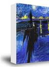
·
Beli rub дин1
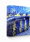
zamrljene ivice дин1
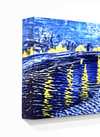
Prošireno дин1
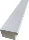
P118B дин10
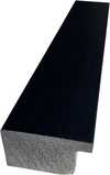
P118H дин10
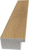
P118W дин10
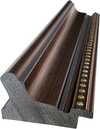
P438Z дин10
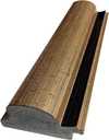
P508JH дин12
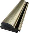
P508YH дин12
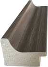
P805H дин10
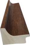
P805Z дин10
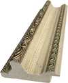
P919BZ дин10
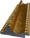
P919G дин10
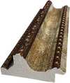
P919XJ дин10
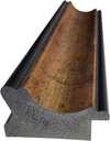
P959ZH дин10
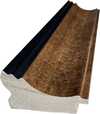
P968JZ дин12
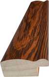
W106C дин8
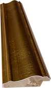
W218G дин10
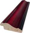
W218JH дин8
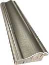
W218Y дин10
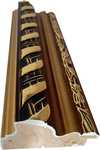
W307PJ дин10
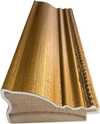
W316G дин10
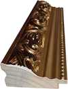
W316PJ дин8
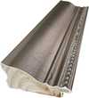
W316Y дин10
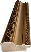
W398PJ дин8
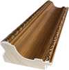
W4111J дин10
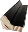
W500HY дин15
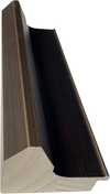
W500JH дин15
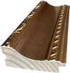
W692G дин12
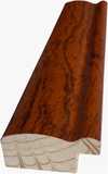
W849H дин8
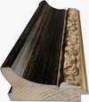
W940BG дин15
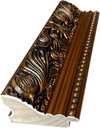
W953PJ дин8
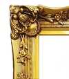
H24-GOLD дин30
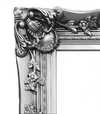
H24-SILVER дин30
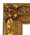
H36-GOLD дин45
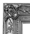
H36-SILVER дин45
Isporućuje se u zaštitnoj tubi, spremno za ugradnju u vaš ram.
Dodatne usluge
opcionoŠta dodatne opcije uključuju?
Dostava širom sveta () za 2 nedelje umesto uobičajenih 4/5 nedelja. (25 новембар)
Zaštitni lak
Kratki opis natpisa
Detalji gravirane bronze ploče
This elegant plaque features the artist's name and the title of the artwork, finely engraved for a timeless presentation.
It is made from bronze with a refined, elegant finish. The text is precisely laser-engraved for a sharp and permanent result. Measuring 9x2 cm, the plaque is compact yet easy to read. It's built to be durable and scratch-resistant, offering a professional, museum-quality look. Mounting is simple thanks to the included adhesive backing.
Detalji prozirne akrilne pločice
The plaque includes essential engraved details such as the artist's name, the title of the artwork, the date it was created, the type of media used-like oil on canvas or watercolor-a brief description of the piece, and a QR code that links to the complete artwork information.
It is crafted from clear acrylic, offering a sleek, modern appearance. The text is UV-engraved in black to ensure strong visual contrast. With a size of 10x15 cm, it ensures optimal readability. It comes equipped with two metal hooks for secure wall mounting. The plaque is designed to be weather-resistant, making it suitable for various environments, and it includes interactive features that work seamlessly with smartphone scanning.
Detalji crne akrilne pločice
This elegant plaque includes engraved information such as the artist's name, the title of the artwork, the date it was created, the type of media used (like oil on canvas or watercolor), a short description of the artwork, and a QR code for quick access to more information.
The plaque itself is made from refined black acrylic with a premium finish. The text is laser-engraved in white for high contrast and readability. Its size is 10x15 cm, designed to be easy to read. It comes with two metal hooks for professional mounting. The design is sleek and fits any interior style. It is also weather-resistant and durable, with built-in digital integration for mobile compatibility.
Opcija sa staklom dostupna je samo za dimenzije manje od 110 cm
 Opcija sa staklom dostupna je samo za dimenzije manje od 110 cm
- Besplatna ekspresna dostava širom sveta
- Visokokvalitetno laneno platno
- Potpuno osiguranje transporta
- Garancija povraćaja carine i uvoznih dažbina
- Garancija vernosti boja
- Politika povraćaja u roku od 100 dana (samo u slučaju nedostataka)
- Garancija povrata 100% novca
- Popust na više proizvoda


Opis predmeta
A balanced grid of primary red, blue, and yellow rectangles against black and white, reflecting a search for cosmic order in 1923.
Biografija umetnika
Holandski pionir De Stijla koji koristi primarne boje i geometrijsku apstrakciju za dinamične kompozicije od pravih linija i uglova.
O umetničkom delu
Identification of Composition by Theo van Doesburg
The canvas known as Composition emerges from the mind of Theo van Doesburg, a work that captures a specific moment in 1923. This piece exists as a precise arrangement of form and color, born from a period of intense creative focus. The artist, Theo van Doesburg, brings a sense of equilibrium to the surface, translating abstract thought into a tangible presence. It is a work that demands attention through its structural clarity and its commitment to the principles of the De Stijl movement.
The history of this object is tied to a specific circle of thinkers and patrons. Antony Kok commissioned the work, setting it on its path through the hands of those who shaped the modern era. From there, the painting finds its way into the hands of Bart de Ligt (1883–1938), who becomes its first owner. This transition marks the beginning of a long lineage of stewardship, as the work moves from the artist's studio into a private collection where its presence remains constant.
Every line and color choice within Composition reflects the artist's pursuit of a universal visual language. As we observe the work, we see the direct result of a vision that seeks to strip away the unnecessary to find a fundamental truth. The painting remains a vital part of the history of abstraction, holding the weight of its 1923 origins in every carefully placed rectangle and primary hue.
Visual Composition and Geometric Elements
The canvas unfolds as a precise grid of rectangles, where vertical and horizontal lines intersect to dictate the movement of the eye. There is a profound sense of equilibrium achieved through this arrangement, as non-representational forms find their place within a structured, rhythmic order. The eye moves across the surface, guided by the intersections of these straight lines, finding balance in the way the shapes occupy the space. It is a study in pure geometry, where the subject matter is stripped of any external reference, leaving only the essence of form and relation.
Color acts as the primary force within this structured environment. The palette relies on the fundamental strength of red, yellow, and blue, which anchor the composition. These primary hues interact with a supporting cast of black, white, and grey, creating a tension between the boldest tones and the more neutral shades. The colors appear solid and flat, avoiding any blending or shading, which emphasizes the stark, clean nature of the geometric arrangement. Each rectangle holds its own weight, contributing to a visual language that seeks a universal harmony through simplicity.
Provenance and History of the Object
The history of this work begins in the creative atmosphere of Paris, where it finds its way from the artist's studio into the hands of Bart de Ligt. This acquisition likely occurs in late 1923, marking the start of a long and steady lineage. De Ligt, a man deeply connected to the avant-garde circles of the time, holds the piece within his personal collection until his passing in 1938.
From that moment, the painting enters a quiet, private chapter. It remains within the same family, passing through the hands of descendants for nearly a century. This continuity preserves the work's integrity, keeping it sheltered within a single domestic line since 1923. The colors and forms remain as they were when they first left the artist's side, held in a state of careful preservation through the decades.
Documented Interpretations and Artistic Debates
The canvas captures a moment of profound transition, acting as a key work within the artist's entire oeuvre. It reveals a growing complexity within his purist style, where the rigid logic of geometry begins to dance with a more nuanced sense of equilibrium. One senses the tension between the absolute and the evolving, as the lines and colors find a new, sophisticated rhythm. This evolution suggests a mind moving beyond simple shapes toward a more intricate visual language.
A deep connection between the realm of architecture and the act of painting pulses through the work. The composition feels less like a mere arrangement of pigment and more like a blueprint for a structured reality. This link is no accident; the artist himself articulated the concept behind its creation in the magazine Architectura on 17th July 1923. The painting exists as a bridge, where the spatial logic of built environments meets the spiritual pursuit of pure abstraction.
Related Works by the Same Artist
The evolution of this geometric language unfolds through several other pieces that trace the artist's shifting focus. One can look back to Composition XX from 1920 to see the early movements of these shapes. Nearby in the timeline, the 1923 work Study for a Composition offers a glimpse into the creative process behind these structured arrangements. These works exist as part of a continuous search for balance and order within the frame.
As the years progress, the compositions grow more complex and dynamic. The 1925 Counter composition XIV introduces a different energy to the grid. Later, the Simultaneous Counter-Composition from 1929–1930 pushes the boundaries of the aesthetic even further. Each piece captures a specific moment in a lifelong pursuit of a new visual language, moving from the rigid to the more fluid and experimental.
Pitanja i odgovori
Na koji način se tema dela "Composition" odnosi na uobičajene teme umetnika Тео Ван Дусбург?
Učestale teme umetnika Тео Ван Дусбург obuhvataju wassily kandinsky, de stijl movement, neoplasticism, geometric abstraction, total work of art; delo "Composition" fokusira se na red, blue, yellow, black, white, rectangles, lines.
Kolika je luminancija dela „Composition”, autor Тео Ван Дусбург?
Boje dela "Composition" pokazuju luminancu od Bright Balance.
Kakav osećaj prenosi „Composition”, autor Тео Ван Дусбург?
Zabeleženo raspoloženje dela „Composition”, autor Тео Ван Дусбург je Minimalist, a njegov emocionalni ton je Tranquil.
Brze činjenice i kviz o umetnosti
O Тео Ван Дусбург

Тео Ван Дусбург
1883 - 1931, Холандија
Biografija umetnika
Архитекта Апстракције: Живот у Геометријској Хармонији
Тео ван Дузбург, рођен као Кристијан Емил Марије Купер 1883. године у Утрехту, Холандија, био је више од сликара; он је био револуционарна сила која је преобликовала саме основе модерне уметности. Његов пут је започео у сенци Импресионизма и Постимпресионизма, првобитно огледајући стилове подсећајуће на Винсента ван Гога – како по тематици тако и по емоционалном интензитету. Међутим, ова рана фаза служила је као кључни прелиминијари, неопходни степеник ка радикалној трансформацији која ће дефинисати његово трајно наслеђе. Преломни тренутак дошао је 1913. године са сусретом са *Rückblicke* Василија Кандинског. Овај текст је пробудио у ван Дузбургу дубоко увиђање: права уметничка експресија не лежи у реплицирању спољашњег света, већ у каналисању унутрашње, духовне стварности кроз чисту апстракцију. Управо је ово уверење родило Неопластицизам, познатији као Де Стијл – покрет који је он основао и жестоко заступао, постајући његов најстраственији присталица.Ковање Новог Визуелног Језика: Принципи Де Стијла
Де Стијл није био само уметнички стил; то је била свеобухватна филозофска декларација преведена у визуелни облик. Ван Дузбург је веровао да треба скинути уметност до њених најсуштинскијих елемената – правих линија, правих углова и примарних боја црвене, жуте и плаве, заједно са црном, белом и сивом. Ова строга палета није рођена из ограничења, већ из жеље за универзалношћу – уверење да ови фундаментални облици одговарају основном космичком поретку. Замислио је *тотално* уметничко дело, које се протеже ван платна како би обухватило архитектуру, дизајн и чак обичне предмете. Сарадња је била кључна; ван Дузбург је блиско радио са архитектима као што су Ј.Ј.П. Оуд и Герит Ритвелд, пројектујући витраже, намештај и читаве ентеријере који су уградили принципе Де Стијла. Његова сарадња се протезала на колеге уметнике као што је Пит Мондријан, са којим је заједно основао угледни часопис *Де Стијл*, платформу за ширење својих идеја и привлачење сродних стваралаца. Ипак, упркос њиховом заједничком почетку, тензије су настале између ван Дузбурга и Мондријана у вези крутости Неопластицизма. Ван Дузбург је представио “Елементаризам” 1926. године, заговарајући дијагоналне линије и динамичнији композициони приступ – одступање које је на крају довело до раскола унутар покрета, откривајући његов немиран дух и константну потрагу за уметничком еволуцијом.Иза Сликарства: Многострана Уметничка Визија
Иако је слављен као сликар, ван Дузбургове уметничке тежње биле су изузетно разноврсне. Био је плодан писац, песник и критичар, користећи перо да артикулише теоријске основе Де Стијла и оспорава конвенционална схватања уметности. Његово ангажовање са Дадаизмом раних двадесетих година додатно је проширило његов уметнички хоризонт, доводећи до експерименталних дела која су укључивала колаж и типографију. Ово доба га је такође видело како предаје на Баухаусу, где је делио своје идеје са новом генерацијом уметника и дизајнера. Није био задовољан да остане у оквирима традиционалних уметничких форми; ван Дузбург је активно тражио да интегрише уметност у свакодневни живот, верујући да има моћ да трансформише друштво. Његови дизајни за ентеријере и намештај нису били само естетички експерименти, већ покушаји стварања хармоничних животних простора који су одражавали принципе Де Стијла. Још један пример је његова сарадња са Софијом Таубер-Арп и Жоржем Вантонгелоом на пројектовању резиденција уметника, демонстрирајући холистички приступ стваралаштву – покушај изградње света *у* слици његових идеала.Наслеђе и Трајан Утицај: Пионир Модернизма
Живот Теа ван Дузбурга је трагично прекинут 1931. године у доби од 47 година, али његов утицај на модерну уметност остаје дубок. Де Стијл, иако релативно краткотрајан као кохезивни покрет, имао је огроман утицај на каснији уметнички развој, укључујући Баухаус дизајн, Минимализам и Конструктивизам. Његов акцент на геометријској апстракцији, чистој боји и функционализму наставља да одјекује са уметницима и дизајнерима данас. Његово дело служи као подсетник да уметност није само о репрезентацији, већ о истраживању фундаменталних облика и идеја. Ван Дузбургово наслеђе се протеже ван његових слика и дизајна; лежи у његовој непоколебљивој посвећености уметничкој иновацији и веровању у трансформативну моћ апстракције. Његова визија унификованог, хармоничног света – изражена кроз језик Де Стијла – наставља да инспирише оне који траже стварање лепшег и значајнијег окружења.Кључна Дела & Трајан Утицај
- Студија за Композиције Двадесет и две (1922): Квинтeсенцијални пример Неопластицизма, који показује карактеристичне геометријске облике покрета и ограничену палету боја.
- Композиција са пола вредности (1928): Демонстрира ван Дузбургово истраживање тоналних варијација унутар Де Стијл естетике.
- Плесачи (1917-1918): Представља прелазни период у његовом раду, спајајући фигуративне елементе са новим апстрактним тенденцијама.
- Сарадња на часопису *Де Стијл*: Кључна платформа за ширење идеја покрета и неговање дијалога међу уметницима и интелектуалцима.
- Елементаризам (1926): Ван Дузбургов покушај да убризне динамику у Неопластицизам, уведући дијагоналне линије и флуиднији композициони приступ.
Kratke činjenice o umetniku Тео Ван Дусбург
- Artistic Movement Or Style: De Stijl, Neoplasticizam
- Artists Or Movements Influenced By This Artist:
- Bauhaus
- Minimalizam
- Konstruktivizam
- Artists Who Influenced This Artist:
- Wassily Kandinsky
- Vincent van Gogh
- Date Of Birth: 30. avgust 1883.
- Date Of Death: 7. mart 1931.
- Full Name: Theo van Doesburg
- Nationality: Holanđanin
- Notable Artworks (List Of Titles):
- Study for Simultaneous...
- Composition with half values
- Dancers
- Place Of Birth (City And Country): Utrecht, Holandija
Istražite umetnička dela organizovana prema temama, stilovima i karakteristikama.


Тео Ван Дусбург
Composition
() ·
Sa okvirom: ·
Ukupno