

 实景预览

 印象派油画
 分享
 分享
 详情
 作品详情表


 下载作品
 相似作品
 X射线
 幻灯片播放
 问答

 统计数据
Stranded (莱昂内尔·费宁格)


27 x 37 cm 起售价 ¥314 的帆布画与艺术微喷
- Free Worldwide Shipping in 3 to 4 Weeks
- 100天无忧退货,全额退款
- ArtShopReviews.com 上 241 位客户评分为 4.9/5
材质与媒介
 了解更多
Our budget print: the same image printed on a 260 g/m² polyester canvas instead of cotton, delivered rolled in a tube by regular post in 3 to 4 weeks. Rolled only (no stretcher, no frame) and no urgent production, for sizes with at least one side of 80 cm or less. About 30% cheaper than the cotton canvas print.
此尺寸暂不可用:至少有一边必须小于或等于 80 cm。
仅限卷装:请选择卷装画布以购买此版画。
适用于任一边长不超过 100 cm 的尺寸。若尺寸超过此范围,印刷品将采用哑光棉质画布制作。
此尺寸无法选择哑光档案级画布:至少有一边必须小于或等于 100 cm。您的打印件将改为使用哑光棉质画布。
玻璃选项仅适用于110厘米以下的尺寸。
尺寸
·您可以从与原作比例一致的预设尺寸中进行选择。
正在加载尺寸...

宽度
高度
请输入您所需的宽度和高度,以适配您的画框或墙面。由于印刷品只能进行裁剪,无法超出原图尺寸,因此若比例不一致,画面的一部分将会被裁切。在正式印刷之前,我们会为您发送一份数字效果图供您确认。本页面显示的图片并非最终裁剪后的效果——只有效果图才能展示真实的裁剪情况。
标准尺寸
定制
厘米
英寸
完成
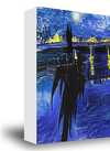
·
白色边缘 ¥1
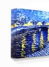
边缘晕染效果 ¥1
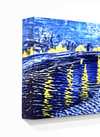
延展式 ¥1
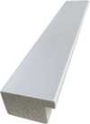
P118B ¥10
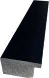
P118H ¥10
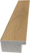
P118W ¥10
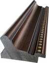
P438Z ¥10
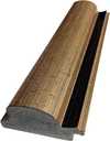
P508JH ¥12
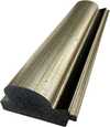
P508YH ¥12
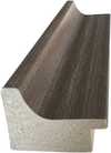
P805H ¥10
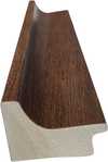
P805Z ¥10
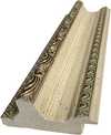
P919BZ ¥10
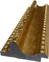
P919G ¥10
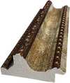
P919XJ ¥10
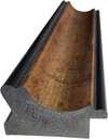
P959ZH ¥10
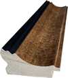
P968JZ ¥12
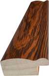
W106C ¥8
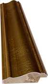
W218G ¥10
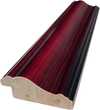
W218JH ¥8
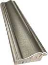
W218Y ¥10
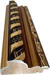
W307PJ ¥10
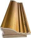
W316G ¥10
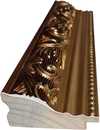
W316PJ ¥8
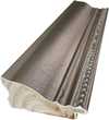
W316Y ¥10
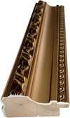
W398PJ ¥8
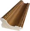
W4111J ¥10
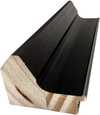
W500HY ¥15
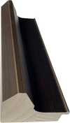
W500JH ¥15
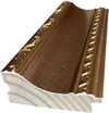
W692G ¥12
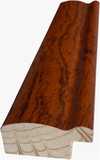
W849H ¥8
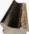
W940BG ¥15
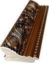
W953PJ ¥8
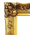
H24-GOLD ¥30
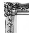
H24-SILVER ¥30
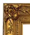
H36-GOLD ¥45
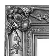
H36-SILVER ¥45
采用保护管包装寄送,方便您交由专业的装裱师进行装裱。
增值服务
可选附加内容包含哪些内容?
全球配送()仅需 2 周即可送达,无需等待标准流程的 4/5 周。(7 December)
经济型聚酯帆布印画不支持加急制作及快递服务,将通过普通邮政寄送。
保护性清漆
展品铭牌
青铜铭牌雕刻详情
这款优雅的铭牌刻有艺术家姓名与作品名称,工艺精湛,呈现永恒之美。
采用青铜材质打造,表面处理细腻优雅。文字经激光精密雕刻,字迹清晰且永不褪色。铭牌尺寸为 9x2 厘米,小巧精致且易于阅读。材质坚固耐用、抗刮擦,呈现出专业博物馆级的质感。随附背胶,安装简便。
透明亚克力铭牌详情
铭牌包含精美的雕刻细节,包括艺术家姓名、作品名称、创作日期、媒介类型(如布面油画或水彩)、作品简介,以及可跳转至作品完整信息的二维码。
采用透明亚克力材质打造,外观简约现代。文字采用黑色UV雕刻工艺,确保视觉对比鲜明。尺寸为10x15厘米,确保极佳的阅读体验。配备两个金属挂钩,可稳固地安装在墙面上。铭牌设计具备耐候性,适用于多种环境,并包含可与智能手机扫描无缝衔接的互动功能。
黑色亚克力铭牌详情
这款优雅的铭牌包含刻有艺术家姓名、作品名称、创作日期、媒介类型(如布面油画或水彩)、作品简介以及用于快速获取更多信息的二维码。
铭牌采用精选黑色亚克力材质,表面处理工艺考究,质感高级。文字采用白色激光雕刻,对比度高,清晰易读。尺寸为10x15厘米,设计便于阅读。配有两枚金属挂钩,便于专业安装。设计风格简约,适配各种室内风格。此外,铭牌具有耐候性且经久耐用,并内置数字化集成功能,可实现移动端兼容。
玻璃选项仅适用于110厘米以下的尺寸。
 玻璃选项仅适用于110厘米以下的尺寸。
- Free Worldwide Shipping in 3 to 4 Weeks
- 优质亚麻画布
- 全程运输保险
- 关税退款保证
- 色彩精准还原保证
- 100天无忧退货,全额退款
- 100% 退款保证
- 多件购买优惠


Stranded:莱昂内尔·费宁格 与Expressionism时期的经典之作
Fragmented sailing ships dissolve into angular geometric planes and muted gray washes in this expressive watercolor study of isolation.
关于艺术品详情
The Depiction of Stranded by Lyonel Feininger
In Stranded, Lyonel Feininger presents a scene of sailing ships at sea, though the familiar maritime subject is transformed through a highly abstracted lens. Rather than a literal representation of vessels navigating the waves, the work offers a fragmented view of these ships. The forms are broken into angular planes and overlapping shapes that disrupt a traditional sense of perspective. This approach creates a feeling of disorientation, as if the viewer is witnessing a moment of profound isolation or abandonment.
The subject matter is stripped of its conventional clarity. Instead of solid hulls and billowing sails, we encounter a series of intersecting lines and geometric shapes. This fragmentation suggests a sense of being lost or adrift, a sentiment reinforced by the title. The ships appear as echoes of their former selves, caught in a space where the boundaries between the sea and the sky are blurred by muted tones and shifting forms.
Composition and Visual Elements of the Work
The composition of this piece is highly unconventional, eschewing the stability we typically expect from a maritime scene. Instead of a grounded perspective, the space seems to tilt and shift, creating a sense of disorientation. Diagonal lines dominate the work, cutting through the frame to disrupt any sense of traditional equilibrium. These sharp, angular lines intersect at odd angles, working alongside overlapping forms to fragment the subject matter into a series of disconnected planes.
Geometric shapes, specifically triangles and rectangles, dictate the structure of the composition. These forms represent the hulls, masts, and sails of the ships, yet they are rendered with a fractured logic that denies a clear horizon line. The absence of a steady horizon contributes to the feeling of being adrift. The arrangement of these elements feels both arbitrary and deliberate, contributing to an overall atmosphere of unease and isolation.
Technique and Materials Used in the Artwork
In this work, the artist employs watercolor as the primary medium, utilizing the fluid nature of the pigment to establish the atmosphere. Through the careful layering of color washes, a sense of tonal variation is achieved, allowing the grays and creams to shift subtly across the surface. This method creates a soft, impressionistic background that suggests the presence of water or sky without relying on heavy, opaque applications.
The structural integrity of the composition relies on more deliberate, linear marks. These lines, likely rendered with a pen or pencil, provide a sharp contrast to the softer watercolor washes. They define the angular planes of the ships and the intersecting geometric shapes that characterize the scene. This interplay between the translucent, bleeding edges of the paint and the precise, controlled lines creates a tension within the work's surface.
The choice of materials—watercolor paints applied to paper—is evident in the subtle graininess visible through the washes. This texture adds a tactile quality to the piece, grounding the abstraction in the physical reality of the medium. The artist's hand is visible in the way the pigment settles into the fibers of the paper, particularly where the colors are most diluted.
Artistic Style and Visual Characteristics
The work is deeply rooted in Expressionism, prioritizing a subjective emotional state over a literal representation of the sea. You can see this through the way the forms are broken apart, revealing a clear Cubist influence. Rather than presenting a cohesive vessel, the artist uses a fragmentation of forms to disrupt the viewer's sense of space. This approach creates a tension between the recognizable subject of sailing ships and the abstract, geometric reality of the composition.
The color palette is restrained and somber, relying on a quiet arrangement of grays, browns, and creams. These muted tones are punctuated only by small, deliberate accents of orange that catch the eye amidst the more subdued washes. The lighting is diffused and even, lacking a singular, dramatic source. This evenness flattens the image, working in tandem with the watercolor technique to produce a relatively smooth texture across the surface of the paper.
Related Works by Lyonel Feininger
To understand the nuances of this piece, one might look toward other maritime explorations by the artist. His interest in the sea often manifested through various media and stylistic shifts. For instance, Boats offers a different perspective through the lens of cubism, rendered in oil on canvas. This work provides a point of comparison for how Feininger approached the fragmentation of nautical forms. Similarly, The Motor Boat exists within his body of work, reflecting his ongoing engagement with these aquatic subjects.
The artist's versatility is further evident in his use of different mediums to capture light and atmosphere. While Stranded utilizes watercolor, his work Werder I also employs this medium to explore tonal variations. There is a certain continuity in how he handles the fluidity of the sea across these different applications. Even the more subtle movements of the water are addressed in Gentle swell, which remains a significant related work in the catalog.
常见问题与解答
Stranded 的这件复制品是手绘的还是印刷的?
印刷:Stranded 将以艺术微喷(giclée)工艺印制在棉质画布或爱普生(Epson)档案级画布纸上。
Stranded 我该选择什么尺寸?
尺寸从 27.2 x 36.8 cm (¥314) 到 180.8 x 244.2 cm (¥2385) 不等;本页表格列出了主要步骤及其价格。
莱昂内尔·费宁格 在创作《Stranded》时使用了什么媒介?
Watercolor
艺术速览与艺术小测验
关于 莱昂内尔·费宁格

莱昂内尔·费宁格
1871 - 1956, 美國
关于 莱昂内尔·费宁格 的简介
- Artistic Movement Or Style: 表现主义、立体主义
- Artists Or Movements Influenced By This Artist:
- 包豪斯运动
- 路德维希·赫什菲尔德·马克
- Date Of Birth: 1871年7月17日
- Date Of Death: 1956年1月13日
- Full Name: 莱昂内尔·费宁格
- Nationality: 美德双重国籍
- Notable Artworks (List Of Titles):
- 韦尔德岛I
- 加贝尔多夫II
- 船
- Place Of Birth (City And Country): 美国纽约市

莱昂内尔·费宁格
Stranded
() ·
含框总尺寸: ·
总计