由我们的艺术家按需定制,为您提供您所选尺寸及画框的布面手工油画。 (![]() Switch to Print
Switch to Print![]() Switch to Image)
Switch to Image)
从与原作比例一致的预设尺寸中进行选择。
您可以输入自定义尺寸,以适配特定的画框或空间。如果所选尺寸与原图比例不符,我们将通过裁剪作品或添加手绘元素来扩展画面。数字样稿将在制作开始前发送给您确认。
请注意,屏幕预览无法准确反映实际的裁剪或扩展效果,只有样稿才能真实呈现最终的构图。
虽然我们提供定制尺寸服务,但为了保留原作比例,建议您从预设列表中选择尺寸。

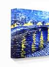
Sacrifice
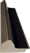
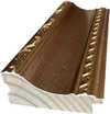
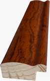
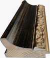
复制品尺寸
Mark Rothko's “Sacrifice,” painted in 1946, isn’t merely a canvas filled with color; it’s an immersion. The work immediately confronts the viewer with a profound sense of melancholy and quiet contemplation – a feeling that lingers long after the initial glance. Dominated by a palette of muted blues, grays, and ochres, the painting eschews sharp outlines or representational imagery, instead opting for a carefully orchestrated layering of translucent washes and subtle shifts in tone. It’s a landscape not of space, but of emotion, a visual embodiment of introspection.
Rothko's approach during this period – often referred to as his “Color Field” phase – was revolutionary. He moved away from figuration, believing that color itself could convey profound spiritual and emotional experiences. “Sacrifice,” like many works from this era, is built upon the principle of ‘all-over’ composition; every area of the canvas contributes to the overall effect, creating a sense of unity and dissolving any clear focal point. The fragmented figures, barely discernible within the washes of color, aren't portraits but rather echoes of humanity – suggestions of individuals caught in a moment of profound reflection or perhaps even sorrow.
The painting’s remarkable depth is achieved through Rothko’s masterful use of layering and glazing. He applied thin washes of color, allowing them to bleed into one another, creating a hazy, atmospheric effect. The surface isn't smooth; it retains the evidence of his process – visible brushstrokes and subtle variations in texture that add to the painting’s tactile quality. He employed a technique he called “veiling,” where layers of translucent color were applied over previous ones, subtly altering their hue and intensity. This created an illusion of depth and luminosity, as if the colors themselves were radiating light.
The choice of materials – watercolor and gouache on paper – is crucial to understanding the work’s ethereal quality. Watercolor's inherent fluidity lends itself perfectly to Rothko’s atmospheric style, while gouache provides a slightly more opaque layer, allowing him to control the intensity of color and create subtle gradations. The use of paper, rather than canvas, contributes to the painting’s intimate scale and delicate feel.
The title, “Sacrifice,” immediately invites interpretation. While Rothko rarely offered explicit explanations for his work, it's widely believed that this piece explores themes of loss, mortality, and spiritual yearning. The muted colors evoke a sense of sadness and resignation, while the fragmented figures suggest a search for meaning in a world often marked by suffering. Some art historians connect the painting to Rothko’s own personal experiences – his early losses, his displacement as a Jewish immigrant, and his lifelong struggle with existential questions.
Beyond individual interpretation, “Sacrifice” resonates on a broader level. The painting's ambiguity allows viewers to project their own emotions and experiences onto the canvas, creating a deeply personal connection. It’s a work that demands quiet contemplation, inviting us to confront our own mortality and grapple with the mysteries of existence.
“Sacrifice” stands as a pivotal example of Rothko's mature style – a testament to his ability to transform simple colors into profound expressions of human emotion. Its enduring appeal lies in its capacity to evoke a wide range of responses, from melancholy and introspection to awe and wonder. Reproductions of this work continue to captivate audiences worldwide, serving as a reminder of the power of art to transcend language and connect us to something deeper within ourselves.

1903 - 1970 , 拉脱维亚

Explore the profound emotional depth of Mark Rothko's abstract expressionism. Discover the history, techniques & lasting impact of this pivotal Color Field painter. Expert insights for collectors and art enthusiasts.

Explore 10 famous paintings bathed in 'Pale Goldenrod' tones! From Van Gogh’s sunflowers to Monet’s haystacks, discover the stories & artistry behind these iconic artworks. Find museum-quality reproductions and curated decor ideas at TopImpressionists.com.

Explore the vibrant world of Gene Davis and the Washington Color School. Discover his iconic stripe paintings, innovative techniques, and lasting impact on American abstract art. A deep dive for collectors & enthusiasts.

Explore 10 iconic paintings with captivating 'mushroom' tones! Discover Van Gogh, Monet & Rembrandt’s masterpieces—earthy palettes, rich history & artistic techniques. Find museum-quality art reproductions and curated decor ideas at

Explore the groundbreaking abstract expressionism of Morris Louis, a pioneer of Color Field painting. Discover his innovative techniques, influential series & lasting legacy in post-war American art. Learn more at TopImpressionists.

第一时间获取最新的艺术新闻、独家优惠及装饰灵感。
向我们介绍您的项目需求,我们的艺术专家将为您提供 3 个个性化的艺术品推荐。
由我们的专家为您精选 3 款心仪之作 —— 完全免费!

 分享
分享


 玻璃选项仅适用于110厘米以下的尺寸。


