
从与原作比例一致的预设尺寸中进行选择。
您可以输入自定义尺寸,以适配特定的画框或空间。如果您选择的尺寸与原图比例不符,我们将对作品进行裁剪,或通过镜像填充/纯色填充边缘的方式来扩展图像。在开始制作之前,我们会向您发送一份数字效果图供您确认。
请注意,屏幕上的预览并不能反映实际的裁剪或扩展效果。只有效果图才能准确展示最终的构图。
虽然我们提供定制尺寸,但为了保持原图比例,我们建议您从预设列表中选择尺寸。

Counter composition XV
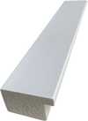
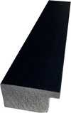
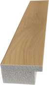
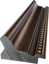
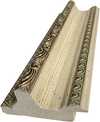
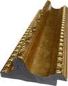
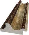
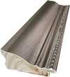
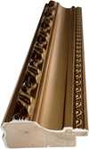
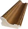
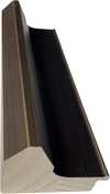
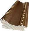
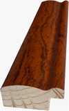
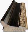
复制品尺寸
Theo van Doesburg's "Counter Composition XV," painted in 1925, isn’t merely a painting; it’s a distilled essence of the De Stijl movement – a radical declaration of order and universal harmony. This deceptively simple work, executed against a stark white canvas, pulsates with an underlying tension born from the careful orchestration of geometric forms and primary colors. It represents a pivotal moment in 20th-century art, moving beyond representational imagery to explore the very foundations of visual language itself. The piece immediately commands attention not through elaborate detail or narrative, but through its profound sense of balance and its unwavering commitment to abstraction.
At first glance, the composition appears austere – a red rectangle dominating the upper left quadrant, juxtaposed with a blue counterpart in the lower right. However, this initial impression quickly gives way to an appreciation for the intricate grid that underpins the entire work. A network of black and white squares, meticulously arranged, creates a dynamic interplay of movement and stillness, suggesting both order and potential disruption. This isn’t haphazard placement; it's a deliberate choreography designed to evoke a feeling of controlled dynamism – a visual embodiment of De Stijl’s core philosophy.
The brilliance of "Counter Composition XV" lies in its reduction. Van Doesburg stripped away all extraneous elements, leaving only the fundamental building blocks of form and color: red, yellow, blue, black, and white. This limited palette wasn’t chosen arbitrarily; each hue was selected for its inherent purity and intensity, intended to be experienced without distraction. The application is equally crucial – flat, unmodulated areas devoid of shading or blending. This technique emphasizes the geometric shapes themselves, highlighting their sharp edges and creating a sense of crystalline clarity. It's a testament to the artist’s belief that beauty could be found in simplicity and precision.
The absence of perspective is equally significant. Van Doesburg deliberately rejects traditional spatial representation, opting instead for a two-dimensional plane where shapes are presented as independent entities. Overlapping elements and variations in size subtly suggest depth, but the overall effect is one of flattened planes interacting within a carefully constructed framework. This approach reflects De Stijl’s rejection of illusionism and its embrace of a purely conceptual understanding of space.
Beyond its formal qualities, "Counter Composition XV" carries profound symbolic weight. The geometric forms – rectangles, squares, lines – are not merely decorative; they represent fundamental principles of order, balance, and harmony. The primary colors, stripped of their associations with natural phenomena, become pure expressions of energy and vibration. Van Doesburg believed that through the rigorous application of these abstract elements, artists could create a visual language capable of transcending individual expression and communicating universal truths. The piece is an attempt to build a new aesthetic based on mathematical ratios and geometric relationships – a blueprint for a harmonious world reflected in art.
Theo van Doesburg’s “Counter Composition XV” stands as a powerful testament to the transformative potential of abstraction. It's more than just a painting; it’s an invitation to contemplate the underlying order of the universe and the possibility of creating beauty through pure geometric form. Its stark simplicity, combined with its profound symbolic depth, continues to resonate with viewers today, cementing its place as a cornerstone of modern art.

1883 - 1931

探索几何抽象艺术的十大杰作!康定斯基、蒙德里安等大师作品,色彩构成与非具象之美。TopImpressionists.com提供博物馆级艺术复制品,为您的家居带来现代艺术灵感。立即在线探索完整系列!

Explore the evolution of Willem de Kooning's iconic Abstract Expressionist paintings. Discover his signature style, key themes & investment potential with expert insights for discerning art collectors.

Explore the revolutionary De Stijl movement & Neo-Plasticism with our expert guide. Discover Piet Mondrian, Theo van Doesburg, and the lasting impact of this influential art style. Learn about collecting & investing in De Stijl masterpieces.

深入探析奥菲斯主义:现代艺术抽象根源的色彩与形式交响。了解德劳内、康定斯基等大师,探索立体主义突破及对后世艺术的影响。TopImpressionists.com提供高品质艺术复制品和定制服务。

深入探索新造型主义的起源、核心原则及其深远影响。了解蒙德里安的艺术之路,风格派杂志的角色,以及如何收藏和鉴赏这一重要的现代艺术流派。TopImpressionists.com为您提供专业的艺术咨询服务。


第一时间获取最新的艺术新闻、独家优惠及装饰灵感。
向我们介绍您的项目需求,我们的艺术专家将为您提供 3 个个性化的艺术品推荐。
由我们的专家为您精选 3 款心仪之作 —— 完全免费!
 分享
分享


 玻璃选项仅适用于110厘米以下的尺寸。


