


 معاينة الحجم الواقعي
 إرسال
إرسال مشاركة
 عرض التفاصيل
 دليل الأعمال الفنية للطلاب

 تحميل
تحميل
 قطع مشابهة
 الأشعة السينية
 عرض شرائح متتابع
 الإحصائيات
The pink tablecloth

Delve into Henri Matisse's "The Pink Tablecloth" (c.1924-1925), a vibrant Fauvist masterpiece showcasing bold color palettes and simplified forms. Explore its legacy at Glasgow Life Museums.
 اقرأ المزيد
استكشف عالم هنري ماتيس (1869-1954)، رائد الفوفية وإتقان الألوان! اكتشف لوحاته الشهيرة، أعمال الكولاج الورقي، وتأثيره العميق على الفن الحديث. رسام فرنسي بارز.
طباعة جيلي / مطبوعات فنية
طباعة جيكلي أو كانفاس بجودة المتاحف، مع سرعة في التنفيذ وخيارات متنوعة للتشطيب. ( اطلب نسخة مرسومة يدويًا التحويل إلى الصورة الرقمية)




P118B E£10

P118H E£10

P118W E£10

P438Z E£10

P508JH E£12

P508YH E£12

P805H E£10

P805Z E£10

P919BZ E£10

P919G E£10

P919XJ E£10

P959ZH E£10

P968JZ E£12

W106C E£8

W218G E£10

W218JH E£8

W218Y E£10

W307PJ E£10

W316G E£10

W316PJ E£8

W316Y E£10

W398PJ E£8

W4111J E£10

W500HY E£15

W500JH E£15

W692G E£12

W849H E£8

W940BG E£15

W953PJ E£8




مقاس قياسي
مخصص
CM
INCH
اختر من بين أحجامنا المُعدّة مسبقاً والتي تتوافق مع النسب الأصلية للعمل الفني.
Loading sizes...

العرض
الارتفاع
يمكنك إدخال أبعاد خاصة لتناسب إطاراً أو مساحة معينة. وفي حال عدم تطابق الحجم المختار مع نسب الصورة الأصلية، سنقوم إما بقص العمل الفني أو تمديد الصورة باستخدام حافة معكوسة أو لون مصمت. وسيتم إرسال نموذج تجريبي رقمي لاعتمادك قبل بدء عملية الإنتاج.
يرجى ملاحظة أن المعاينة على الشاشة لا تعكس عملية القص أو التمديد الفعلية؛ حيث سيوضح النموذج التجريبي فقط التكوين النهائي بدقة.
وعلى الرغم من توفر أحجام مخصصة، إلا أننا نوصي باختيار أبعاد من القائمة المحددة مسبقاً للحفاظ على النسب الأصلية.
توصيل عالمي إلى خلال أسبوعين بدلاً من المدة القياسية البالغة 4/5 أسابيع. (12 أكتوبر)

شحن سريع ومجاني لجميع أنحاء العالم

قماش كتان فاخر

تأمين شامل على الشحن

ضمان استرداد الرسوم الجمركية

ضمان دقة مطابقة الألوان

سياسة الإرجاع خلال 100 يوم (في حالات العيوب فقط)

ضمان استرداد نقدي بنسبة 100%

عرض خصم الكميات
 خيار الزجاج متاح فقط للمقاسات التي تقل عن 110 سم

The pink tablecloth
طباعة جيلي / مطبوعات فنية
مقاس النسخة المطبوعة
-


إجمالي السعر
E£ 3544
The Pink Tablecloth: A Study in Matisse’s Bold Color Palette
Henri Matisse's "The Pink Tablecloth," painted around 1924-1925, stands as a quintessential example of Fauvist art—a movement that championed unrestrained color and simplified forms as reactions against Impressionism. This unassuming still life transcends mere depiction; it’s an exploration of emotion conveyed through pigment, reflecting Matisse's profound belief in painting as a vehicle for expressing inner feelings rather than objective reality. The artwork resides within the collection of Glasgow Life Museums, acquired from William McInnes in 1944, and its accession number is 2402. Measuring approximately 60.3 x 81 cm (approximately 23 ¾ x 32 inches), it’s a relatively small canvas that belies the monumental impact of Matisse's artistic vision.- Style: Fauvist – Characterized by its deliberate disregard for naturalistic color, “The Pink Tablecloth” prioritizes vibrant hues—primarily shades of pink—to create an atmosphere of warmth and tranquility. This bold chromatic choice distinguishes it from the muted tones favored by Impressionists who sought to capture fleeting moments of light and shadow.
- Technique: Matisse employed a loose brushstroke technique, applying paint thickly onto the canvas with visible marks that contribute to the textural richness of the composition. The artist’s deliberate layering of color creates depth and luminosity, emphasizing the materiality of the surface itself.
الأسئلة والأجوبة
ما مدى سطوع "The pink tablecloth" للفنان هنري ماتيس؟
تتمتع لوحة "The pink tablecloth" للفنان هنري ماتيس بدرجة سطوع تبلغ Soft Shadow. ويصف السطوع مقدار الضوء الذي تبدو الألوان عاكسة له.
أين يمكنني مشاهدة معاينة لـ "The pink tablecloth"؟
لمعاينة نسخة من "The pink tablecloth" للفنان هنري ماتيس، افتح صفحة معاينة الخاصة بالعمل الفني.
هل يمكنني استخدام تقنية الواقع المعزز لرؤية "The pink tablecloth" للفنان هنري ماتيس في غرفتي؟
تتوفر ميزة المعاينة بالواقع المعزز لـ "The pink tablecloth": حيث تعرض صفحة معاينة الواقع المعزز العمل الفني في مساحتك الخاصة عبر جهاز متوافق.
ما هي الغرفة التي يُنصح بوضع "The pink tablecloth" للفنان هنري ماتيس فيها، بالنظر إلى ألوانه؟
بفضل لوحة ألوانه التي تتميز بـ Earthy، يُنصح بوضع "The pink tablecloth" للفنان هنري ماتيس في Dining Room؛ حيث تُعد الألوان أحد الأسباب وراء هذا الاقتراح.
كيف يمكنني الحصول على نسخة رقمية من "The pink tablecloth" للفنان هنري ماتيس؟
للحصول على نسخة رقمية من "The pink tablecloth" للفنان هنري ماتيس، اطلب تحميل صورة رقمية عالية الدقة عبر هذه الصفحة.
ما هي الموضوعات التي تظهر في "The pink tablecloth" للفنان هنري ماتيس؟
تُصور "The pink tablecloth" للفنان هنري ماتيس: still life, fruit composition, color palette, table setting, decorative art, post impressionism, floral arrangement.
هل يُعد "The pink tablecloth" أحد أكثر أعمال هنري ماتيس شهرة؟
يتمتع "The pink tablecloth" للفنان هنري ماتيس بمستوى شعبية Iconic. ويعكس هذا التصنيف مدى انتشار شهرة هذا العمل الفني.
ما مدى إشراق "The pink tablecloth" بشكل عام؟
بشكل عام، تم تسجيل درجة السطوع لـ "The pink tablecloth" بـ balanced. ويصف السطوع المدرك مدى ظهور العمل الفني كضوء أو عتمة.
نبذة عن الفنان
هنري ماتيس: رائد الألوان وعبقري التكوين
من قلب مدينة لوكاتو كامبريزيس الصغيرة في شمال فرنسا، بزغ هنري إميل بنوا ماتيس (31 ديسمبر 1869 – 3 نوفمبر 1954) ليرسم لنفسه مسارًا فنيًا فريدًا، بعيدًا عن المسارات التقليدية. بعد دراسة القانون في باريس، تغيرت حياته بشكل جذري إثر إصابته بالتهاب الزائدة الدودية عام 1889. خلال فترة نقاهة طويلة، اكتشف شغفًا دفينًا بالرسم، هدية بسيطة من والدته أشعلت شرارة الإبداع فيه. لم يكن هذا مجرد ترفيه عابر، بل كان بمثابة كشف عن موهبة كامنة، قادته نحو عالم الألوان والأشكال، حيث أصبحت اللوحة نافذته على العالم واللون لغته الخاصة. بعد تلك الفترة، التحق بأكاديمية جوليان ثم بكلية الفنون الجميلة الوطنية، حيث درس على يد ويليام أدولف بوغريه وغوستاف مورو، مستوعبًا التقنيات الكلاسيكية التي ستشكل أساس ابتكاراته المستقبلية. تعكس أعماله المبكرة هذا التدريب الأكاديمي، مع إظهار براعة فنية واضحة، لكنها تفتقر إلى الصوت المميز الذي سيحدد هويته الفنية لاحقًا.الفن التعبيري واندفاع الألوان: ظهور الفوفية
شكلت زيارته لجزيرة بيل إيل عام 1896 برفقة الرسام الأسترالي جون راسل نقطة تحول حاسمة في مسيرته الفنية. قدم له راسل عالم الانطباعية النابض بالحياة، والأهم من ذلك، لوحات فينست فان جوخ العاطفية المشحونة. كان التأثير عميقًا؛ إذ حطم استخدام فان جوخ للتعبير عن الألوان لوحة ماتيس اللونية المقيدة سابقًا، وحثه على تبني نهج أكثر جرأة وذاتية. بدأ في الابتعاد عن الألوان الترابية، معانقًا درجات لونية تت resonate مع المشاعر بدلًا من التمثيل الدقيق للواقع. بلورت هذه الاستكشافات ظهور الفوفية عام 1905 – حركة فنية قادها ماتيس، حيث أصبحت الألوان هي المحرك الأساسي للتعبير. الاسم نفسه، الذي يعني "الوحوش البرية"، كان في البداية ساخرًا، مُنحَبًّا على المجموعة بسبب لوحاتهم النابضة بالحياة وغير الطبيعية التي عُرضت في صالون الخريف. إلى جانب فنانين مثل أندريه ديراني وموريس دي فلامينك، احتفى ماتيس بالألوان الصافية كعنصر مستقل للتعبير، وبسّط الأشكال لتضخيم تأثيرها. أعمال مثل "اليقطين" (1905) تجسد هذا النمط – انفجار من الأحمر والأخضر والأصفر مطبق بجرأة تتجاهل المنظور التقليدي والدقة التصويرية.التأمل والانسجام الزخرفي
بعد زخم الفوفية الأولي، خضع أسلوب ماتيس لتطور دقيق ولكنه كبير. وبينما لم يتخل عن حبه للألوان، أصبح عمله أكثر دقة، مائلًا نحو جمالية زخرفية تؤكد على الأشكال المسطحة والأنماط المعقدة. استكشف موضوعات الراحة والحياة المنزلية والشخصيات البشرية في بيئات هادئة، مما أدى إلى إنشاء تركيبات تبدو متناغمة وعاطفية في آن واحد. ساهم انتقاله إلى نيس على الريفيرا الفرنسية عام 1917 في هذا التحول، حيث أضفى إحساسًا بالهدوء والتوازن الكلاسيكي على عمله. بدأ في التركيز على إنشاء بيئات – لوحات ومنحوتات وأشياء زخرفية – تغمر المشاهد في جو من الجمال والسكينة. لم يكن يصور ببساطة مشاهد؛ بل كان يبني عوالم مصممة لإثارة استجابة عاطفية محددة.سنوات متأخرة: الابتكار من خلال القيود: فن القص
مع تدهور صحته وتقليل قدرته على الرسم بالطريقة التقليدية، شرع ماتيس في فصل جديد مذهل في رحلته الفنية – إنشاء أعمال فنية باستخدام تقنيات القص الورقية أو "ديكوباج". بدءًا من حوالي عام 1947، ولدت هذه الأعمال كنتيجة للحاجة. مقيدًا على كرسي متحرك، لم يتمكن جسديًا من الوقوف والرسم، لكنه كان لا يزال قادرًا على معالجة الورق بالمقص. ما بدأ كحل عملي تطور إلى تقنية فنية رائدة. كان سيطلي أوراقًا كبيرة بألوان نابضة بالحياة، ثم يقصها إلى أشكال – أشكال عضوية وأوراق وشخصيات – ويرتبها على القماش، مما يخلق تركيبات ديناميكية وبسيطة بشكل خادع. لم تكن هذه "الديكوباج" مجرد بدائل للرسم؛ بل كانت طريقة جديدة للتفكير في اللون والشكل والتكوين. لقد واصل استكشافه لهذه العناصر، وعرض رؤية فنية دائمة حتى في مواجهة القيود الجسدية.- سمحت له تقنية القص الورقية بتحقيق نقاء في الشكل واللون يصعب تحقيقه باستخدام الطلاء.
- غالبًا ما أشار هذا العمل إلى الموضوعات والمواضيع السابقة من لوحاته، لكنه قدمها بطريقة جديدة ومبتكرة.
- لقد أظهر قدرته على التكيف والتطور كفنان طوال حياته المهنية.
إرث دائم: تأثير ماتيس على الفن الحديث
توفي هنري ماتيس في نيس عام 1954، تاركًا وراءه أعمالًا فنية لا تزال تلهم وتأسر الجماهير حول العالم. تأثيره على عالم الفن لا يمكن إنكاره؛ لقد تحدى المفاهيم التقليدية للتمثيل، ودعا إلى القوة التعبيرية للألوان، ومهد الطريق لأجيال مستقبلية من الفنانين. غالبًا ما يُعتبر إلى جانب بابلو بيكاسو أحد أهم الشخصيات في فن القرن العشرين، فقد شكل ماتيس بشكل أساسي الحداثة. يمتد إرثه إلى أبعد من أعماله الفنية نفسها – فهو يشمل فلسفة تحتفي بالبهجة والجمال والإمكانات التحويلية للون. لم يكن يرسم ببساطة ما يراه؛ بل كان يخلق تجربة عاطفية للمشاهد، ويدعوه إلى مشاركة رؤيته لعالم غارق في الضوء والألوان النابضة بالحياة. تأثير ماتيس يمكن رؤيته في أعمال فنانين عبر مختلف التخصصات، مما يعزز مكانته كعبقري حقيقي للفن الحديث – رسام تجرأ على أن يرى العالم ليس كما هو، بل كما يمكن أن يكون، مليئًا بالألوان والانسجام والإمكانات التي لا حدود لها.
هنري ماتيس
1869 - 1954 , فرنسا
لمحة سريعة
- أعمال فنية بارزة:
- القرع
- لوريت في طوق أبيض
- السعادة في الحياة
- استوديو أحمر
- الاسم الكامل: هنري إميل بنوا ماتيس
- الجنسية: فرنسي
- الحركة الفنية: الفوفية, التعبيرية
- تاريخ الميلاد: 31 ديسمبر 1869
- حركات فنية متأثرة:
- الحديثية
- التعبيرية
- فنانون مؤثرون:
- فنسنت فان جوخ
- جان-بابتيست سيمون شاردن
- جون راسل
- مكان الميلاد: لو كاتو-كامبريزي، فرنسا
مقالات ذات صلة

Fauvism Unveiled: The Wild Revolution of Color and Emotion in Modern Art
Explore the vibrant revolution of Fauvism. Discover how masters like Henri Matisse liberated color from reality to express pure emotion. An expert guide into the 'Wild Beasts' of modern art history for collectors and enthusiasts.

Fauvism's Boldest Visions: 10 Masterpieces That Revolutionized Modern Art | TopImpressionists
Explore 10 Fauvist masterpieces by Matisse, Derain & Vlaminck that ignited Modern Art! Discover bold colors, expressionist landscapes & the history of this revolutionary movement. Find museum-quality prints at TopImpressionists.com.

أعمال هنري ماتيس الرائعة: 25 تحفة فنية تزين منزلك بجمال الألوان والابتكار
اكتشف 25 تحفة فنية لهنري ماتيس، رائد التعبيرية وFauvism. استكشف قصص لوحاته المذهلة وألوانه الجريئة. احصل على مطبوعات عالية الجودة لديكور منزلي فاخر. اكتشف جميع الروائع على TopImpressionists.com
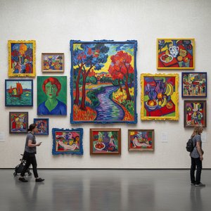
أعلى 10 روائع تحدد ملامح الفوية: رحلة في عالم الألوان الجريئة و الفن الراقي
اكتشف روائع الفوية! استكشف 10 لوحات أيقونية تحدد هذا التيار الفني الجريء مع ماتيس وديرين. قصص فنانين، تقنيات فريدة، وألوان آسرة. احصل على إعادة إنتاج عالية الجودة وابتكر ديكورًا فنيًا راقيًا. استكشف المجموعة الكاملة على TopImpressionists.com

Blush & Brilliance: 10 Iconic Paintings Dominated by Light Pink Tones |
Explore 10 iconic paintings bathed in captivating light pink tones! From Monet's Impressionism to Renoir’s romance, discover the stories behind these blush-hued masterpieces. Find museum-quality art reproductions & decor inspiration at .
استكشف الأعمال الفنية المصنفة حسب الموضوعات والأنماط والخصائص.


