

展示内容: · 額縁を含むサイズ:
 設置イメージを表示

 シェアする
 シェアする
 詳細を見る
 ガイドを表示


 ダウンロード
 似ている作品
 X線調査
 スライドショーを表示
 Q&A
 統計情報


¥ 42502
手描き油彩複製画
当社のアーティストが、ご希望のサイズと額縁に合わせてキャンバスに手描きで制作する、オーダーメイドの油彩画です。 ( プリント版に切り替え デジタル画像販売へ切り替え)
本作品の著作権について
このページに掲載されている作品は著作権法によって保護されており、当社の許可なく同一の複製物を制作または販売することは法律で禁じられています。この保護は、以下のような国際条約に基づき執行されます。 ベルヌ条約 および、以下の条項に定められたものを含む各国の法律により、 米国著作権法 第17編。
敬意を払った法的な代替手段として、私たちはオリジナルにインスピレーションを与えられた、カスタムの手描きアートワークを提供しています。私たちの熟練したプロのアーティストは、元の作品が持つスタイル、情緒、そして芸術的なエッセンスを注意深く研究し、独自の創作物でありながら、同じ感性を呼び起こすような、新しくユニークな作品を作り上げます。
この手法は、著作権で保護された作品の複製や複写を伴わないため、著作権法に完全に準拠しています。これは単なる模倣ではなく、創造的な再解釈です。元の作品からインスピレーションを受けつつも、それとは異なる、全く新しい絵画を生み出すものです。
 詳しく読む
サイズ
·標準サイズ
オーダーメイド
CM
INCH
作品のオリジナル比率に合わせた、当店の規定サイズからお選びください。
サイズを読み込み中...

横幅
高さ
フレームや壁のスペースに合わせて、ご希望の幅と高さを入力してください。本作品は手描きのため、異なる比率のサイズをご希望の場合、絵画の周囲を少し広げて描くか、あるいは端を少しカットして調整することが可能です。お客様のご要望に合わせます。制作を開始する前に、仕上がりを確認するためのデジタルモックアップをお送りいたします。このページに表示されている画像は完成品の実物ではなく、あくまでモックアップによるイメージです。
仕上げ
·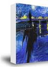
白の側面仕上げ ¥1
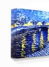
エッジぼかし仕上げ ¥1
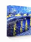
回り込み仕上げ ¥1
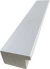
P118B ¥10
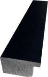
P118H ¥10
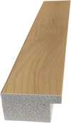
P118W ¥10
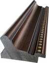
P438Z ¥10
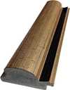
P508JH ¥12
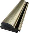
P508YH ¥12
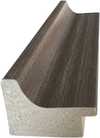
P805H ¥10
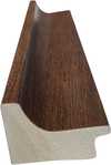
P805Z ¥10
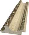
P919BZ ¥10
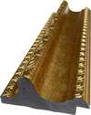
P919G ¥10
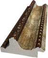
P919XJ ¥10
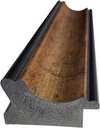
P959ZH ¥10
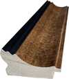
P968JZ ¥12
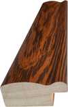
W106C ¥8

W218G ¥10
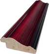
W218JH ¥8
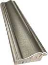
W218Y ¥10
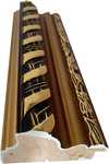
W307PJ ¥10
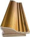
W316G ¥10
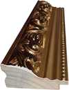
W316PJ ¥8
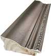
W316Y ¥10
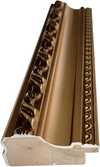
W398PJ ¥8
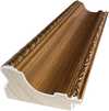
W4111J ¥10
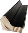
W500HY ¥15
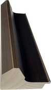
W500JH ¥15
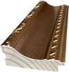
W692G ¥12
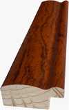
W849H ¥8
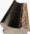
W940BG ¥15
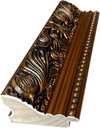
W953PJ ¥8
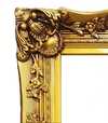
H24-GOLD ¥30
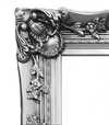
H24-SILVER ¥30
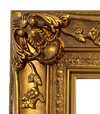
H36-GOLD ¥45
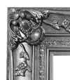
H36-SILVER ¥45
保護用の筒に入れてお届けしますので、お客様ご自身でフレーム(額縁)をご用意いただく形となります。
オプションサービス
任意特典の内容について
変更可能な例:顔をお客様の写真に差し替え、ペットの変更(例:猫を犬に変更)、背景に隠しメッセージを追加、背景の風景や要素の変更。
ご注文後、TopImpressionists.com のチームより詳細な手順についてメールをお送りし、仕上がりイメージ(モックアップ)をご提示いたします。
ご注文後、TopImpressionists.com のチームより詳細な手順についてメールをお送りし、仕上がりイメージ(モックアップ)をご提示いたします。
世界中への配送()は、通常の5週間ではなく、3〜4週間でお届けいたします。(16 11月)。品質には一切妥協いたしません。
保護用ワニス
キャプション
刻印入りブロンズプレートの詳細
This elegant plaque features the artist's name and the title of the artwork, finely engraved for a timeless presentation.
It is made from bronze with a refined, elegant finish. The text is precisely laser-engraved for a sharp and permanent result. Measuring 9x2 cm, the plaque is compact yet easy to read. It's built to be durable and scratch-resistant, offering a professional, museum-quality look. Mounting is simple thanks to the included adhesive backing.
透明アクリル銘板の詳細
The plaque includes essential engraved details such as the artist's name, the title of the artwork, the date it was created, the type of media used-like oil on canvas or watercolor-a brief description of the piece, and a QR code that links to the complete artwork information.
It is crafted from clear acrylic, offering a sleek, modern appearance. The text is UV-engraved in black to ensure strong visual contrast. With a size of 10x15 cm, it ensures optimal readability. It comes equipped with two metal hooks for secure wall mounting. The plaque is designed to be weather-resistant, making it suitable for various environments, and it includes interactive features that work seamlessly with smartphone scanning.
黒アクリル製銘板の詳細
This elegant plaque includes engraved information such as the artist's name, the title of the artwork, the date it was created, the type of media used (like oil on canvas or watercolor), a short description of the artwork, and a QR code for quick access to more information.
The plaque itself is made from refined black acrylic with a premium finish. The text is laser-engraved in white for high contrast and readability. Its size is 10x15 cm, designed to be easy to read. It comes with two metal hooks for professional mounting. The design is sleek and fits any interior style. It is also weather-resistant and durable, with built-in digital integration for mobile compatibility.
ガラスオプションは、110cm未満のサイズでのみご利用いただけます。
 ガラスオプションは、110cm未満のサイズでのみご利用いただけます。
- 世界中へ無料エクスプレス配送
- 高品質なリネンキャンバス
- 配送時完全保険付
- 関税・輸入税の払い戻し保証
- 真の色彩再現に関する保証
- 100日間返品保証(製造上の欠陥がある場合のみ)
- 100% 全額返金保証
- まとめ買い割引のご案内


作品解説
Experience the vibrant energy of Patrick Heron's Vertical: January 1956, a masterpiece of Color Field Painting that uses bold blue tones and dynamic geometric forms to invite you into a world of pure abstract beauty.
アーティストの略歴
パトリック・ヘロン(1920-1999年):色彩、光、形態の革新的な使用で名高い英国のアブストラクトおよび具象芸術家の鮮やかな世界を探訪。セザンヌやマティスに影響を受けています。
作品について
Identification of Vertical: January 1956
Vertical: January 1956 is an abstract work by Patrick Heron. Created in 1956, the piece emerged during the height of Color Field Painting, a movement focused on the expressive potential of pure color and geometric abstraction. This period marked a significant shift in Heron's practice as he moved away from representational constraints toward non-figurative forms.
The artist, born in 1920 in Headingley, United Kingdom, developed a visual language that prioritized the relationship between color and space. Heron's career spanned several decades until his death in 1999. His approach to abstraction was deeply informed by his engagement with modernism and his interest in the formal qualities of the medium.
Composition and Visual Elements
The composition is defined by a series of vertical strokes that establish a rhythmic, upward movement across the surface. These lines intersect with a dense arrangement of irregular rectangular and elongated forms. The shapes are closely packed, creating a fragmented visual field that avoids rigid structural symmetry. Through the strategic use of color intensity, a sense of depth is achieved; shapes positioned in the foreground appear highly saturated, while those receding into the background transition into lighter or more muted tones.
The palette is dominated by a spectrum of blues, ranging from deep indigo to pale, translucent shades. These primary hues are punctuated by deliberate accents of white, yellow, red, and grey. Rather than blending, the colors maintain distinct identities, allowing for a direct interaction between the various hues and the geometric shapes. This interplay of color and form creates a palpable tension within the vertical structure.
Technique and Material Composition
The work is executed in oil paint on hardboard. Heron employs a deliberate layering of pigment to build a surface that pulsates with visual energy. Rather than blending hues to create gradients, the artist eschewed traditional transitions, opting instead to maintain the distinct identities of each color. This approach creates a palpable dialogue between the individual hues and the geometric shapes they inhabit.
A strong textural quality defines the surface, driven by visible brushstrokes and the application of the impasto technique. The paint is not applied uniformly; certain areas appear significantly thicker than others, creating a physical depth that interacts with the light. This variation in thickness emphasizes the materiality of the medium and the spontaneity of the application.
Related Works by Patrick Heron
The artist's exploration of color and form during this period includes Red Garden, created in 1956. This work belongs to a sequence of loosely structured garden pictures that preceded the more formal investigations of the late 1950s. Following these compositions, the artist produced 1959 January, a piece that moved away from landscape references toward the formal qualities of space and color. This shift emphasized the asymmetry of shape and the specific application of paint.
As the decade progressed, the artist's palette and structural approach continued to evolve. In March 1957, he produced Scarlet, Lemon and Ultramarine. By May 1960, the work Green and Purple Painting with Blue Disc emerged, followed by Purple Shape in Blue in 1964. These works demonstrate a sustained interest in the relationship between color tones and the spatial properties of the canvas.
The later years of the artist's career saw further experimentation with bold color combinations. In 1969, he created Cadmium with Violet, Scarlet, Emerald, Lemon and Venetian. This period reflects a continued commitment to the expressive potential of pure color and the development of a distinct visual language.
Q&A
パトリック・ヘロン作「Vertical: January 1956」は、Color Field Paintingにおいてどのような情緒を表現していますか?
「Vertical: January 1956」は、Color Field Paintingのムーブメントにおいて、Energeticな情緒を湛えています。
パトリック・ヘロン作「Vertical: January 1956」 に近い雰囲気の作品を探すには?
パトリック・ヘロン作「Vertical: January 1956」の関連作品ページでは、関連する作品をご紹介しています。
「Vertical: January 1956」は、どのような場所や用途での使用がおすすめですか?
パトリック・ヘロン作「Vertical: January 1956」 のおすすめの用途は (Statement)、飾る場所は (Living Room) です。
作品の豆知識とアートクイズ
パトリック・ヘロンについて

パトリック・ヘロン
1920 - 1999, イギリス
作家プロフィール
色彩と光に浸された生涯
20世紀英国美術における極めて重要な人物であったパトリック・ヘロンは、単なる画家という言葉では語り尽くせません。彼は視覚の詩人であり、この世の鮮やかさを、極めて個人的な言語をもってキャンバス上に翻訳したのです。1920年にリーズのヘディングリーに生まれた彼の芸術的な旅路は、学問の神聖な殿堂から始まったわけではありません。むしろ、家族経営の現実的な営みと、芽吹き始めたコーンウォール地方の美しさの中で育まれたのです。衣服メーカーであり熱心な平和主義者であった父の影響のもと、創造性が花開く環境が醸成され、若いパトリックは思春期を迎える頃から布地の柄をデザインすることさえできました。これは、彼が生まれ持っていた色彩と形態に対する鋭敏さの初期的な兆候でした。この形成期は、1925年にコーンウォールへ移住したことで頂点を迎え、決定的なものとなりました。そこにあった劇的な光と荒々しい風景は、彼のキャリアを通して永続するモチーフとなり、何十年にもわたる抽象的な探求に静かに影響を与え続けることになります。転機となった出来事は、1933年にロンドンのナショナル・ギャラリーへの学校の遠足中に訪れました。そこでポール・セザンヌの作品に出会ったことは、彼の一生をかけた情熱に火をつけ、彼の芸術的な軌跡を深く形作ったのです。具象的な始まりから抽象の領域へ
ヘロンが絵画に初めて手を広げた初期の試みは、彼が心惹かれた伝統――マティス、ボナール、ブラック、そしてセザンヌといった巨匠たちの長い影を色濃く受けていました。作品『ピアノ』(1943年)は、しばしば彼の最初の成熟した作品として挙げられ、色彩と構図を通して雰囲気や感情を捉える初期の能力を示しています。その後も依頼が続き、特に1947年のT.S.エリオットの肖像画などは、彼を熟練した具象画家としての名声で確固たるものにしました。しかし、戦後の時代は、ヘロンのアプローチに地殻変動のような変化をもたらします。台頭しつつあったアメリカの抽象表現主義運動の影響と、ヨーロッパモダニズムへの再度の関与から、彼は具象的な形態を解体し始め、純粋な抽象という領域へと足を踏み入れました。この移行は唐突なものではなく、徐々に開花する過程でした。1956年にコーンウォールのイーグルズ・ネストに移り住んだことがそのきっかけとなり、この場所こそが彼の芸術的アイデンティティと不可分なものとなるのです。ここでは、コーンウォール海岸の生の美しさに囲まれながら、彼は非具象的な形態と色彩関係の表現的な可能性を探求することに完全に身を捧げました。縞模様の言語とその先へ
1950年代後半から1960年代にかけては、ヘロンの代名詞ともいえる「ストライプ」絵画が出現します。これらは、細長く伸びた垂直線と目もくらむような鮮やかな色彩の配列を特徴とする、大胆でダイナミックな構成でした。それらは単なる装飾的な遊びではありませんでした。それは、色彩と空間の相互作用に対する厳密な探求であり、抽象表現をその極限へと押し進める試みだったのです。アラン・ボウンズが指摘したように、これらの作品は「光と色に満たされ、ポジティブで生命力を高める質に溢れていた」といいます。彼は単にキャンバスに絵の具を塗っているのではなく、視覚的な体験を構築し、鑑賞者を色彩という純粋な感覚の中に没入させるよう誘っていたのです。この時期はヘロンのキャリアにおける頂点であり、彼を英国抽象美術を牽引する声として確立させました。その後も1960年代から70年代にかけて、彼の様式は再び進化し、「揺らぐハードエッジ」と呼ばれるものを受け入れます。『カドミウムとバイオレット、スカーレット、エメラルド、レモン、ヴェネチアン:1969年』のような作品がこの段階を象徴しています。大胆な色彩と明確な形状がダイナミックな緊張感の中で共存し、ヘロンの絶え間ない実験精神と、様式的な慣習に囚われることを拒否する姿勢を示していたのです。創造者であると同時に批評家として
パトリック・ヘロンは単なる芸術家ではありませんでした。彼はまた、手腕を振るう優れた美術評論家であり作家でもありました。『ニュー・ステイツマン』や『アーツ・ニューヨーク』といった出版物に定期的に寄稿し、現代美術に対して洞察に富み、しばしば挑発的な論評を提供しました。彼の著作は単に絵画に付随するものではなく、彼の芸術的実践そのものに不可欠な要素であり、美術の歴史と理論に対する深い知的な関与を反映していました。批評というレンズを通して、ヘロンはモダニズムの理想を擁護し、美や表象に関する従来の概念に異議を唱えました。彼は抽象表現を支配する根底にある原理を照らし出すことを目指し、彼自身の作品だけでなく、美術界全体を形作る広範な潮流を理解するための貴重な文脈を提供したのです。この「芸術家」と「批評家」という二重の役割が、彼を戦後イギリスにおける重要な知的な人物として位置づけ、芸術コミュニティ内に対話と議論を育んだのでした。永続する遺産
パトリック・ヘロンが英国美術にもたらした貢献は否定できません。彼は抽象化の発展において指導的な存在であり続け、ヨーロッパモダニズムとアメリカの抽象表現主義という二つの潮流を結びつけながら、独自の道を切り開きました。色彩、光、形態を探求し続けた彼の揺るぎない献身と、洞察に満ちた批評的著作が組み合わさることで、彼は美術史の中に確固たる地位を築いたのです。彼は単に流行を追従したのではなく、自ら「創造」し、後世の何世代もの芸術家に影響を与え続けました。ヘロンが持つ、「紛れもなく自分自身のものであるが、同時に自然界と即座につながるイメージを発明する」能力は、彼の不朽の芸術的ビジョンを証明しています。それは今日なお観客の心に響き続けているのです。彼の作品は、抽象化という変革的な力と、色彩そのものが持つ永続的な美しさに対する力強い記念碑として機能しているのです。パトリック・ヘロンについてのクイック・ファクト
- Artistic Movement Or Style: 抽象表現主義
- Artists Or Movements Influenced By This Artist: イギリスの抽象芸術
- Artists Who Influenced This Artist:
- セザンヌ
- マティス
- ブラック
- ボナール
- Date Of Birth: 1920年1月30日
- Date Of Death: 1999年3月20日
- Full Name: パトリック・ヘロン
- Nationality: イギリス人
- Notable Artworks:
- ピアノ
- セント・アブズ教会墓地
- A. S. バヤット
- Place Of Birth: イギリス、リーズ

パトリック・ヘロン
Vertical: January 1956
() ·
額縁を含むサイズ: · リネンに油彩で手描き
合計