

 Náhľad v interiéri

 Odoslať ako digitálnu kartu
 Zdieľať
 Podrobnosti o dielo
 Príručka


 Stiahnuť obraz
 Podobné položky
 RTG skúška
 Prehliadanie diapozoje
 Otázky a odpovede
 Štatistiky
Vertical: January 1956


Experience the vibrant energy of Patrick Heron's Vertical: January 1956, a masterpiece of Color Field Painting that uses bold blue tones and dynamic geometric forms to invite you into a world of pure abstract beauty.
 Zobraziť viac
Patrick Heron (1920-1999): Objavte živý svet tohto britského abstraktného a figuratívneho umelca, známeho inovatívnym použitím farby, svetla a formy. Vplyvnený Cézanne a Matisse.
Umelecké dielo zobrazené na tejto stránke je chránené autorským zákonom, čo znamená, že nemôžeme legálne vytvárať ani predávať jeho identickú reprodukciu. Táto ochrana je vymáhaná na základe medzinárodných dohôd, ako napríklad Bernská konvencia a národnými zákonmi, vrátane tých, ktoré sú stanovené v Autorské právo USA – Title 17. Všetky práva vyhradené.
Táto metóda plne dodržiava autorské práva, pretože nezahŕňa kopírovanie ani duplikovanie chráneného diela. Ide skôr o kreatívnu reinterpretáciu – nový obraz, ktorý je ovplybnený originálom, no nie je s ním identický.
Giclée / Umenotlač
Giclée tlač alebo plátno múzeálnej kvality s rýchlou výrobou a rôznymi možnosťami povrchovej úpravy. ( Kúpiť ručne maľovaný obraz Prepnúť na digitálny obraz)
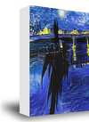
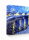
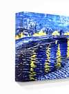
P118B €10
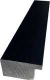
P118H €10
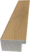
P118W €10
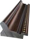
P438Z €10
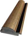
P508JH €12
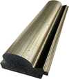
P508YH €12
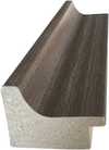
P805H €10
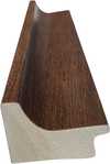
P805Z €10
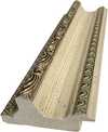
P919BZ €10
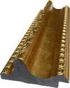
P919G €10
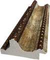
P919XJ €10
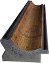
P959ZH €10
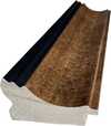
P968JZ €12
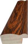
W106C €8
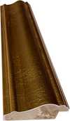
W218G €10
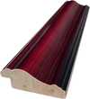
W218JH €8
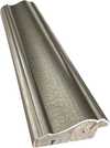
W218Y €10
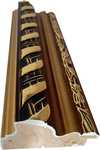
W307PJ €10
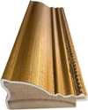
W316G €10
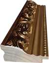
W316PJ €8
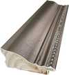
W316Y €10
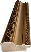
W398PJ €8
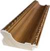
W4111J €10
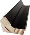
W500HY €15
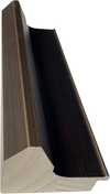
W500JH €15
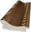
W692G €12
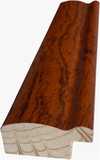
W849H €8
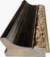
W940BG €15
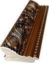
W953PJ €8
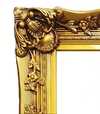
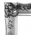
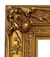
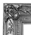
Štandardné
na mieru
CM
INCH
Vyberte si z našich preddefinovaných rozmerov, ktoré zodpovedajú pôvodným pomeroḿ diela.
Loading sizes...

šírka
výška
Zadajte šírku a výšku, ktoré potrebujete, aby sa reprodukcia hodila k vášmu rámu alebo stene. Print možno len orezávať, nikdy však nemennú veľkosť zvětšiť oproti pôvodnému obrázku, preto pri inom formáte stráca časť obrazu. Pred samotným vytlačiacím procesom vám pošleme digitálny náhľad na schválenie. Obrázok zobrazený na tejto stránke nezobrazuje reálny rez — len digitálny náhľad ukazuje presný výsledok.
Celosvetová doprava () do 2 týždňov namiesto štandardných 4 až 5 týždňov. (16 november)

Bezplatná expresná doprava po celom svete

Vysokokvalitné lnianske plátno

Kompletné poistenie prepravy

Záruka vrátenia colného poplatku

Záruka presného farebného zhodnutia

100-dená politika vrátenia tovaru (iba pri vadách)

100% záruka vrátenia peňazí

Zľava pri väčšom množstve
 Možnosť skla je dostupná len pri rozmeroch pod 110 cm

Vertical: January 1956
Giclée / Umenotlač
Veľkosť reprodukcie
-


Celková cena
€ 62
Identification of Vertical: January 1956
Vertical: January 1956 is an abstract work by Patrick Heron. Created in 1956, the piece emerged during the height of Color Field Painting, a movement focused on the expressive potential of pure color and geometric abstraction. This period marked a significant shift in Heron's practice as he moved away from representational constraints toward non-figurative forms.
The artist, born in 1920 in Headingley, United Kingdom, developed a visual language that prioritized the relationship between color and space. Heron's career spanned several decades until his death in 1999. His approach to abstraction was deeply informed by his engagement with modernism and his interest in the formal qualities of the medium.
Composition and Visual Elements
The composition is defined by a series of vertical strokes that establish a rhythmic, upward movement across the surface. These lines intersect with a dense arrangement of irregular rectangular and elongated forms. The shapes are closely packed, creating a fragmented visual field that avoids rigid structural symmetry. Through the strategic use of color intensity, a sense of depth is achieved; shapes positioned in the foreground appear highly saturated, while those receding into the background transition into lighter or more muted tones.
The palette is dominated by a spectrum of blues, ranging from deep indigo to pale, translucent shades. These primary hues are punctuated by deliberate accents of white, yellow, red, and grey. Rather than blending, the colors maintain distinct identities, allowing for a direct interaction between the various hues and the geometric shapes. This interplay of color and form creates a palpable tension within the vertical structure.
Technique and Material Composition
The work is executed in oil paint on hardboard. Heron employs a deliberate layering of pigment to build a surface that pulsates with visual energy. Rather than blending hues to create gradients, the artist eschewed traditional transitions, opting instead to maintain the distinct identities of each color. This approach creates a palpable dialogue between the individual hues and the geometric shapes they inhabit.
A strong textural quality defines the surface, driven by visible brushstrokes and the application of the impasto technique. The paint is not applied uniformly; certain areas appear significantly thicker than others, creating a physical depth that interacts with the light. This variation in thickness emphasizes the materiality of the medium and the spontaneity of the application.
Related Works by Patrick Heron
The artist's exploration of color and form during this period includes Red Garden, created in 1956. This work belongs to a sequence of loosely structured garden pictures that preceded the more formal investigations of the late 1950s. Following these compositions, the artist produced 1959 January, a piece that moved away from landscape references toward the formal qualities of space and color. This shift emphasized the asymmetry of shape and the specific application of paint.
As the decade progressed, the artist's palette and structural approach continued to evolve. In March 1957, he produced Scarlet, Lemon and Ultramarine. By May 1960, the work Green and Purple Painting with Blue Disc emerged, followed by Purple Shape in Blue in 1964. These works demonstrate a sustained interest in the relationship between color tones and the spatial properties of the canvas.
The later years of the artist's career saw further experimentation with bold color combinations. In 1969, he created Cadmium with Violet, Scarlet, Emerald, Lemon and Venetian. This period reflects a continued commitment to the expressive potential of pure color and the development of a distinct visual language.
Otázky a odpovede
Akú náladu vyjadruje „Vertical: January 1956“ od Patrick Heron v rámci smeru Color Field Painting?
„Vertical: January 1956“ vyžaruje Energetic emóciu v rámci smeru Color Field Painting.
Ako môžem objaviť diela podobné „Vertical: January 1956“ od Patrick Heron?
Stránka Podobné diela diela „Vertical: January 1956“ od Patrick Heron ponúka ďalšie súvisiace umelecké diela.
Kde a za akým účelom sa odporúča dielo "Vertical: January 1956"?
Odporúčané použitie (Statement) a priestor (Living Room) pre dielo „Vertical: January 1956“ od Patrick Heron.
Biografia umelca
Život ponorený v farbe a svetle
Patrick Heron, kľúčová postava britského umelí 20. storočia, nebol len maľebník; bol vizuálny poet, ktorý prenášal žiarivosť sveta na plátno s intenzívne osobným jazykom. Narodený v Headingley v Leeds v roku 1920, jeho umelecká cesta sa začala nie v svieženckých galériách akademického života, ale spraviac v praktickosti rodinného podnikania a rozkvétajúcou kráľovskou krajinou Cornwallu. Jeho otec, výrobca oblečenia a vyznávateľ pacifizmu, vytvoril prostredie, kde kvetla kreativita, čo umožnilo mladému Patrickovi navrhovať vzory na tkaniny už ako teenager – raný znak jeho prirodzenej citlivosti voči farbe a forme. Tento formatívny obdobie, ktoré vrcholilo presunom do Cornwallu v roku 1925, sa ukázalo ako kľúčové; dramatické svetlo a surosť krajiny sa staly trvalými motívmi počas celého jeho kariéry, jemne informujúc jeho abstraktné skúmania na decədky. Kľúčový moment nastal počas školského výletu do Národnej galérie v Londýne v roku 1933, kde ho stretnutie s dielami Paula Cézanneho rozžehlo životnú vášeň a hlboko formovalo jeho umeleckú trajektóriu.Od figuratívnych začiatkov k abstraktným svetadielkam
Heronove prvotné pokusy v maľbe boli hlboko zakorenené v tradíciách, ktoré obdivoval – Matisse, Bonnard, Braque a Cézanne všetci vrhali dlhé tieňe na jeho ranú prácu. The Piano (1943) je často citovaný ako jeho prvý zrelý diel, ktorý demonštruje národnú schopnosť chytiť atmosféru a emóciu pomocou farby a kompozície. Následovali objednávky, najmä portréty T.S. Eliota v roku 1947, čím sa upevnil jeho reputácia ako zručného figuratívneho umelca. Avšak obdobie po vojne bolo svedkom seizmického posunu v Heronovej metóde. Ovplyvnený rozkvétajúcim americkým abstraktným expresionistickým hnutím a obnoveným zaangažovaním sa európskim modernizmom, začal rozkláňať reprezentatívne formy, čím sa vydal do sveta čistej abstrakcie. Tento prechod nebol náhly; bol postupným rozkvétom, spúdaný jeho presunom do Eagles Nest v Cornwallu v roku 1956 – miesta, ktoré sa stalo synonymom s jeho umeleckou identitou. Tu, obklopený surovou krásou cornishskeho pobrežia, sa plne oddal skúmaniu nefiguratívnych form a expresívneho potenciálu farebných vzťahov.Jazyk pruhov a viac
Konca 50. a 60. rokov viedlo k objaveniu signatúрных „pruhov“ Heronových maľieb – odvážnych, dynamických kompozícií charakterizovaných predĺženými vertikálnymi líniami a oslnivou škálou žiarivých odtieňov. Neboli to len dekoratívne cvičenia; boli to rigorózne výzkumy vzájomného vplyvu farby a priestoru, ktoré posúvali abstrakt až na jeho hranice. Ako pozoroval Alan Bowness, tieto diela boli „preplnené svetlom a farbou a plné pozitívnej životnej kvality“. Neaplikoval len farbu na plátno; vytváral vizuálne zážitky, čím invitoval divákov k ponoření sa do čistej senzácie farby. Toto obdobie predstavovalo vrchol Heronovej kariéry, čo ho upevnilo ako vedúcu silu v britskom abstraktnom umení. Neskôr, počas 60. a 70. rokov, sa jeho štýl znova vyvinul, prijímajúc to, čo bolo známe ako „trhákové hard-edge“ maľby. Diela ako Cadmium with Violet, Scarlet, Emerald, Lemon and Venetian: 1969 ilustrujú túto fázu – odvážne farby a definované tvary koexistujú v dynamickej napätosti, čím demonštrujú Heronov pokračujúci experiment a odmietanie byť obmedzený štýlistickými konvenciami.Kritik rovnako ako tvorca
Patrick Heron nebol len umelcom; bol tiež impozantným artkritikom a spisovateľom. Pravdivelne prispieval k publikáciám ako New Statesman a Arts New York, ponúkajúc vnikavé, často provokatívne komentáre na moderné umenie. Jeho spisy neboli len doplnkom k jeho maľbstvu; boli neoddeliteľnou súčasťou jeho umeleckej praxe, odrážajúce hlboké intelektuálne zaangažovanie sa históriou a teóriou umenia. Skrz svoj kritický pohľad Heron propagoval modernizátorské ideály, čím napadal konvenčné pojmy krásy a reprezentácie. Snažil sa osvietiť základné princípy, ktoré ovládali abstraktnú expresiu, poskytujúc cenný kontext na pochopenie nielen svojej práce, ale aj širších prúdov, ktoré formovali svet umenia. Toto dvojité úloha – umelec a kritik – ho umiestnila ako kľúčovú intelektuálnu figúru v po-vojenskej Británii, podporujúc dialóg a debatu v umeleckej komúne.Trvajúce dedičstvo
Patrick Heronov príspevok k britskému umeniu je nepochybný. Stojí ako vedúca postava vo vývoji abstraktnej maľby, premostil medzerie medzi európskym modernizmom a americkým abstraktným expresionizmom, pričom si vytvoril vlastnú jedinečnú cestu. Jeho neochvytná oddanosť skúmaniu farby, svetla a formy, spojená s jeho vnikavým kritickým pisateľstvom, upevnila jeho miesto v umeleckej histórii. Neprikvapoval len trendom; on ich vytváral, ovplyvnil generácie umelníkov, ktorí ho nasledovali. Heronova schopnosť „wynáliť obrazotvorcu, ktorý je jednoznačne jeho vlastný, a napriek tomu okamžite spája s prirodzeným svetom“ zostáva dôkazom jeho trvajúceho umeleckého výzora – výzoru, ktorý dnes stále rezonuje u publikum. Jeho práca slúži ako silné pripomienku transformatívnej sily abstraktcie a trvajúcej krásy farby sama o sebe.
Patrick Heron
1920 - 1999 , Spojené kráľovstvo
Základné informácie
- Artistic Movement Or Style: Abstraktný expresionizmus
- Artists Or Movements Influenced By This Artist: Britský abstraktný umenie
- Artists Who Influenced This Artist:
- Cézanne
- Matisse
- Braque
- Bonnard
- Date Of Birth: 30. január 1920
- Date Of Death: 20. marec 1999
- Full Name: Patrick Heron
- Nationality: Britický
- Notable Artworks:
- The Piano
- St Ives Churchyard
- A. S. Byatt
- Place Of Birth: Leeds, Spojené kráľovstvo
Súvisiace články

From Cézanne to Cubism: How One Painter Cracked Open Modern Art
Explore the revolutionary journey of Paul Cézanne, the master who bridged Impressionism and Cubism. Discover how his pursuit of structure and form redefined modern art through a deep, cultural lens for true art lovers.

The Architecture of Vision: How Impressionist Masters Orchestrate Composition to Direct the Eye
Master the secrets of Impressionist composition through the eyes of masters like Renoir and Cézanne. Explore the architecture of vision now.

Sculpting Space: The Structural Interplay of Impasto and Atmospheric Perspective in Modern Art
Explore the expert interplay of impasto texture and aerial perspective in modern art. Discover how depth is sculpted on canvas.